The network for creativity
Join 1.25M professional creatives like you
Connect with clients, get discovered, and run your business 100% commission-free
Creatives on Contra have earned over $150M and we are just getting started
Back to feedPost
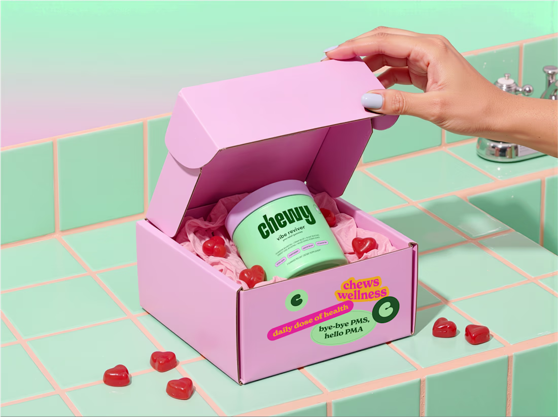
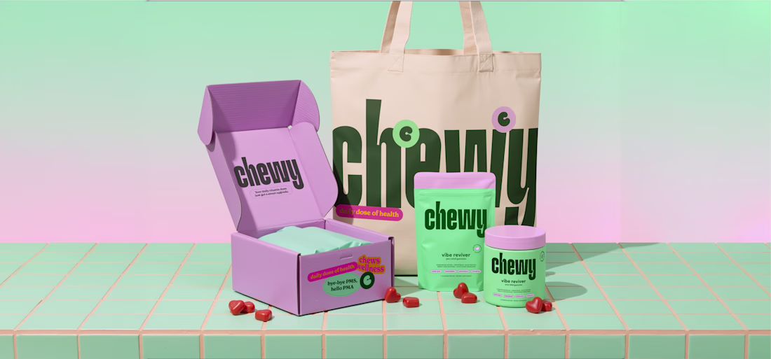
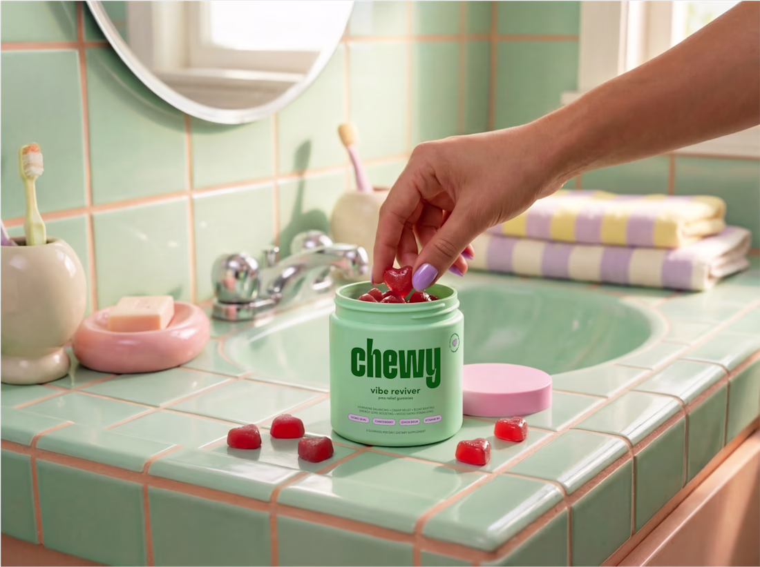
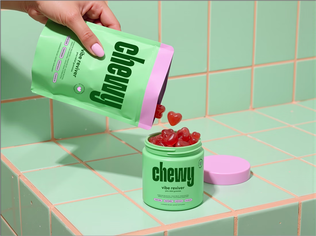
Chewy is an Australian daily vitamin brand that wants to make supplements feel simpler and actually enjoyable to take. They launched with Vibe Reviver, a PMS relief gummy, and the whole thing is about making functional health easy to understand and easy to fit into your day.
The category was the tricky part. Most supplement brands in Australia go really clinical, minimal logos, white packaging, sterile type. It looks trustworthy but it's all a bit cold and samey.
So we went the opposite way. A bold typography-led identity with a playful logo at the heart of it, and a bright colour palette to give it energy and personality. Then clean layouts and clear info design so it's all still easy to read, just nothing like the usual stuff on the shelf.
Brand identity and packaging.
Like this
I love this colors and typography! What a great packaging design 💫 goated!
i love this
The network for creativity
Join 1.25M professional creatives like you
Connect with clients, get discovered, and run your business 100% commission-free
Creatives on Contra have earned over $150M and we are just getting started
Related posts
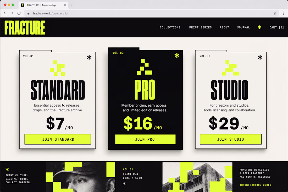
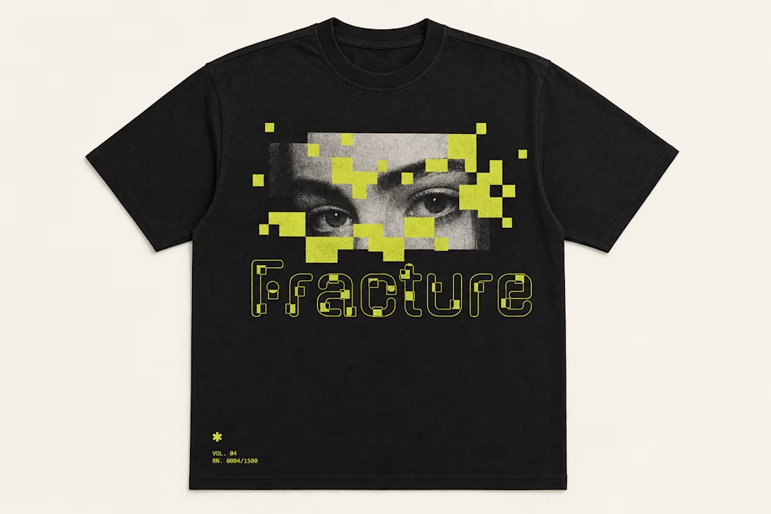
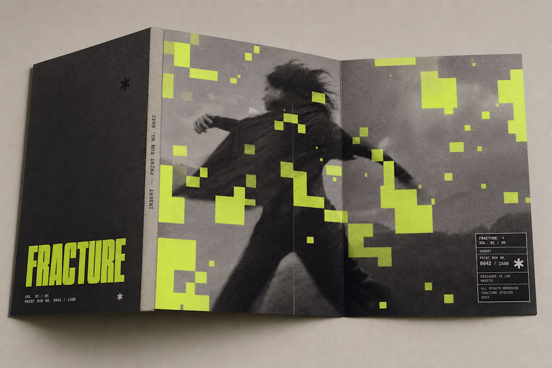
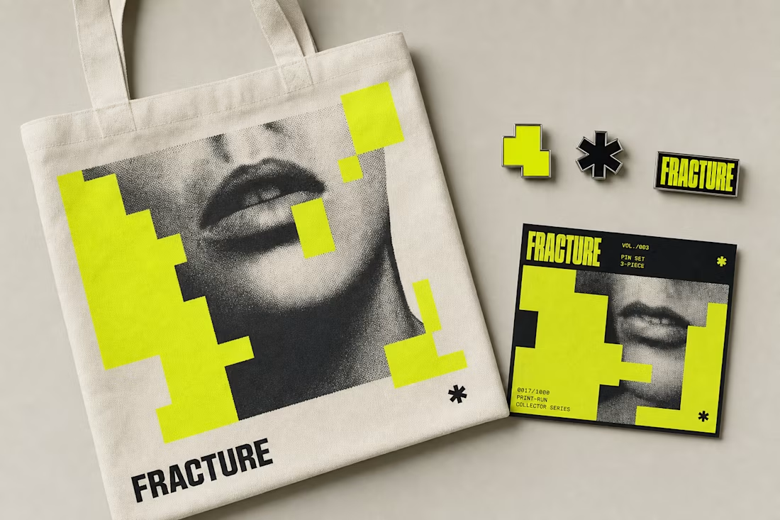
Fracture's identity doesn't stop at posters — it survives a t-shirt, a pin set, a phone screen, and a mailer box without breaking the rule: yellow blocks occlude, never distort. Same system, five very different surfaces.
See the full case study → Check it out
Used my 1st upgoat on this platform. Amazing job!
Designed and developed the complete brand identity and digital experience for The Mine, a boutique cinematography studio.
From the logo and visual identity to UX/UI, art direction, 3D visual elements, motion design, and full website development, every aspect was crafted to reflect the studio's cinematic approach. Inspired by the concept of a mine, the visual language features floating stone formations, creating a distinctive and memorable brand experience.
The website also features a fully custom cinematic navigation system, replacing conventional page browsing with an immersive storytelling journey through smooth transitions and carefully choreographed interactions.
Wow! Such an UNEXPECTED experience! 🤩✨️
Two homepage concepts for film production studio - which one do you choose? 🧐
38 voted
57%
29 voted
43%
67 votes
Closed
amazing!
Challenges
View allTrending
Claude
Claude has entered the design space. How are you using Claude Design?
Contra University
Learn from expert creatives how to earn more using next-gen AI tools.
fifaworldcup2026
The World Cup is here and the whole world's watching. How are you designing for the world stage?
creativeaiflow
Creative AI workflows are evolving. What tools do you use, and what are their strengths and weaknesses?
freelancerlife
Freelancer life is wins, pivots, and everything in between. What’s yours right now?