The network for creativity
Join 1.25M professional creatives like you
Connect with clients, get discovered, and run your business 100% commission-free
Creatives on Contra have earned over $150M and we are just getting started
Back to feedPost
Taste Test

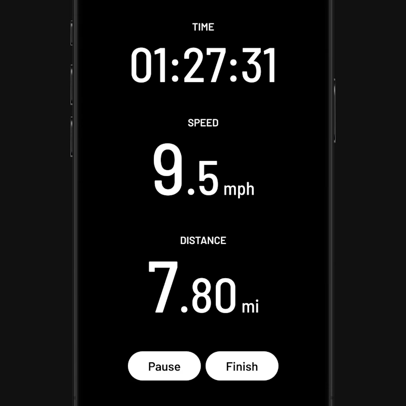
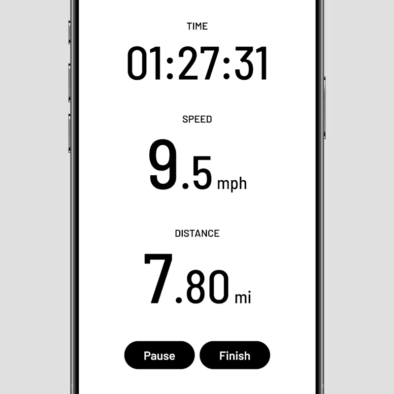
What about this app? Black or white?
19 voted
63%
11 voted
37%
30 votes
Closed


Black


White — and only because of where this screen actually gets looked at. Black is the nicer object on a desk, but a run tracker is read outdoors at arm's length in daylight, often through a sweaty screen with auto-brightness maxed, and dark backgrounds lose that fight badly. White...

Adorable design! Fresh and vibrant!

Nice work as usual! High-contrast dark states always bring out the best in data-dense UI layouts.

black one is great

For something you'd glance at mid-run in bright sunlight, my gut says white wins on legibility even though black looks sleeker sitting still. Are you designing this with outdoor use in mind, or is it mostly an indoor treadmill scenario?

both's simplicity are fabulous, but black wins here for me!

Black


you should have both for better UX

both look cool!


White looks better

Black for me. This reads as a running or workout tracker, and dark mode is easier on the eyes outdoors and better for glanceable metrics mid run.
The network for creativity
Join 1.25M professional creatives like you
Connect with clients, get discovered, and run your business 100% commission-free
Creatives on Contra have earned over $150M and we are just getting started





Related posts

Light or dark, which one wins? ☀️🌙
Same site, two moods. Warm stone and lacquer red, or the same build after dark.
Both are hand-built with a 3D paper crumple, real physics, a stick-figure film drawn in code, and a receipt that gets a bicycle kick. 🔊 Sound on.
Tell me which you'd ship: light or dark? 👇
26 voted
59%
18 voted
41%
44 votes
Closed

I really like how the light version looks, but it has some legibility issues. Since readability is more important for users than visual appeal, I think the dark version is the better option.
BTW, I initially voted for the light version, but after analyzing both options more closely, I changed my mind 😄

Same prompt. Two builders.
One site made with Lovable, one with Google AI Studio. A Flemish still-life snack brand, gilt frames, GSAP scroll, the works.
Which one is better?
33 voted
67%

16 voted
33%

49 votes
Closed

Minimal vs Detailed - Which coin design feels more premium for a fintech brand?
9 voted
27%
24 voted
73%
33 votes
Closed

I like the premium gold version