The network for creativity
Join 1.25M professional creatives like you
Connect with clients, get discovered, and run your business 100% commission-free
Creatives on Contra have earned over $150M and we are just getting started
Back to feedPost

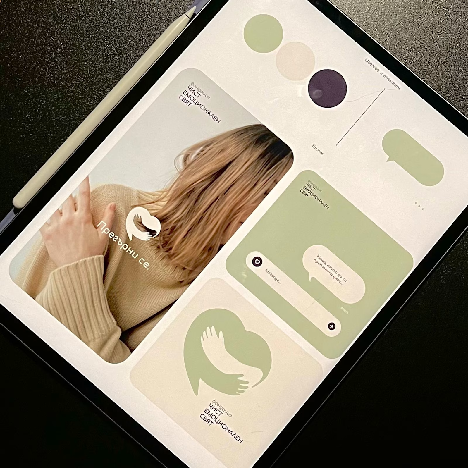
60% of people who need emotional support don't seek it. Help exists, but the visual language makes it feel institutional.
I designed for a client launching a mental health foundation that solves this at a behavioral level:
Sage palettes that calm instead of clinical blue that distances.
Organic shapes that invite instead of rigid geometry that intimidates.
Typography that signals conversation instead of clinic.
Every decision tested against one question: Does this remove barriers to vulnerability?
Introducing Фондация Чист Емоционален Свят, where behavioral research drives design, and design builds trust.
If your brand operates in health, education, or social impact and your visuals create distance when they should create connection - let's change that.
DM me or book a meeting at www.alexm.life

The network for creativity
Join 1.25M professional creatives like you
Connect with clients, get discovered, and run your business 100% commission-free
Creatives on Contra have earned over $150M and we are just getting started




Related posts


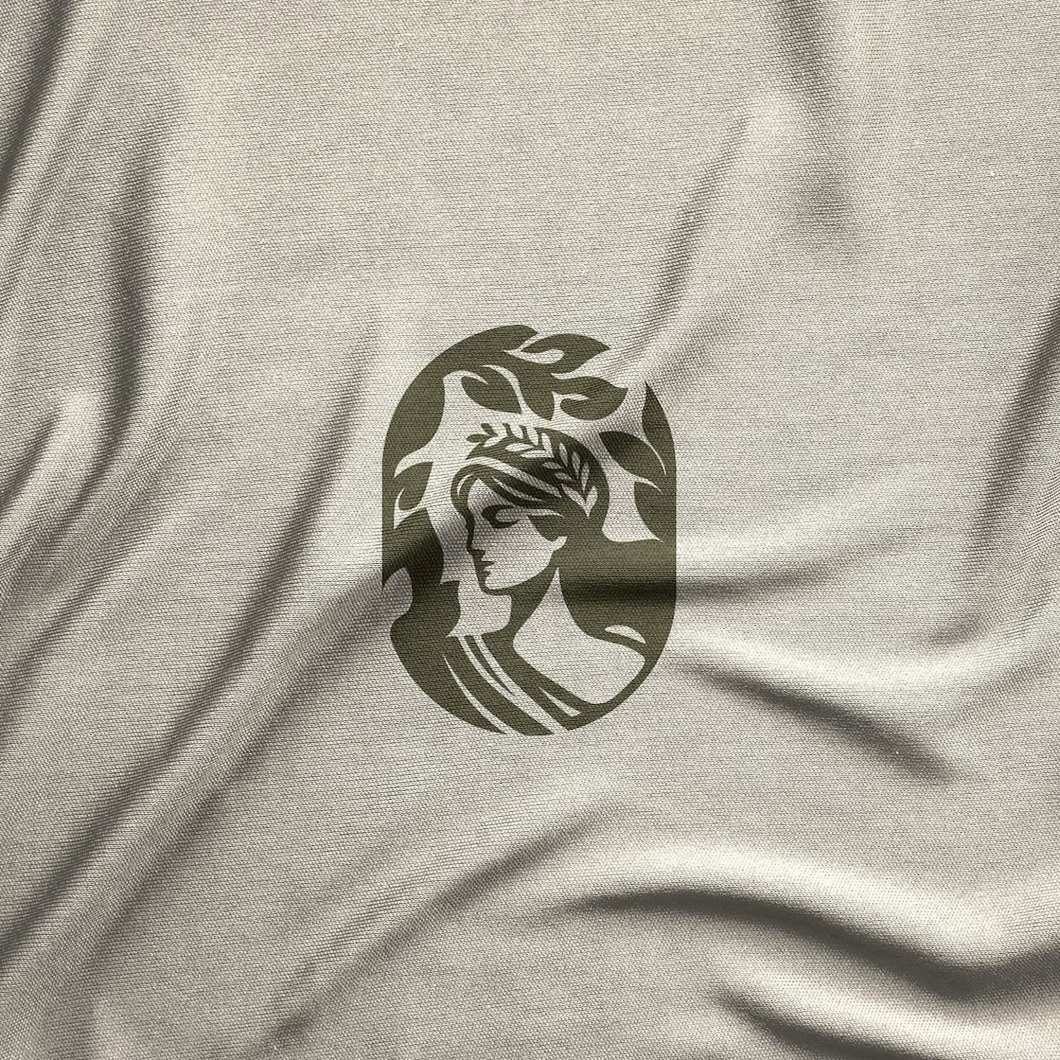
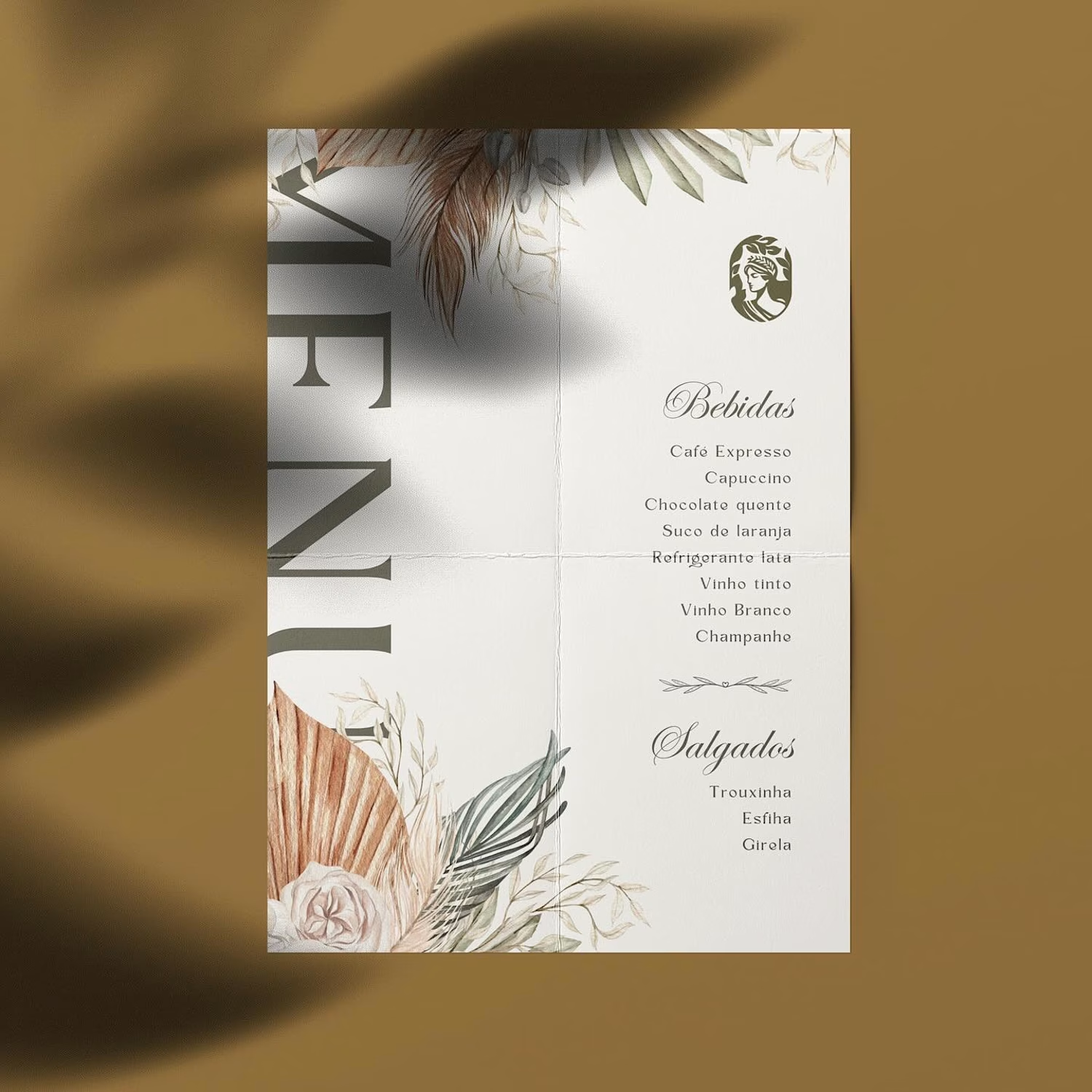
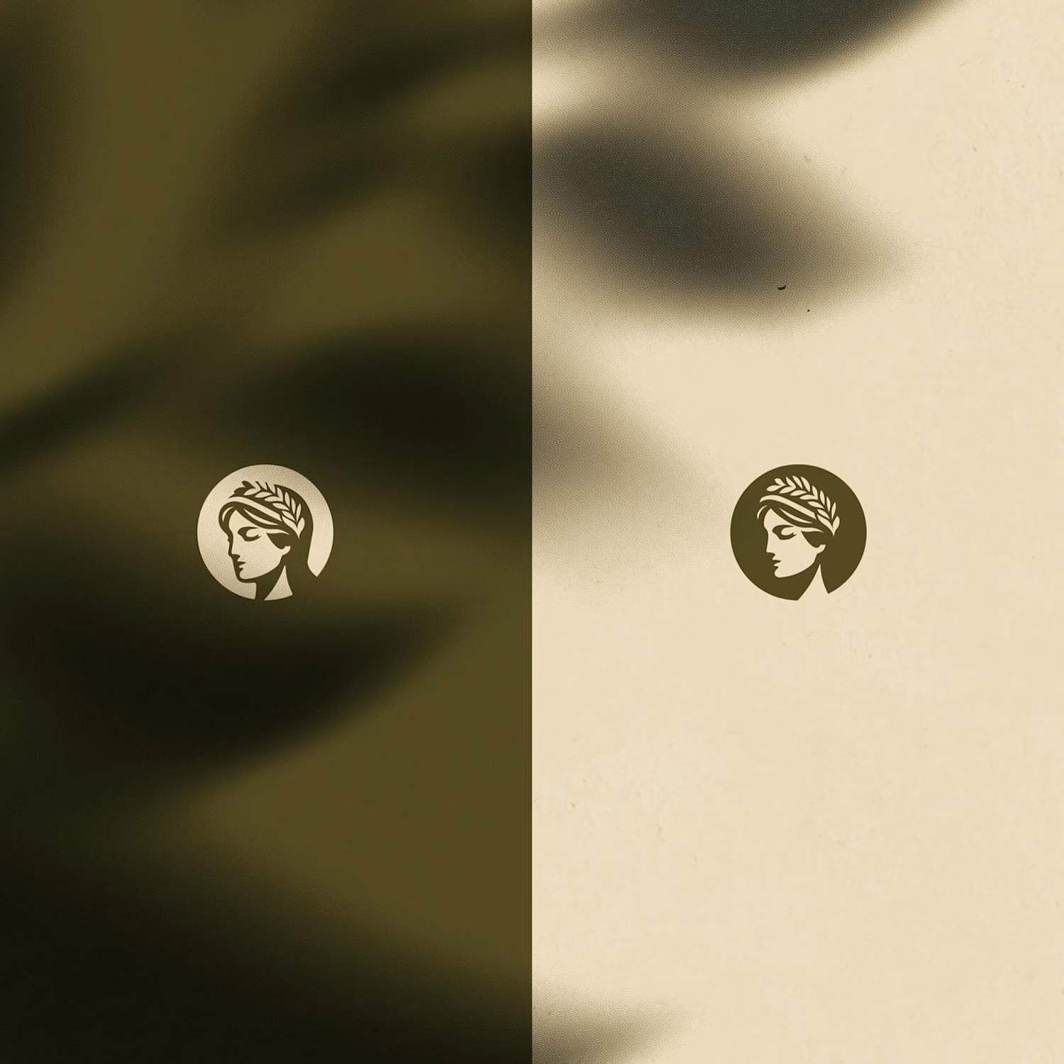
Hot take: aesthetics and clinical results should walk hand in hand.
Most brands in this space lean into cold, sterile whites or aggressive dark tones. It reads functional, but it also feels like something you'd hide in a medicine cabinet, not display on your vanity.
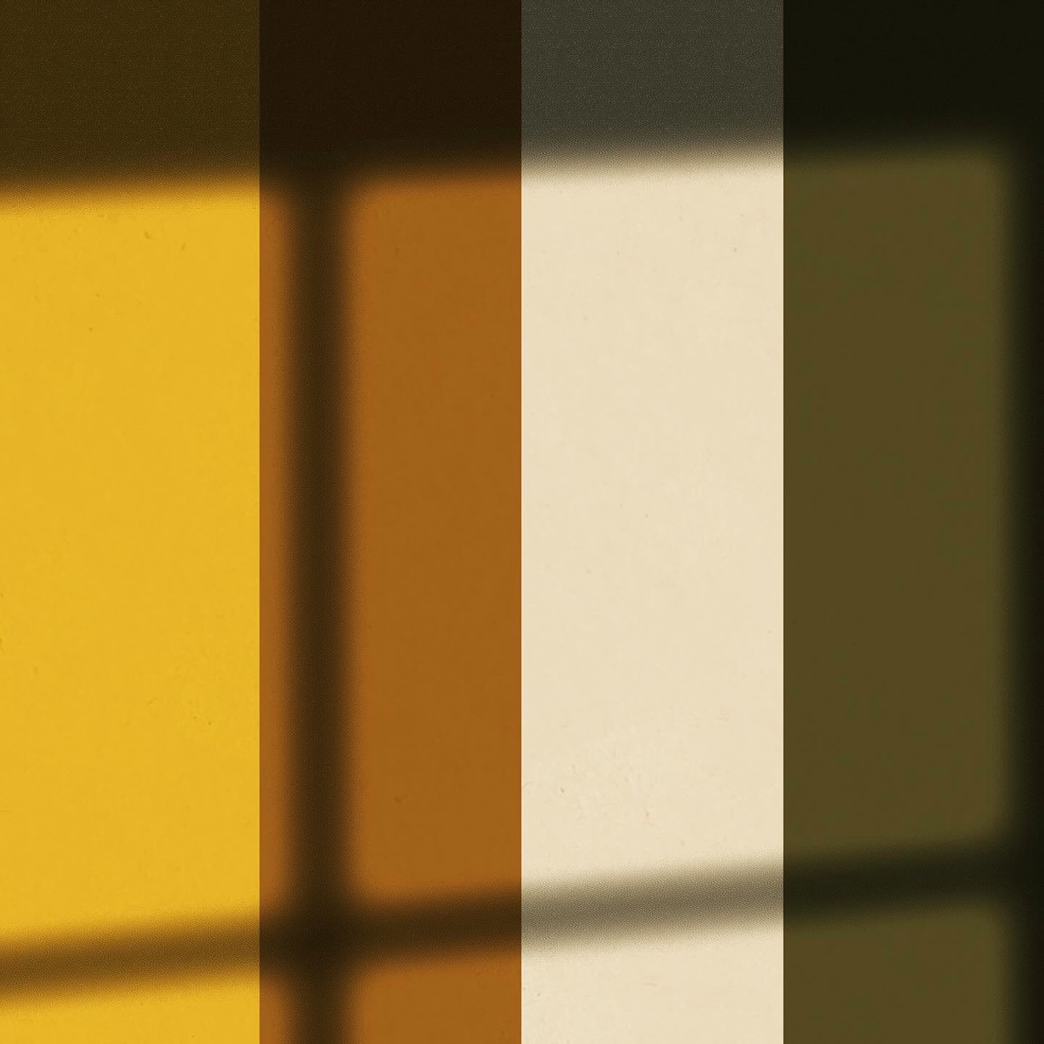
For this rebrand, we anchored the identity in classical beauty and organic sophistication. By combining warm earthy tones, botanical cues, and timeless iconography, we moved away from the "pharmacy product" feel into true high-end personal care.
It was a deliberate shift: positioning the brand not for someone who feels like they are treating a flaw, but for someone investing in a premium daily ritual.
Would a piece like this deserve a spot on your display shelf?



This is brilliant!

Do you prefer the main logo or the mark? Choose your pick.
The full project is coming soon, or check it out here on Instagram if you don't wanna wait.
11 voted
69%
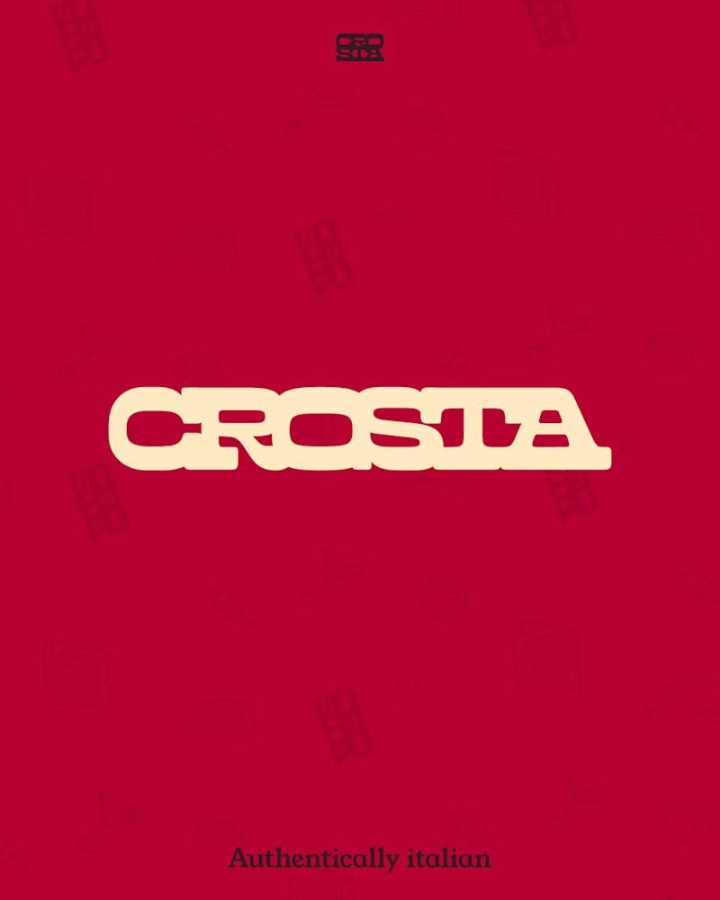
5 voted
31%
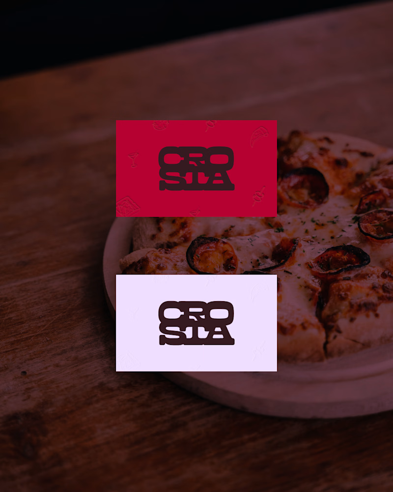
16 votes
Closed

The mark, but for a reason that has nothing to do with which one looks better here: this brand lives on a pizza box, a napkin and a sticker on a takeaway bag, mostly around 20mm and often one ink on brown board. The full logo introduces the place once; the mark is what someone...


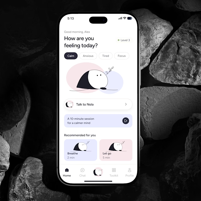
🔥 If you were building an AI Wellness Companion today, would you design a feature or a brand people could actually form a relationship with?
I explored two directions for the same product.
🅰️ Emotional Companion
Built around context, continuity and the feeling that it remembers you.
🅱️ Character Led Companion
A recognizable character that becomes the emotional anchor of the product.
Imagine you’re the founder. Which concept and character would you bet the brand on for the next few years?
Which feels more distinctive, memorable and scalable?
👇 A or B and why?
#AI #WellnessApp #AICompanion #ProductDesign #MobileAppDesign #BrandDesign #UXDesign #HealthTech #AsolDesign


30 voted
39%
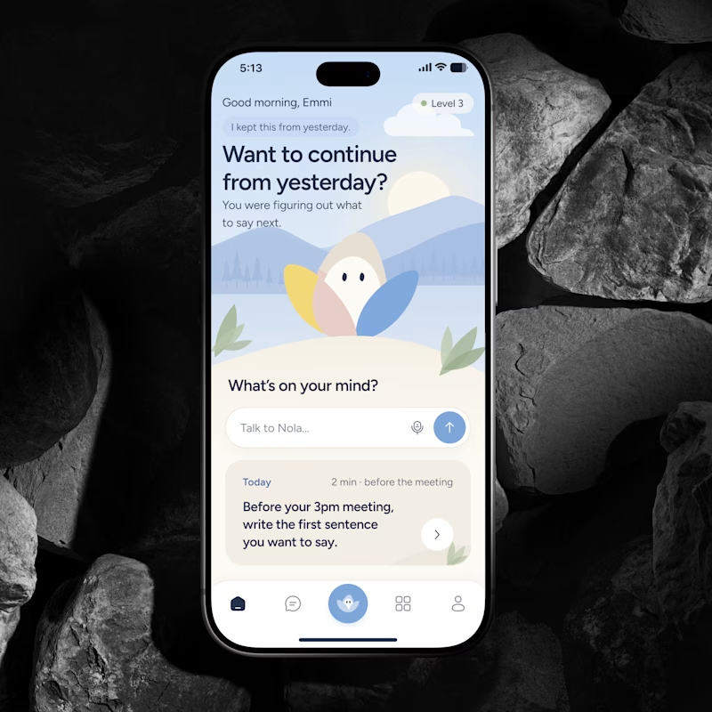
46 voted
61%
76 votes
Closed
Character definitely wins here. I think it's like verion2.0 of the emotional one.