The network for creativity
Join 1.25M professional creatives like you
Connect with clients, get discovered, and run your business 100% commission-free
Creatives on Contra have earned over $150M and we are just getting started
Back to feedPost

Good typography and clear spatial hierarchy are often the difference between a product card that looks good and one that actually converts.
When designing, I always aim for instant readability — if a customer can't grasp the main offer in 2 seconds, the layout needs work.
What's your main priority when structuring e-commerce assets? Typography, color contrast, or grid layout?
The network for creativity
Join 1.25M professional creatives like you
Connect with clients, get discovered, and run your business 100% commission-free
Creatives on Contra have earned over $150M and we are just getting started
Trending
retrofuturism
Share your favorite designs from the past exploring the distant future. Or your own take on the aesthetic 🚀
halftone
Dots. Texture. Grain. Let's see your designs using the halftone technique.

Midjourney
Creatives are showing off what they're making with Midjourney.
colorgrade
Video editors sound off: How do you enhance the mood of your video in color grading?





Related posts


How important is the custom typeface?
Custom fonts are my favourite way to add personality to a brand identity, and I'm really enjoying creating handwriting typefaces at the moment. After sketching on paper and then bringing my forms into Procreate, I then go on to vectorise in Illustrator. For simpler fonts, I use Fontself to set up my fonts.
If you've not made a font before, it's one of the most enjoyable processes (and handwriting is a great place to start as you don't have to think about matching your serifs or perfecting your line weights).
What's your favourite type project at the moment?
I'm noticing more and more messy/scrawly/scratchy fonts in brands and online. Is this another example of how we're becoming more drawn to the handmade?

Such a cute font😍

Option 1 — Bold & Editorial
Two directions. One brand. Which one wins? 👀
I explored two different visual approaches for the same coaching website — each with its own personality, typography, color, and visual energy.
A — Bold, dark & editorial
B — Bright, elegant & modern
If you were the client, which direction would you choose?
Cast your vote and tell me what made you pick it. 👇
#UIDesign #WebDesign #Framer #WebDesignInspiration #DesignPoll #Framer


75 voted
72%
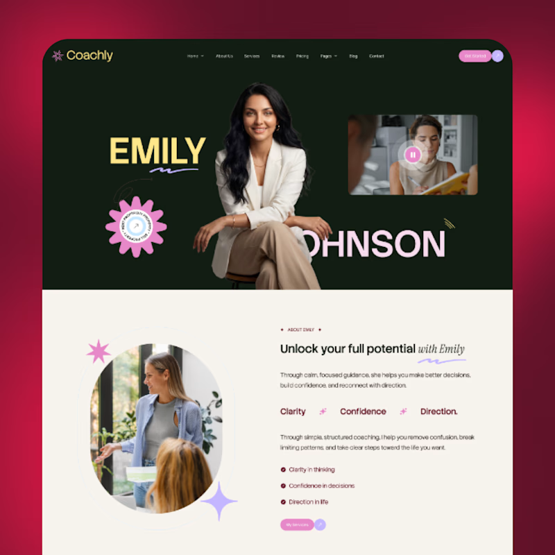
29 voted
28%
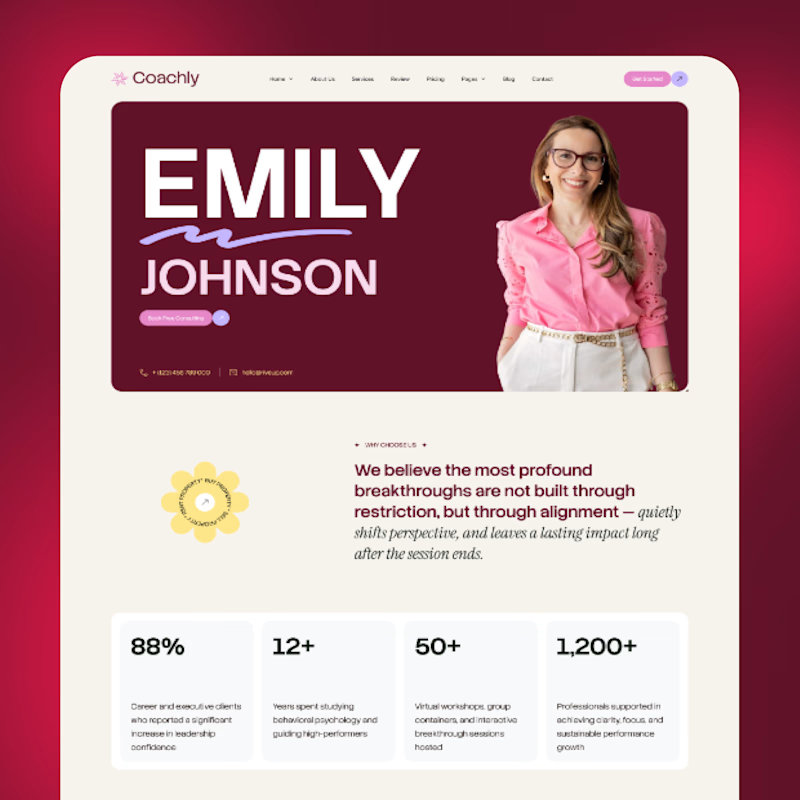
104 votes
Closed

Both directions look strong, but I’m leaning toward A Bold, dark & editorial 👀 It feels more distinctive and has a stronger visual personality. Would love to see where you take it next! 🔥


We built Illuspark to do one thing - make portfolio, hiring, and community work together, not apart. ✨
👉 Check out new case study
We built the loop that keeps all users connected. 🔗
Let us know what do you think about this approach!
platformdesignwebappproductdesignFrontend DevelopmentProduct DesignSoftware DevelopmentFigmaNode.jsReact


Really nice work, looks like the features are so easy to navigate 😍