The network for creativity
Join 1.25M professional creatives like you
Connect with clients, get discovered, and run your business 100% commission-free
Creatives on Contra have earned over $150M and we are just getting started
Back to feedPost
Healthcare tech is where good design goes to die.
I think we're all tired of sterile blue, stock photos of smiling doctors, acronyms stacked on acronyms. The category trains you to expect cold and forgettable.
MTI was a chance to do the opposite.
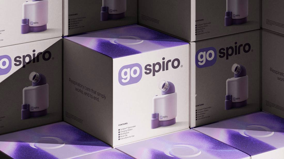
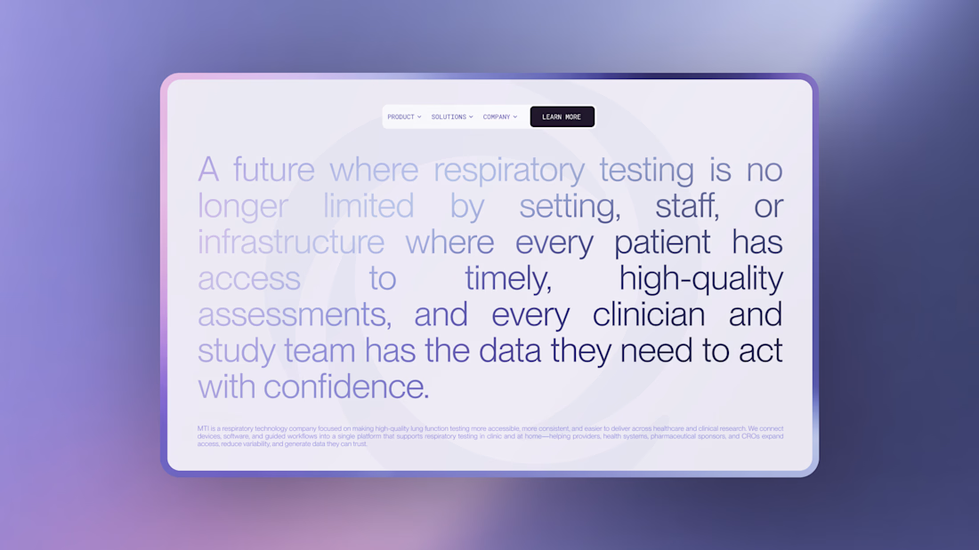
MTI makes lung function testing that works anywhere, in a clinic or at home, without a lab. It's serious, FDA-cleared clinical technology. But the real idea underneath it isn't the device, it's access. A future where a high-quality respiratory test isn't limited by setting, staff, or infrastructure, where anyone, anywhere can get the assessment they need. The brand had to carry that promise, not just look like a medical product.
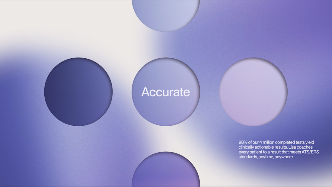
So we built the identity around breath as the universal thing everyone shares. The brand represent the respiratory cycle. A loop that we all forget we're doing, but that without it we won't be able to live. The color moves through soft violet light instead of hospital blue, calm and premium and warm.
The hardest part was the imagery. We wanted to actually show a healthy breath: particles gathering into the shape of lungs, then dispersing on the exhale, alive instead of antiseptic. We generated it with Midjourney, and the real work wasn't making one beautiful frame, it was making dozens that felt like the same world. Consistency is where most AI imagery falls apart. We built a tight visual language for it, the same particle density, the same light, the same violet, the same sense of motion, so every image reads as one lung breathing across the whole system rather than a folder of pretty one-offs. That control is the difference between AI as a gimmick and AI as a real production tool.
Then we made it speak plainly. No jargon fatigue, no acronym soup. Clinical rigor, said like a human, so a serious platform still feels like something built for people, not institutions.
The result is a healthcare brand that feels less like equipment and more like access. Something that makes care feel closer.



Thank you. Loved your motion work!

Love this!

This looks awesome! 🙌

This is pure beauty, great job Leo!! 🚀
The network for creativity
Join 1.25M professional creatives like you
Connect with clients, get discovered, and run your business 100% commission-free
Creatives on Contra have earned over $150M and we are just getting started





Related posts

A concept AI assistant for a medical equipment maker. It answers customer and staff product questions in about 2 seconds, using only the company's own manuals, and shows the exact page each answer came from. Anything tricky goes to a real person along with the full chat. It cuts support time and gives customers answers around the clock. Concept project by Ascalify.


Getting the exact manual page in two seconds cuts the back and forth of searching. When a question trips up the bot, handing the whole chat to a human keeps context intact.

A cinematic product advertising concept created using AI-generated visuals, creative direction and video editing.


The cinematic framing keeps the AI visuals feeling directed rather than assembled.

Lol, did a thing with #CapCut and #Google flow for cleva dollar app.
AI IS NOW THE NEXT BLENDER FOR 3D WORKFLOW 🔥🔥🔥.


Wow this is amazing