The network for creativity
Join 1.25M professional creatives like you
Connect with clients, get discovered, and run your business 100% commission-free
Creatives on Contra have earned over $150M and we are just getting started
Back to feedPost
Taste Test

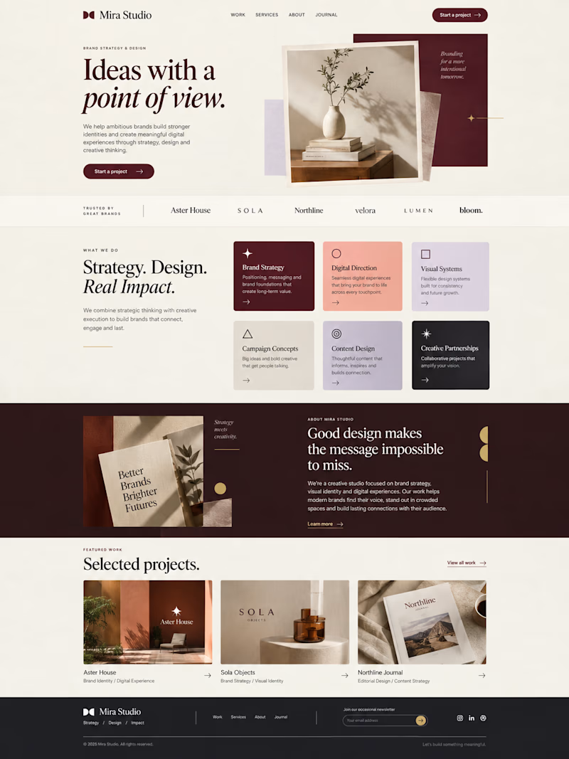
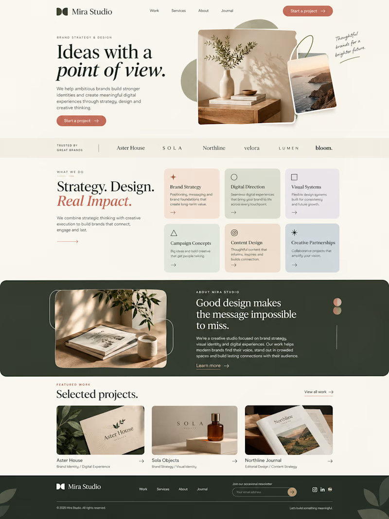
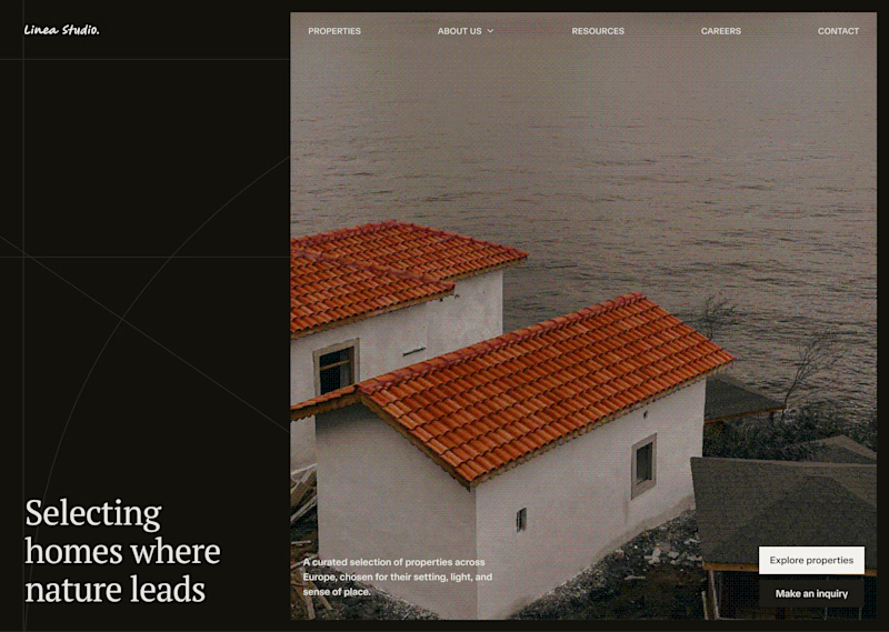
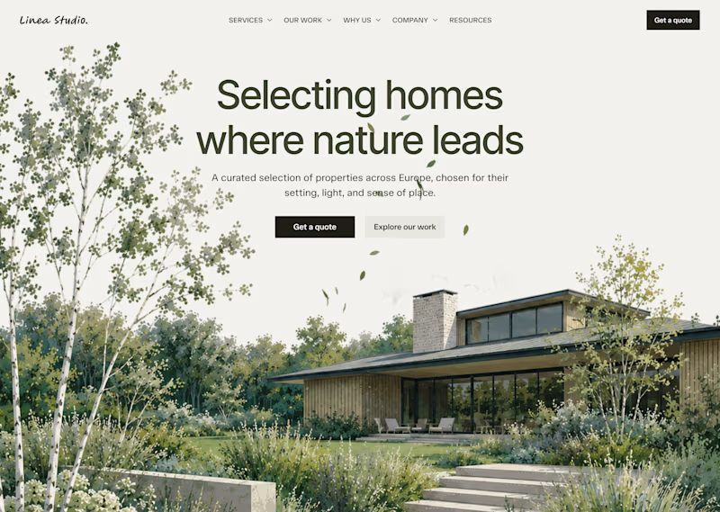
One website, two moods.
Version A: sage + terracotta = warm, natural, approachable
Version B: burgundy + black = bold, refined, high-end
Color alone shifts how "expensive" a brand feels.
Which one would you trust more?


1 vote
Ends in 1d

The sage and terracotta still feels premium because the type stays tight. It just reads warmer than burgundy, so I'd trust version A if the brand wants people to linger.

The network for creativity
Join 1.25M professional creatives like you
Connect with clients, get discovered, and run your business 100% commission-free
Creatives on Contra have earned over $150M and we are just getting started

Challenges
View all


Related posts

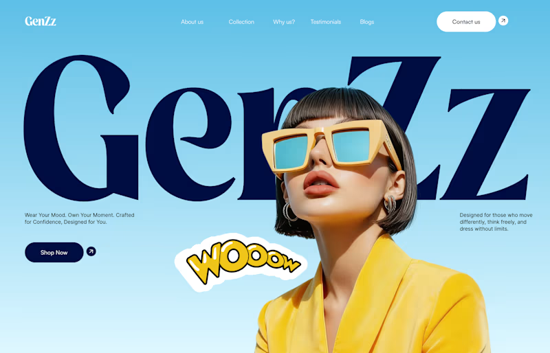
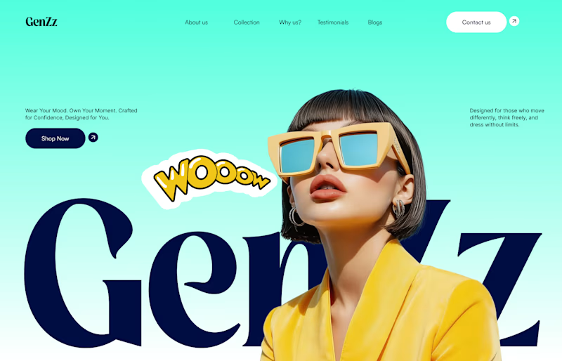
Working on a hero section for GenZz, a bold Gen Z eyewear and fashion brand. Testing two color directions for the landing page and honestly torn between them.
Version 2 has a mint to teal gradient background. Version 1 shifts it to a sky blue gradient. Same layout, same typography, same energy, just a different mood in the backdrop.
Which one pulls you in more and why. Curious if the mint feels more playful and on brand for Gen Z, or if the blue reads cleaner and more premium.
Would love your honest take before I lock this in with the client.

10 voted
59%
7 voted
41%
17 votes
Closed


cool, dmytro stands out. how long did this take?

On my profile, you can see which version I chose out of these two, but I'm curious which one would you choose?
19 voted
26%
53 voted
74%
72 votes
Closed

Light hero


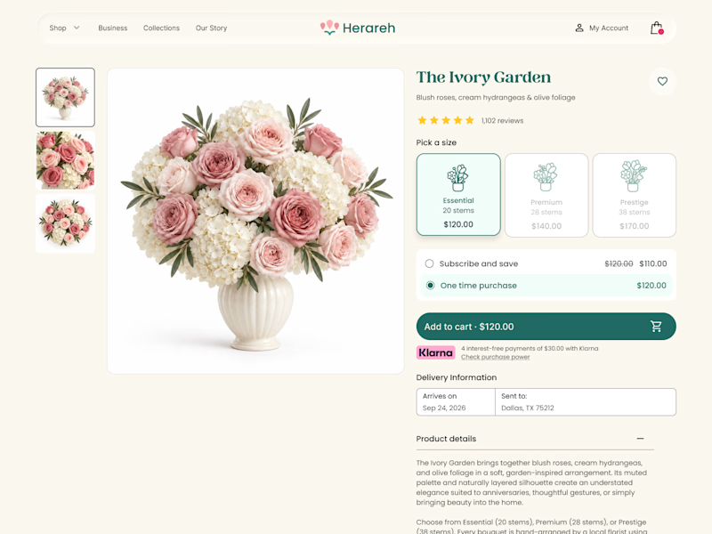
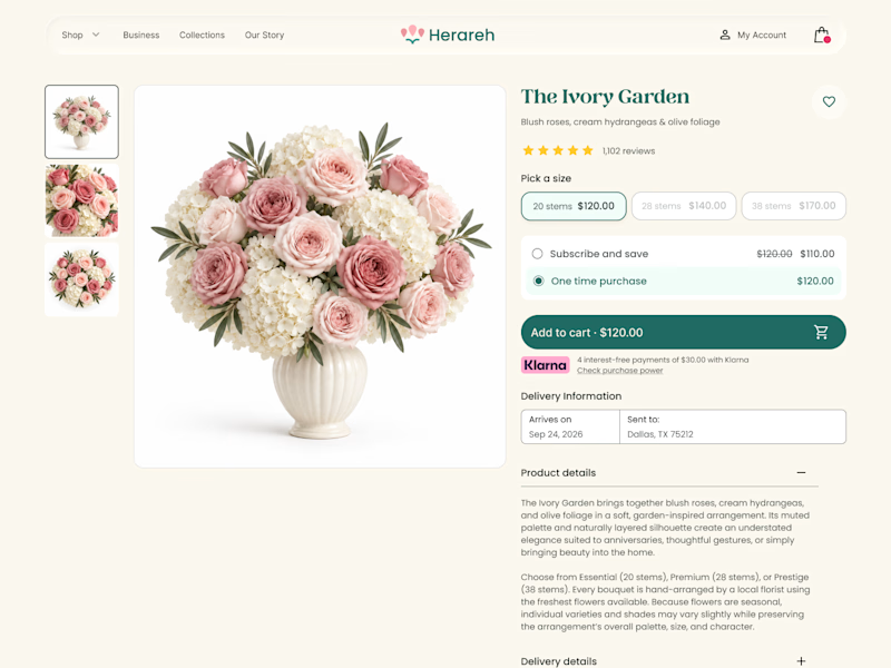

Icon cards for me, bouquets are such a visual purchase that a scannable icon beats reading "small/medium/large" every time. Did the compact chips version convert worse in testing, or are you still gathering data on that?