The network for creativity
Join 1.25M professional creatives like you
Connect with clients, get discovered, and run your business 100% commission-free
Creatives on Contra have earned over $150M and we are just getting started
Back to feedPost
How's the first look of Rejoin hero section looking? Your opinion




Nice Design!!

Thank you @Gopi UI/UX + AI

Looks clean!
Thank you @Zafar Kamal

The Design is really clean💯
The network for creativity
Join 1.25M professional creatives like you
Connect with clients, get discovered, and run your business 100% commission-free
Creatives on Contra have earned over $150M and we are just getting started

Challenges
View all


Related posts


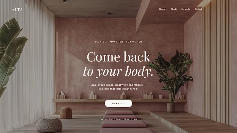
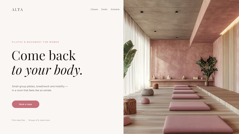
Where should the photo live - behind the words or beside them?
Same pilates studio, same headline.
01 - Photo as the background. Full-bleed atmosphere: the room wraps around the words. Immersive and cinematic, but the text only survives thanks to a darkening overlay laid over the image.
02 - Photo beside the text. A clean split: words on calm ground, the room in its own column. Everything readable at a glance, the trade is a little less drama.
One sells the feeling. The other sells the clarity. Which hero would make you book the class?

80 voted
75%
27 voted
25%
107 votes
Closed

1 nails it


New cover, new visual taste test.
As a visual director, the hardest choice is choosing between your own creations.
Two covers. Two directions. One choice.
Which one gets your vote?


34 voted
79%
9 voted
21%
43 votes
Closed


the blue background makes the orange shapes pop