The network for creativity
Join 1.25M professional creatives like you
Connect with clients, get discovered, and run your business 100% commission-free
Creatives on Contra have earned over $150M and we are just getting started
Back to feedPost

Client spotlight: Silverline Creation, Goa
Our first showcase as we shift focus to the work behind the brand.
Silverline Creation came to us at an early stage—with a strong name, a personal story, and a vision rooted in construction. What they needed was a brand identity that truly reflected where they were headed.
The original logo held emotional value, built around the founders’ initials. But as the brand grew, it no longer aligned with the industry, scale, or positioning they were stepping into.
So we rethought the identity from the ground up.
The new mark draws directly from construction fundamentals—floor plans, stair structures, door curves—woven together with the initials S & C, creating a logo that feels intentional, architectural, and unmistakably relevant.
Paired with a refined colour palette and a cohesive visual system, the identity translated seamlessly across digital and on-ground collaterals—and most importantly, felt right to the client.
View the complete project on our Behance profile: https://www.behance.net/gallery/243586791/Silverline-Creation-Branding-Visual-Identity
Silverline Creation × Eviation
Designed to last.


The network for creativity
Join 1.25M professional creatives like you
Connect with clients, get discovered, and run your business 100% commission-free
Creatives on Contra have earned over $150M and we are just getting started
Related posts

Proper Form — Social Media Branding System
A flexible social media system created for Proper Form as part of the wider brand identity.
The template system was designed to adapt across different post formats, banners and platforms while maintaining a consistent visual language.
Rather than repeating one rigid layout, the system gives the brand room to vary composition, imagery and content while remaining clearly recognizable.
Created by Lepisov Branding in collaboration with Creative Mints.
Logo design: Ilya Gorchanyuk
Creative direction: Dmitry Lepisov
Brand identity + social system: Lepisov Branding × Creative Mints


This is how a social system should work: strong enough rules that the brand reads at thumbnail size, loose enough that the feed never looks copy-pasted. Do you hand clients a Figma kit for this, or build it in something their team edits themselves?

Nothing rots in salt.
So I put a skincare brand in a salt flat and let it crystallize. Name, mark, palette, campaign, packaging. One idea, zero moodboards.
HALITE. Case study live soon.
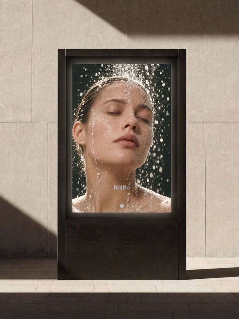
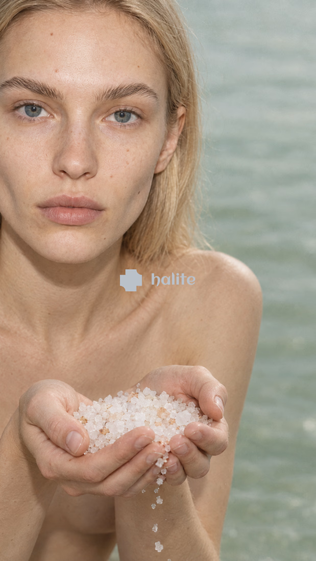
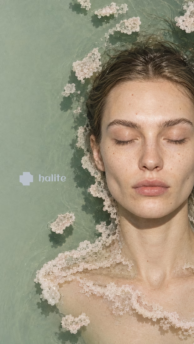
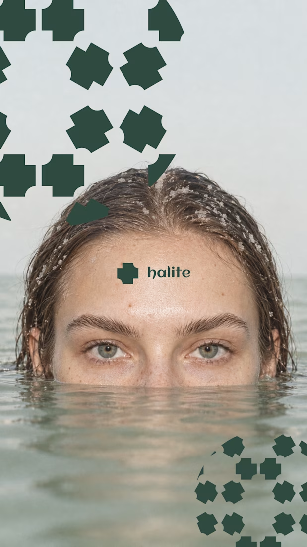
Salt as the core idea is clever. It says preservation, purity and texture in one move, which is exactly what skincare is trying to say. Curious how the crystal motif holds up at small sizes, like a cap or a sachet. Looking forward to the full case.


The Bright Method newsletter just passed 1,000 subscribers on LinkedIn. Didn't expect that when I started it. Thanks to everyone reading.
Read this weeks issue on Linkedin: https://www.linkedin.com/pulse/your-site-said-3-6-7-8-daniel-bright-pvucc

linkedin.com
Your site said 3, 6, 7 and 8
In June, a founder I work with opened his visitor analytics on our call. Qualified enterprise buyers were landing on the site, reading, and leaving.