The network for creativity
Join 1.25M professional creatives like you
Connect with clients, get discovered, and run your business 100% commission-free
Creatives on Contra have earned over $150M and we are just getting started
Back to feedPost

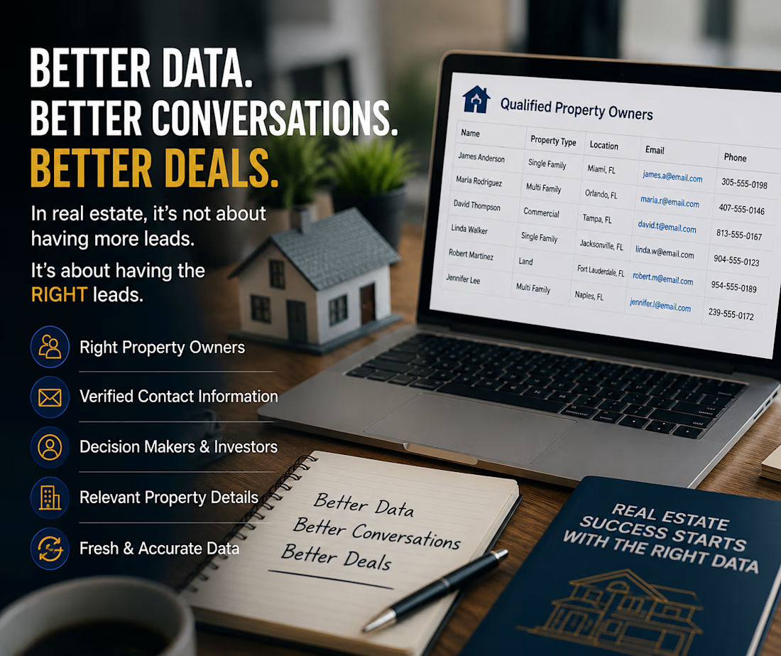
🏠 Your CRM may be full. But are you reaching the RIGHT property owners?
I’ve noticed something in real estate prospecting:
Many agents and teams spend hours collecting leads, but the real challenge isn't finding more contacts.
It’s finding the right contacts.
A good prospect list should help you identify:
✅ Property owners who actually fit your target market
✅ Accurate contact information
✅ Verified email addresses
✅ Investors and decision-makers
✅ Relevant property and business details
✅ Fresh data—not outdated records
Because 1,000 random contacts aren't necessarily better than 100 highly relevant prospects.
Better data → Better conversations → Better opportunities.
If you're a real estate professional, what is your biggest challenge right now?
Finding property owners, getting accurate contact information, or turning prospects into conversations?
I'd love to hear what you're experiencing. 👇

The network for creativity
Join 1.25M professional creatives like you
Connect with clients, get discovered, and run your business 100% commission-free
Creatives on Contra have earned over $150M and we are just getting started

Challenges
View all


Related posts


amazing


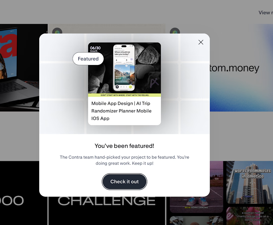
🚀 FEATURED AGAIN.
THE INTERESTING PART IS WHAT HAPPENED BEFORE THE UI.
Traveling Up was the first mobile concept I created purely for myself in almost three years.
No client brief.
No existing product.
No predefined feature list.Just one observation from a short trip:
🌍 Most travel products start by asking where you want to go.
I wanted to start one step earlier.
How do you want to feel?
That single shift changed the whole product logic.
✨ Destination search became mood led discovery.
⏳ Time became part of the recommendation.
🎲 Uncertainty became part of the experience instead of something the product had to remove.
That became Traveling Up.
And now Contra has hand picked the project for Featured and placed it in the AI Projects section on the homepage.
The most interesting part for me is not the feature itself.
It is how often the strongest product directions begin before the interface.
In the framing.
In the question.
In understanding what the user is actually trying to experience.
That is the kind of work we keep pushing at Asol Design.
Not just better screens. Better product decisions before the screens exist.
If you are building a mobile product and want more than polished UI, if you want stronger product thinking, sharper UX direction and a visual system built around a clear idea, let’s talk.
#MobileAppDesign #ProductDesign #UXDesign #UIDesign #MobileUX #TravelApp #TravelAppDesign #iOSDesign #ProductStrategy #GrowthDesign #AppDesign #UXUI #DesignAgency #DigitalProductDesign #AsolDesign #Contra #StartupDesign #ProductThinking #MobileProduct #CreativeDirection

Keeping uncertainty in the product instead of designing it out is the risky half of that shift. Curious what the screen shows when the mood input is thin.

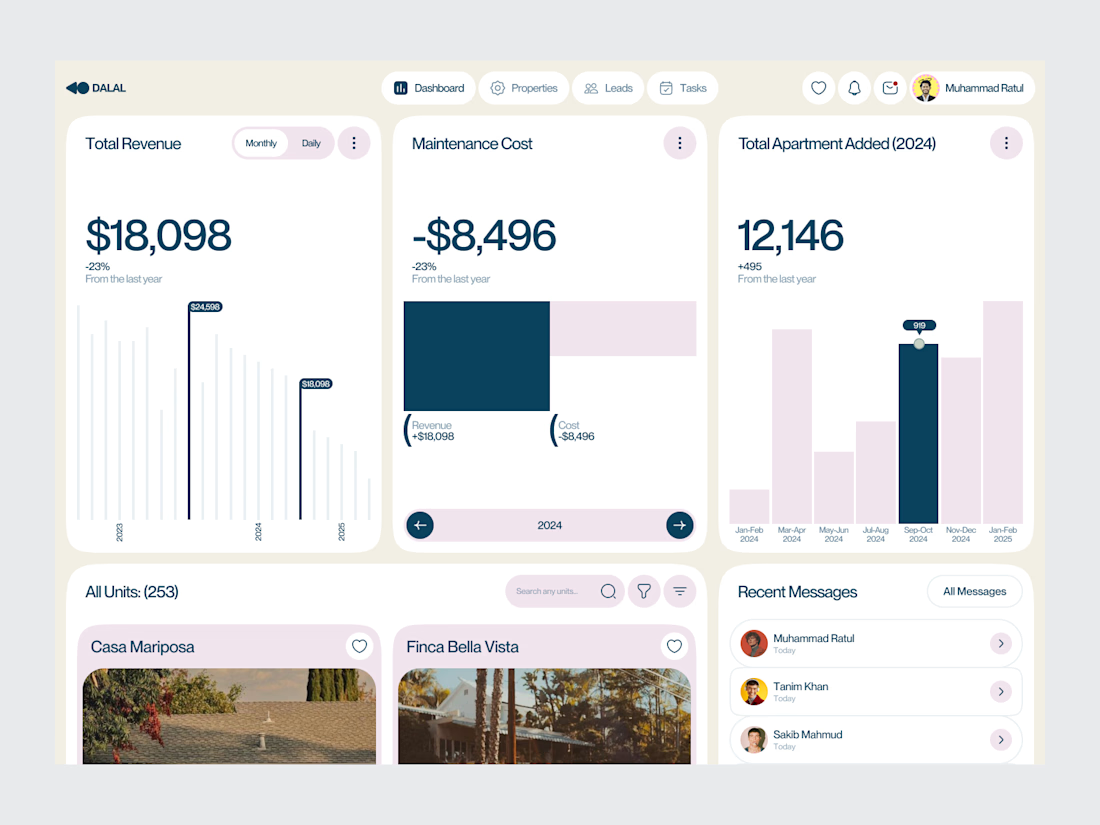
Real Estate SaaS Dashboard
Real estate software often sits on top of a large amount of operational data.
Properties, leads, deals, revenue, tasks and performance all need to be visible without turning the product into an information wall.
For this dashboard concept, the design process started with hierarchy.
The most important metrics get immediate visibility. Supporting information is organized into focused sections, while actions remain close to the data they relate to.
The result is a SaaS interface designed around clarity, decision-making and everyday workflow.
Focus: Real Estate SaaS · PropTech UI/UX · Dashboard Design · Data Visualization · Property Management Software
The goal wasn't to make the product look complex.
It was to make a complex business easier to operate.
Designed by WaxyWeb.
Working on a SaaS or PropTech product?
hello.waxyweb@gmail.com
www.waxyweb.com


great one