The network for creativity
Join 1.25M professional creatives like you
Connect with clients, get discovered, and run your business 100% commission-free
Creatives on Contra have earned over $150M and we are just getting started
Back to feedPost

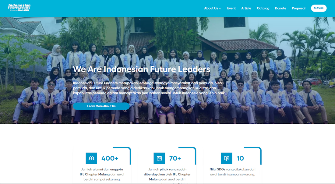
I led the frontend development for a volunteer registration system, focusing on user-centric flows and chatbot-assisted interactions. I also optimized existing features to improve the overall system performance and user experience.


The network for creativity
Join 1.25M professional creatives like you
Connect with clients, get discovered, and run your business 100% commission-free
Creatives on Contra have earned over $150M and we are just getting started

Challenges
View all


Related posts


Which 404 page design for a world-class film production studio would you choose - Pink or Black? ✨👠
404pagecreativedesignfashionwebsiteCreative Design Frontend DevelopmentWeb DesignFigmaJavaScriptWebflow


31 voted
40%
46 voted
60%
77 votes
Closed

Black version looks more editorial, tho the pink one is rly eye-catching

Which AKARI Design Looks Better? 🍣
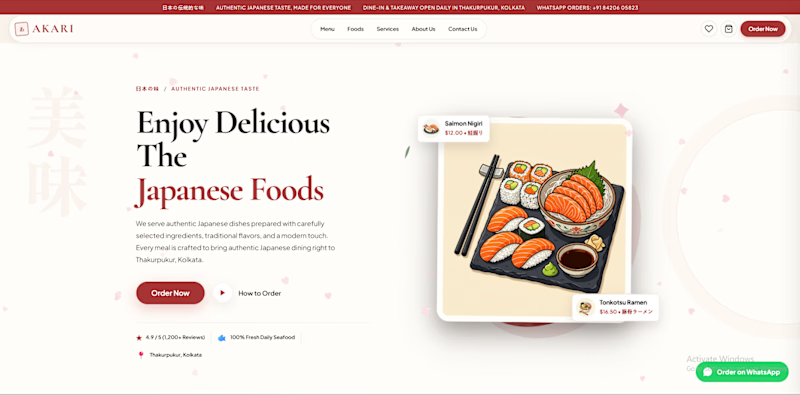
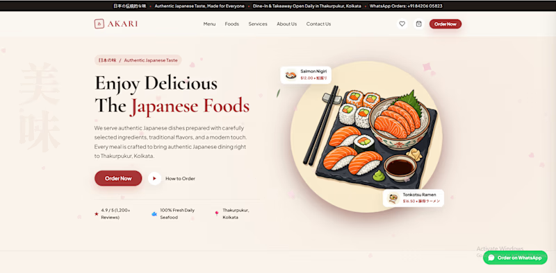
I’ve been working on AKARI (あかり) — a Japanese food restaurant website that I’m building both as a real-shop-ready concept and as a showcase of my web design & development work.
I’ve made two different versions of the design, and I want the Contra community to decide which direction looks better.
🅰️ Option A
Design 1 — More bold, structured and brand-focused.
🅱️ Option B
Design 2 — More minimal, clean and modern.
🅲️ Option C
Neither? 😅
Tell me what you would change, add, or completely redesign. I’m open to ideas!
👇 Vote A, B, or C in the comments.
Which one would you choose for a Japanese restaurant?
🍣 AKARI — あかり
Authentic Japanese Taste, Made for Everyone.


6 voted
46%
7 voted
54%
13 votes
Closed

I’d lean toward Design A—the bolder structure gives the restaurant a clearer point of view, while the centered dish still keeps the page inviting. The restrained palette and generous whitespace make the food do the talking.

Title: UtilForge — Client-Side Developer Tool Matrix
Summary: A suite of 20+ developer utilities that run entirely in
the browser. No uploads, no server, no data leaving your machine.
What I did: Built the full stack — Next.js frontend, Web Workers
for heavy processing (formatting tens of thousands of lines of JSON,
PDF manipulation, hashing) so the UI never blocks. Every tool works
offline after first load.
Tags: Next.js · React · TypeScript · Web Workers
Link: utilforge.dev


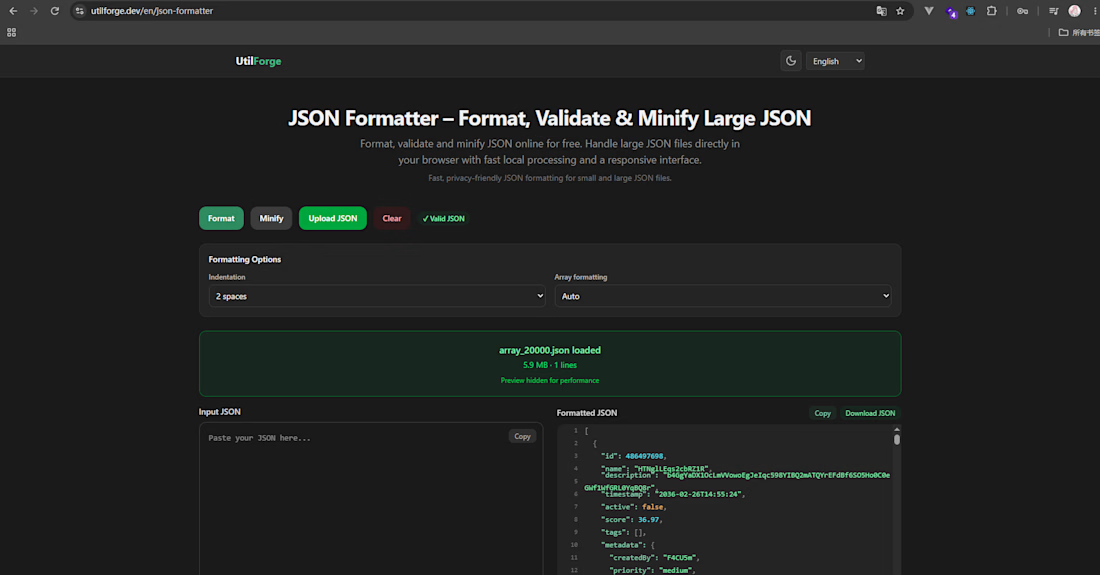

The no-upload promise is the strongest part. I'd make the offline state visible in the UI, so someone working with sensitive JSON or PDFs can see that the file stays on their machine before they drop it in.