The network for creativity
Join 1.25M professional creatives like you
Connect with clients, get discovered, and run your business 100% commission-free
Creatives on Contra have earned over $150M and we are just getting started
Back to feedPost
Taste Test
Which AKARI Design Looks Better? 🍣
I’ve been working on AKARI (あかり) — a Japanese food restaurant website that I’m building both as a real-shop-ready concept and as a showcase of my web design & development work.
I’ve made two different versions of the design, and I want the Contra community to decide which direction looks better.
🅰️ Option A
Design 1 — More bold, structured and brand-focused.
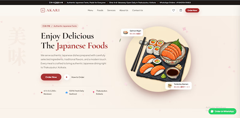
🅱️ Option B
Design 2 — More minimal, clean and modern.
🅲️ Option C
Neither? 😅
Tell me what you would change, add, or completely redesign. I’m open to ideas!
👇 Vote A, B, or C in the comments.
Which one would you choose for a Japanese restaurant?
🍣 AKARI — あかり
Authentic Japanese Taste, Made for Everyone.


6 voted
46%
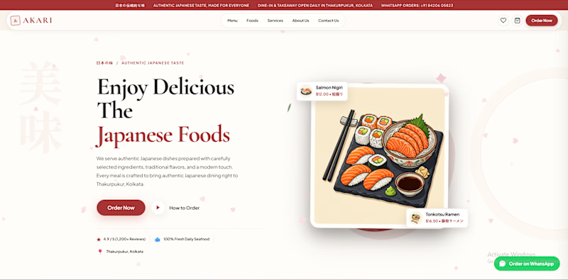
7 voted
54%
13 votes
Closed

I’d lean toward Design A—the bolder structure gives the restaurant a clearer point of view, while the centered dish still keeps the page inviting. The restrained palette and generous whitespace make the food do the talking.

Thank you so much for the thoughtful feedback! 🙏 It genuinely means a lot, and I really appreciate you taking the time to share your perspective. ❤️

for me Design A is good.😊


Voting B. The cream background lets the red accent work as a highlight instead of competing with the food photo for attention, feels closer to how an izakaya menu actually reads.
The network for creativity
Join 1.25M professional creatives like you
Connect with clients, get discovered, and run your business 100% commission-free
Creatives on Contra have earned over $150M and we are just getting started





Related posts

firendev: brand identity and website.
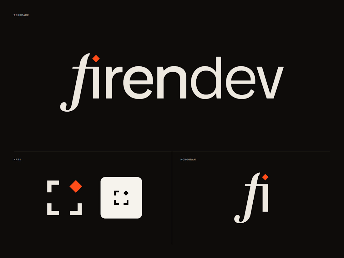
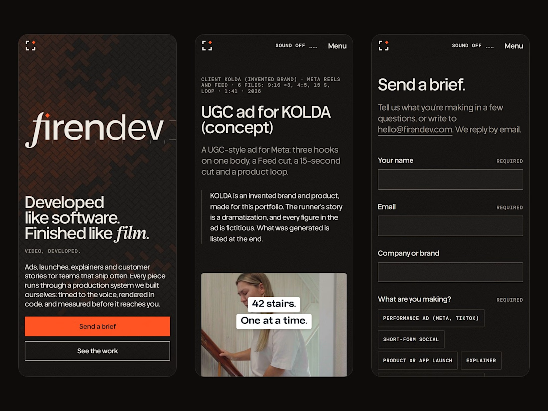
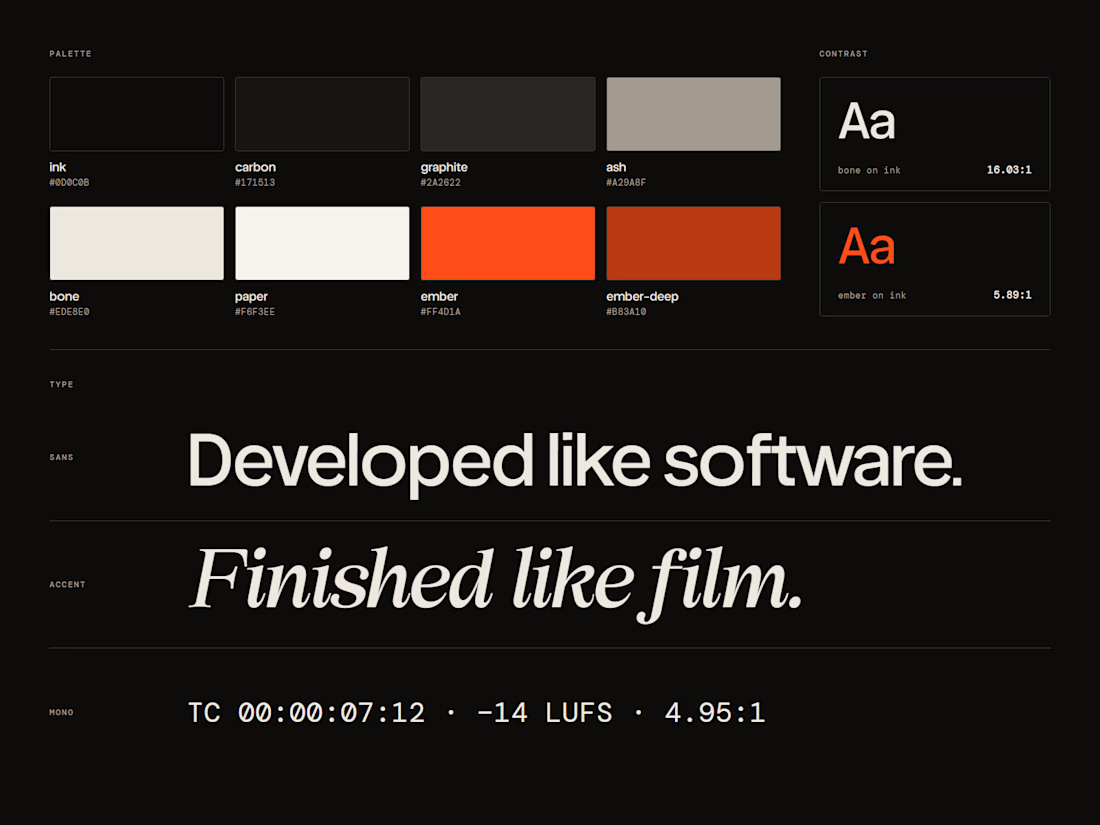
firendev is a video studio, and the name carries the whole brand. Fire, for the spark that starts every piece. Firenze, for a craft measured with proportion and geometry. Develop, in its two senses: developing film and developing software. One line holds it together: developed like software, finished like film.
Everything else grows from that. The spark is the dot of the i. The floor is the herringbone brick of Florence's Duomo. The mark is a camera frame waiting for its spark.
I'd love your honest take on the mark and the hero.
Full case study: https://contra.com/p/bWEMrvZW-firendev-brand-identity-and-website



It's a great design 🔥
I liked the animation in Hero; I'm curious which library you used.

IPO Coins landing page web design 3D animation website icons


Great Design, R

From tattoo enquiry to confirmed appointment.
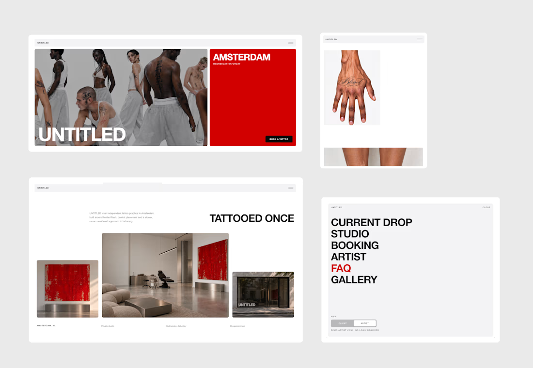
UNTITLED is a fictional independent tattoo studio in Amsterdam, built around a very real problem: tattoo bookings often live in DMs.
Clients ask about prices, availability, placement, references and custom ideas, while artists spend time managing the same back-and-forth manually.
UNTITLED brings that entire process into one connected experience.
The product has two sides:
CLIENT VIEW
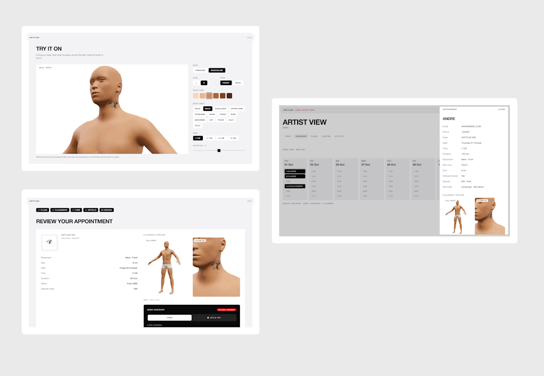
Clients can browse available flash, place tattoos on a 3D body model, choose a date and time, complete a demo checkout, or submit a custom tattoo request with references, placement, size, budget and preferred availability.
ARTIST VIEW
The artist dashboard brings together bookings, payments, calendar availability, flash management, custom enquiries, quotes and activity in one place.
Both views are connected, creating a fully working end-to-end demo.
A flash booking updates the artist calendar and design availability, while a custom request appears in the dashboard for the artist to review, quote and turn into a confirmed appointment.
3D PLACEMENT
The booking flow includes an interactive 3D tattoo placement system, allowing clients to choose body type, skin tone and body area, then position, scale and rotate the selected tattoo before booking.
This replaces part of the placement conversation that would normally happen through messages.
CUSTOM REQUESTS
Not every tattoo starts from an existing design.
Clients can switch from FLASH to CUSTOM and send a structured enquiry with reference images and project details.
The artist can then review the request, create a quote and propose an appointment directly from the dashboard.
Custom request → quote → approval → booking.
FULLY RESPONSIVE
The complete experience is responsive across desktop, tablet and mobile, including the website, booking flow, 3D placement interface and artist dashboard.
DEMO
UNTITLED is a functional demo built for the Lovable Challenge.
Payments are simulated and the data is session-based so the full experience can be tested repeatedly, but the core product logic is fully interactive across both Client and Artist views.
BUILT WITH LOVABLE
I built UNTITLED entirely in Lovable, from the client-facing website to the booking logic, 3D placement experience and artist dashboard.
I also applied to the Lovable Partner Program during the challenge and I’m now officially a Lovable Partner!
Live website: https://untitledamsterdam.lovable.app/
X Post
Walkthrough video (for product and process) below.


Looks amazing, pretty clean, but a product menu in a tattoo studio feels kind of odd. But it looks nice..