The network for creativity
Join 1.25M professional creatives like you
Connect with clients, get discovered, and run your business 100% commission-free
Creatives on Contra have earned over $150M and we are just getting started
Back to feedPost
I spent about 24 hours from yesterday to today developing the branding for Trellis, a fictional AI gateway for B2B SaaS teams.
I started by sketching out the logo shapes I had in my head and honestly, the first few were pretty bad. But after a while I had a rough idea that actually felt worth pushing, so I moved into Figma. Hallelujah.
From there, I started testing the colours I had in mind, playing with the proportions, and checking how the logo worked at different scales. That was probably the point where I started thinking, okay... this might actually work.
Once the base felt right, I started properly detailing and texturing everything. I went through a lot of iterations, and at one point I had to go back to the brief because I felt like something was still missing. Funny enough, that gave me the last bit of direction I needed.
I finished by trying the identity across a few designs and mockups until I was finally convinced by the direction.
Really enjoyed working through this one. Website is next, and I honestly can’t wait to see how the brand starts stretching into a full experience.


The jump from rough logo sketches to that tight blue/black system is great—Trellis feels cohesive without losing energy. The repeated glow treatment ties the launch visuals together nicely.

Thank you Rohan!

Going back to the brief often unlocks that last missing piece.
I agree!
The network for creativity
Join 1.25M professional creatives like you
Connect with clients, get discovered, and run your business 100% commission-free
Creatives on Contra have earned over $150M and we are just getting started





Related posts

Brand identity work for WesoftAI



Still waiting to hear back from @Contra HQ
So I did what any designer would do: I made the card myself 😂
Brushed metal. Laser-engraved logo. Holographic Mastercard rings. Full 360° spin. I'm going to keep polishing this until the real one shows up in my mailbox. Your move, Contra 👀
(Concept / fan design, not an official Contra product..Yet 🙌 )


“Okay, this looks WAY too good 🔥 Contra needs to make this real 👀”

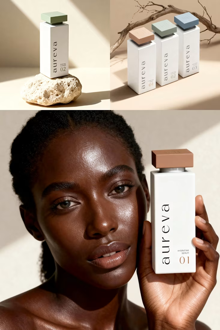
A closer look at Aureva, a Paris-based skincare brand I worked on.
The brief was to create a brand identity and packaging that felt premium yet approachable. I paired distinctive typography with soft earth tones, using color to give each product its own place within the range.
The full case study is now on my profile.

Premium branding