The network for creativity
Join 1.25M professional creatives like you
Connect with clients, get discovered, and run your business 100% commission-free
Creatives on Contra have earned over $150M and we are just getting started
Back to feedPost

First shapes > The final mark
A quick look at how the Bewy logo came together. The idea was to create a simple symbol that feels architectural, structured, and forward-looking, while still being distinctive and easy to recognize.


The network for creativity
Join 1.25M professional creatives like you
Connect with clients, get discovered, and run your business 100% commission-free
Creatives on Contra have earned over $150M and we are just getting started





Related posts

How minimal can a fintech website get before it starts losing personality?
Version 01 of a recent Verlo Finance exploration.
Focused on strong type, clarity and keeping everything else out of the way.
Would you keep it this minimal?


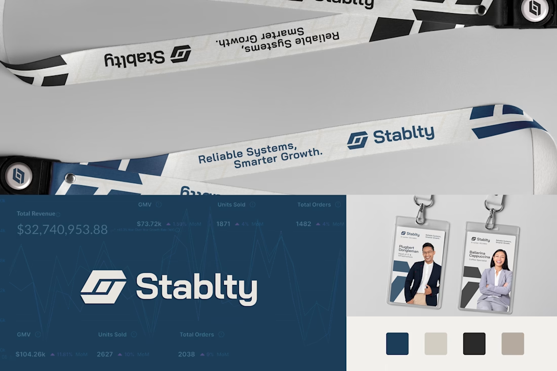
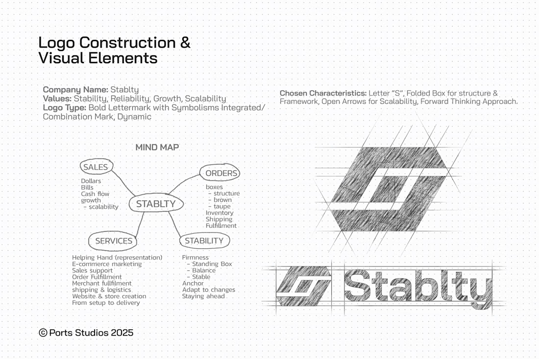
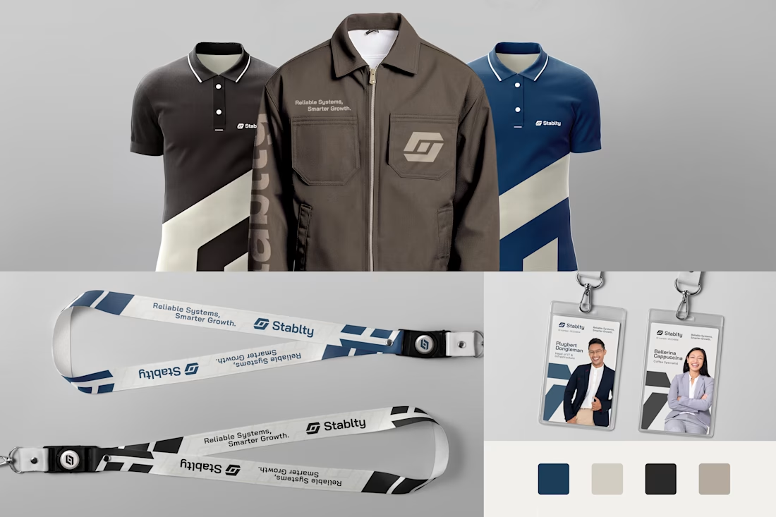
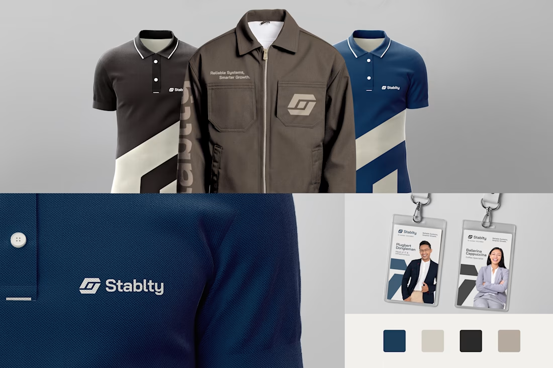
Stablty LLC- Complete Logo and Branding


Typography post design for bar SOKA.
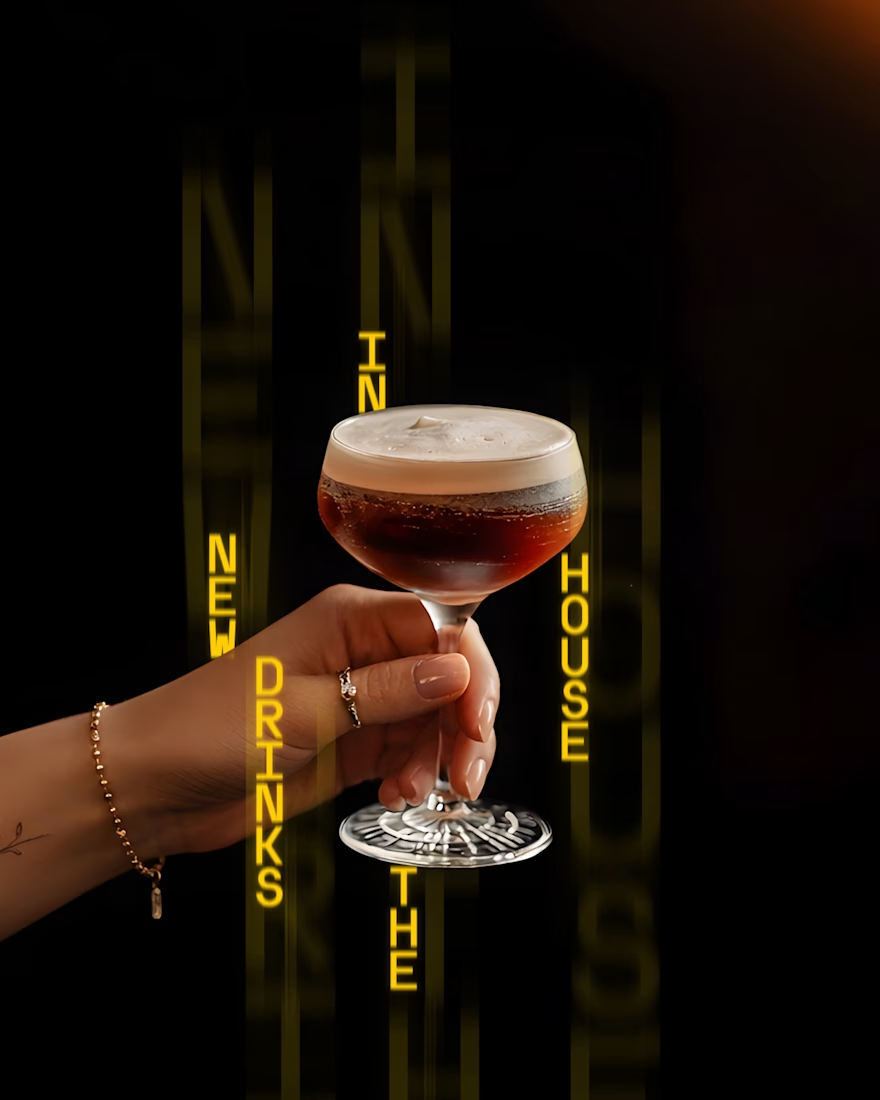




Strong Visual.