The network for creativity
Join 1.25M professional creatives like you
Connect with clients, get discovered, and run your business 100% commission-free
Creatives on Contra have earned over $150M and we are just getting started
Back to feedPost
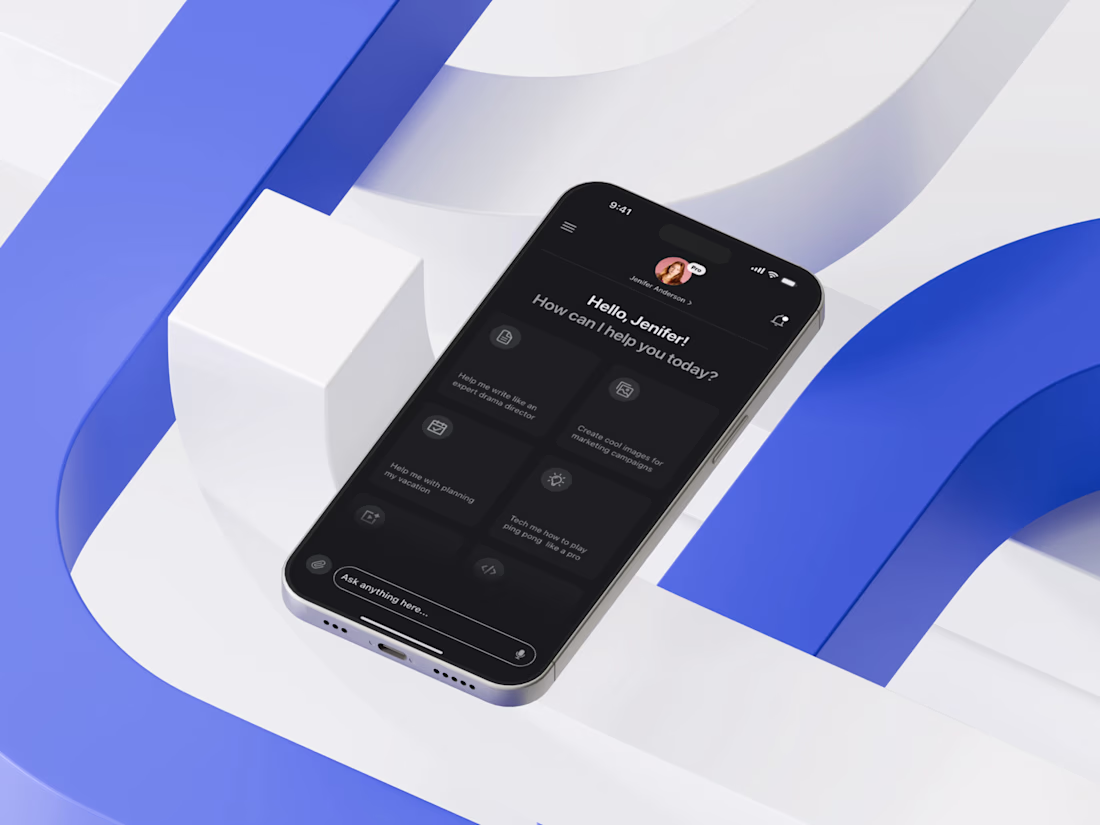
Today I’m excited to share the home screen of an AI Tool Mobile App I recently designed — a space where clarity meets intelligent user flow. My core focus was to simplify decision-making by placing the most frequently used actions upfront, reducing cognitive load and ensuring the user never feels overwhelmed by the depth of AI capabilities.
I approached the layout by first mapping real user intentions: quick prompts, saved actions, and high-impact shortcuts. Then I crafted a modular card structure that adapts visually without breaking hierarchy. The dark theme wasn’t just aesthetic — it enhances visual comfort, especially since AI interactions often involve prolonged reading. I prioritized accessibility through high contrast, consistent spacing, and thumb-friendly tap zones to support seamless single-hand use.
The network for creativity
Join 1.25M professional creatives like you
Connect with clients, get discovered, and run your business 100% commission-free
Creatives on Contra have earned over $150M and we are just getting started
Related posts
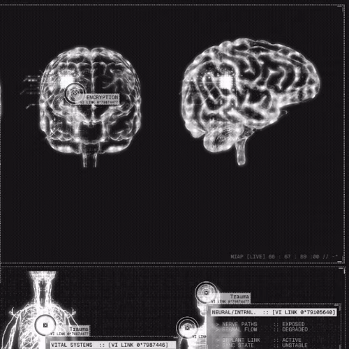
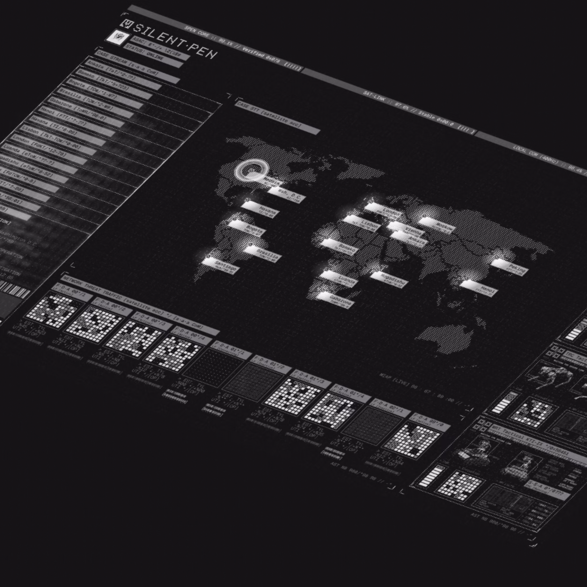
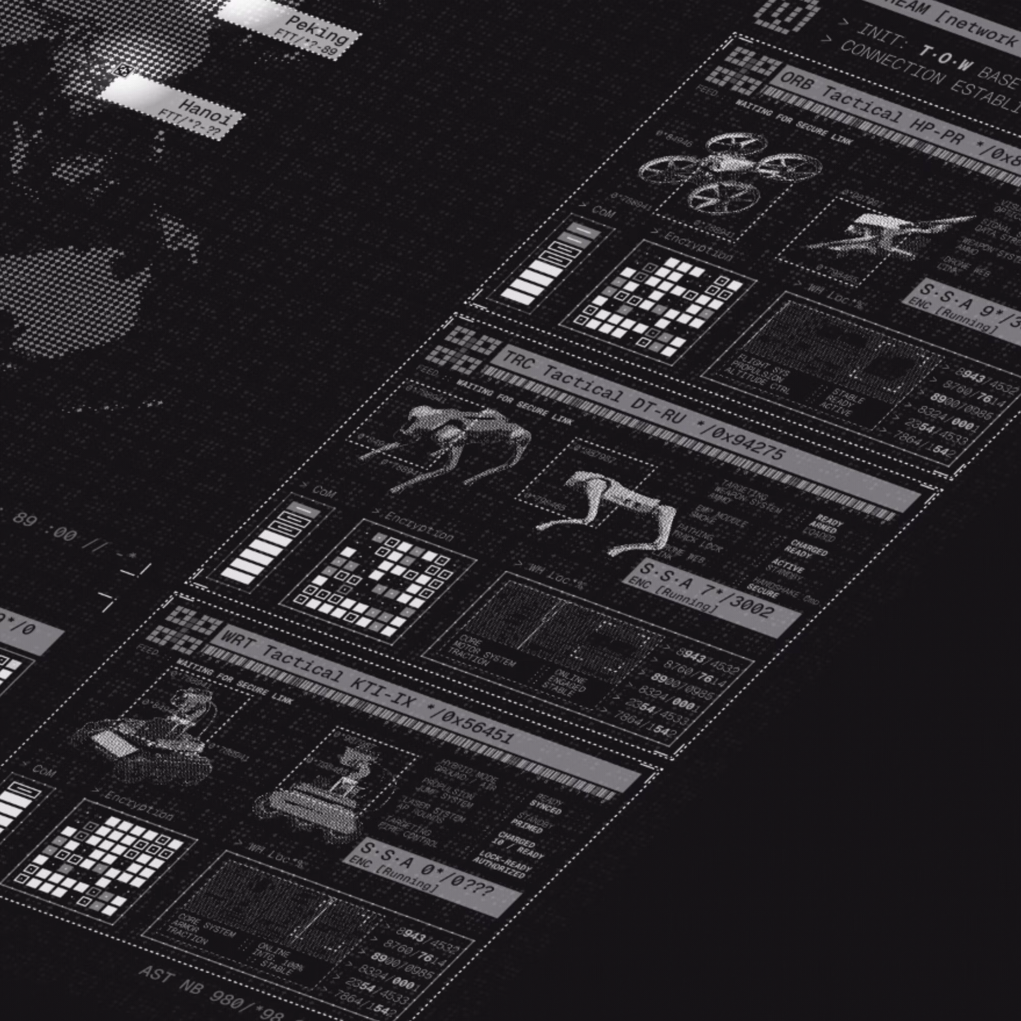
Hey all, Emrah here.
I’m sharing an early sneak peek of my latest concept: S·PEN — a clandestine intelligence system designed for running operations, monitoring assets, and extracting neural/body implant data in real time.
This is just the beginning.
Right now, I’m exploring heavy motion, experimental UI, and some intentionally “impossible” interactions, the kind that look amazing and might make frontend devs question their life choices a bit!
The goal isn’t just to design screens, but to create a system that feels alive, reactive, and slightly out of control.
I’ll be updating the full project on Behance with more visuals and detailed animations leading up to the final submission.
— Emrah

Great animations!
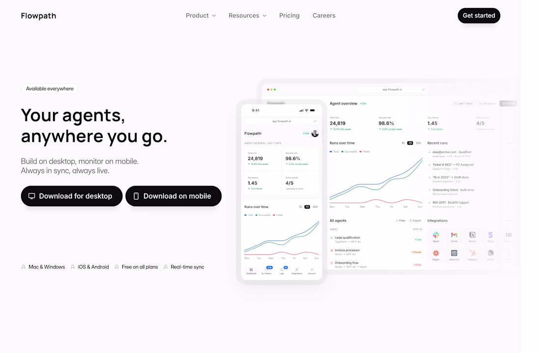
Sneak peek 👀 working on Flowpath: a new Framer template for AI SaaS
Waiting for the final result!
This shows a high level of skill and attention to detail. It’s not something most people can pull off this way. What key principle or technique do you think made the biggest impact here?
Trending
Claude
Claude has entered the design space. How are you using Claude Design?
Contra University
Learn from expert creatives how to earn more using next-gen AI tools.
creativeaiflow
Creative AI workflows are evolving. What tools do you use, and what are their strengths and weaknesses?
portfolioreview
The best portfolios tell a story, not just show a grid. Share yours for feedback.
freelancerlife
Freelancer life is wins, pivots, and everything in between. What’s yours right now?