The network for creativity
Join 1.25M professional creatives like you
Connect with clients, get discovered, and run your business 100% commission-free
Creatives on Contra have earned over $150M and we are just getting started
Back to feedPost

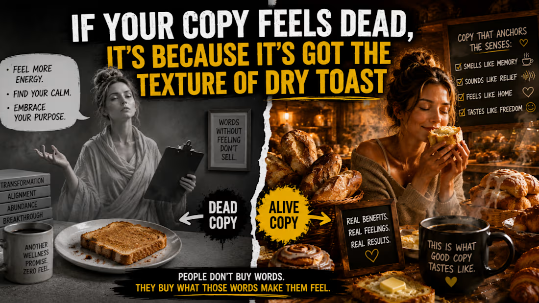
If Your Copy Feels Dead, It’s Because It’s Got the Texture of Dry Toast
You ever walk past a bakery and suddenly forget your own name?
That’s sensory anchoring.
One whiff of cinnamon and boom, your brain’s making love to a memory from 2003.
That’s how strong sensory detail is.
It hijacks logic, ducks past your sales resistance, and goes straight for the gut.
Meanwhile, your copy?
Reads like it was written by a monk on a sugar detox.
“Feel more energy. Find your calm. Embrace your purpose.”
Congratulations.
You've invented the world's first sleeping pill in sentence form.
It’s like licking cardboard while someone hums spa music.
Wellness Copy Shouldn’t Feel Like Dry Toast
Your audience isn’t moved by the word “calm.”
They’re moved by the sound of silence after the dishwasher stops.
Nobody wakes up craving “energy.”
They crave the electric buzz in their fingertips after a night of actual sleep.
And they’re definitely not buying “clarity.”
They’re buying that moment when their head stops spinning long enough to hear their own thoughts, not a podcast, not a toddler, not Karen from HR.
You want them to feel it?
Then you’ve gotta anchor it.
Use the Senses or Lose the Sale
Here’s what I mean:
Flat: “You’ll sleep deeper.”
Felt: “You’ll sink into bed like warm batter sliding into a pan and actually stay there.”
Flat: “You’ll feel calmer.”
Felt: “Like the soft thump of your cat jumping up beside you, without needing a single f*cking mantra.”
Flat: “You’ll get your spark back.”
Felt: “You’ll wake up like someone cracked a window in your soul and let real air in.”
When you wrap your benefit in something physical, something vivid, you bypass the brain and go straight to the body.
And guess what?
The body’s where the buying happens.
How to Anchor Like a Pro (Without Sounding Like You Licked a Candle)
Don’t force it.
You’re not writing a perfume ad for Gwyneth.
Take the benefit you’re already promising, and ask: What does it actually feel like?
Not metaphorically.
Literally.
Is it warm or cold?
Quiet or loud?
Does it crunch, thrum, burn, settle, swell?
Write that instead of “transformation.”
Because “transformation” sounds like a seminar.
“It’s that first moment of stillness when the heating kicks in, the kettle hums, and your shoulders finally drop an inch.”
That’s real.
Let’s Ditch the Floaty Fluff and Write Like We’ve Got Nerves
If your reader can’t smell it, hear it, or touch it… they won’t buy it.
People are overloaded with benefits and buzzwords.
They want moments.
They want to be reminded what it feels like to be alive, not marketed to by a ghost in a crop top.
If your copy currently has the texture of dry toast DM me SENSORY and I will show you where it is losing people.
The network for creativity
Join 1.25M professional creatives like you
Connect with clients, get discovered, and run your business 100% commission-free
Creatives on Contra have earned over $150M and we are just getting started

Challenges
View all


Related posts

Wordmark Logo Design for mattress brand with a bold typography, using my design on Adobe to compare chatgpt. Wich work feel more minimal
2 voted
67%
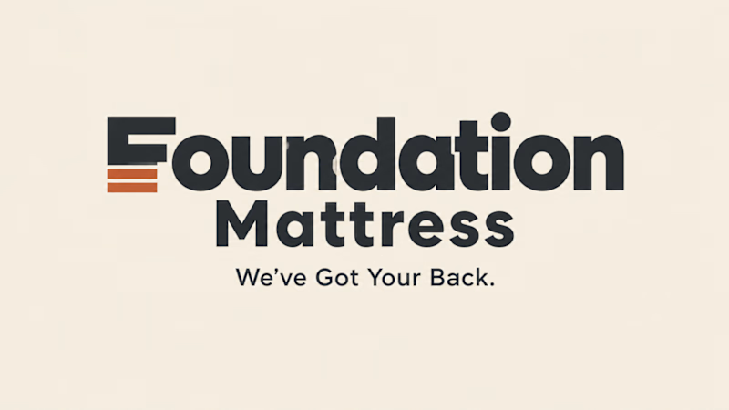
1 voted
33%
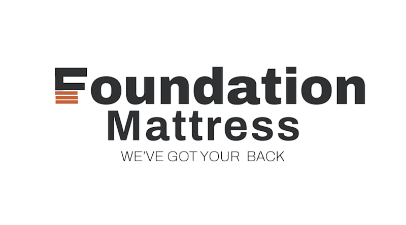
3 votes
Closed

Comparing your manual design against AI output is a useful way to spot where the tech still struggles with specific brand personality. It helps you see exactly which elements need human refinement rather than relying entirely on generated drafts.

Building a wellness brand around what customers actually want.
For Nocta, I developed the brand identity from the consumer perspective: what does someone looking for wellness want to feel when they discover a new DTC brand?
I translated those insights into a brand direction that feels trustworthy, modern, approachable, and premium, avoiding the usual clinical or overly “wellness” visual language.
The result is a flexible identity designed to work across digital channels, from the website and social media to packaging and other customer touchpoints.
See the full project →
https://www.behance.net/gallery/256801253/Nocta


Product content that feels natural, not like a traditional advertisement.
An AI UGC concept created with a creator focused presentation, natural product interaction, and short form pacing designed for social media.
Built for brands that want engaging content for TikTok, Instagram Reels, and ecommerce campaigns.
AI UGC | Product Content | Social Media Video | Ecommerce

