The network for creativity
Join 1.25M professional creatives like you
Connect with clients, get discovered, and run your business 100% commission-free
Creatives on Contra have earned over $150M and we are just getting started
Back to feedPost

The network for creativity
Join 1.25M professional creatives like you
Connect with clients, get discovered, and run your business 100% commission-free
Creatives on Contra have earned over $150M and we are just getting started







Related posts

If everything on your website looks important, nothing feels important.
Most sites don't need more sections, more buttons or more colour.
They need fewer things competing for attention.
→ One clear CTA, not four
→ Real hierarchy, not bold everywhere
→ Whitespace, not filler
→ A strong heading, not a wall of text
→ Your boldest colour saved for the action that matters
Good design isn't about adding more.
It's about deciding what deserves attention.
Save this for your next project.
#WebDesign #UXDesign #UIDesign #DesignTips


For a well known USA service vased business, I specially designed and developed a smooth website. It was designed according to customer's user experience and keeping usability in mind.


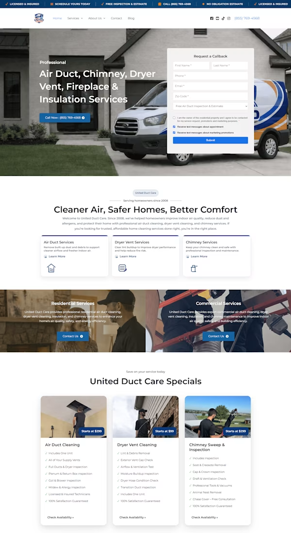

Homepage screen for the personal finance management app, which focuses on main three component at top, assets and liabilities but more importantly cover, when i was thinking about adding the family nominee i thought of another important we buy for our family financial health was cover, so to manage it better it was intentionally added in top...