The network for creativity
Join 1.25M professional creatives like you
Connect with clients, get discovered, and run your business 100% commission-free
Creatives on Contra have earned over $150M and we are just getting started
Back to feedPost

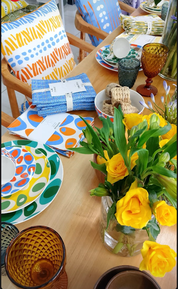
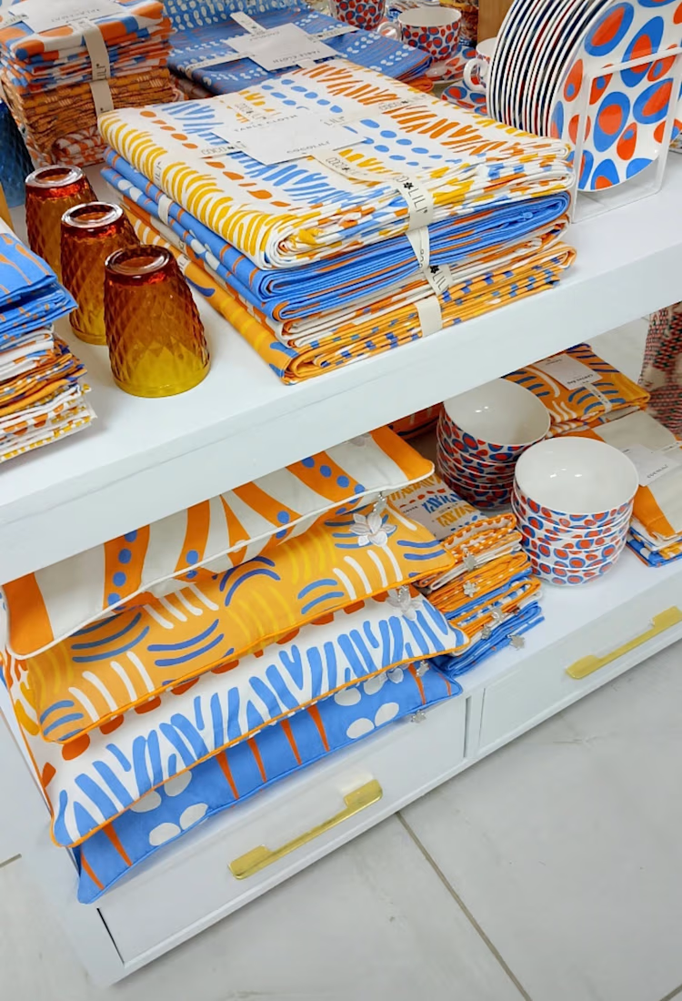
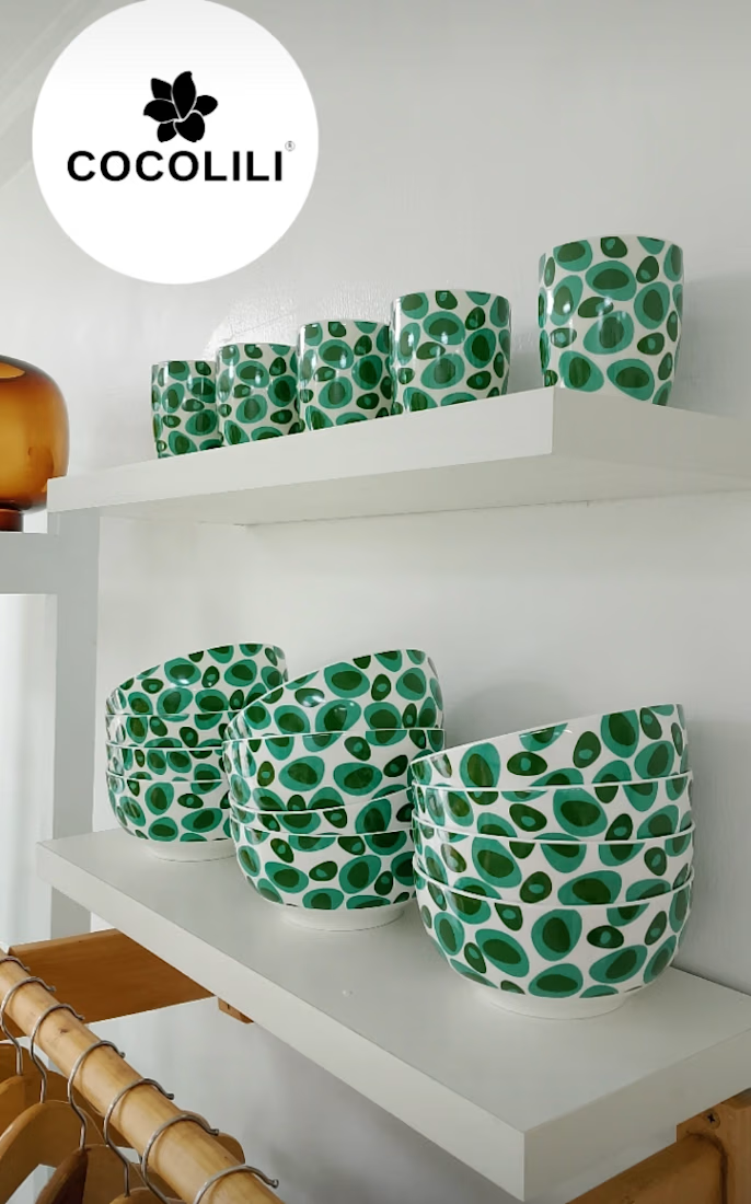
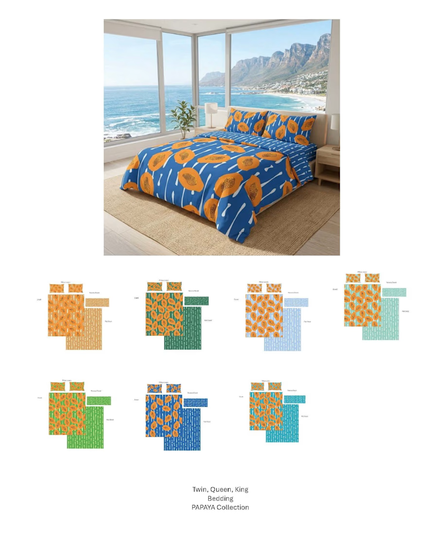
Heritage Collection for Cocolili Africa.
A cohesive homeware collection celebrating African craftsmanship through original surface patterns, colour and thoughtful product design.
My role spanned collection design, surface pattern design and product development—from creating hero prints and coordinating patterns to developing colour palettes and preparing production-ready artwork. Every design was created to work together as one cohesive collection while giving each product its own identity.
The result is a commercially launched collection that demonstrates how thoughtful design can translate seamlessly across multiple products and retail environments.

The network for creativity
Join 1.25M professional creatives like you
Connect with clients, get discovered, and run your business 100% commission-free
Creatives on Contra have earned over $150M and we are just getting started





Related posts

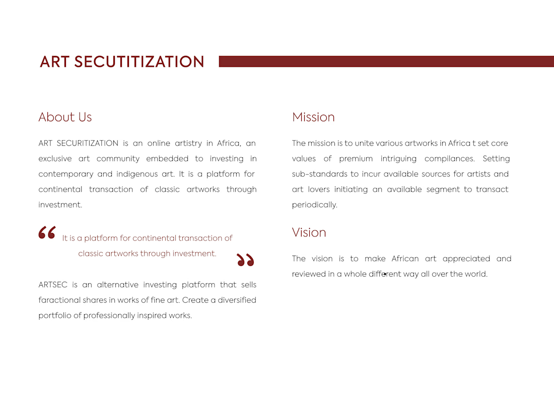
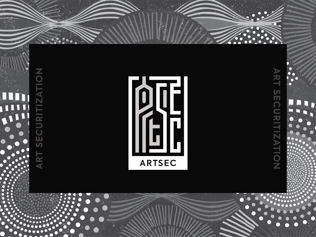
ARTSEC is an art investment platform focused on making African contemporary and indigenous art more accessible to collectors and investors.
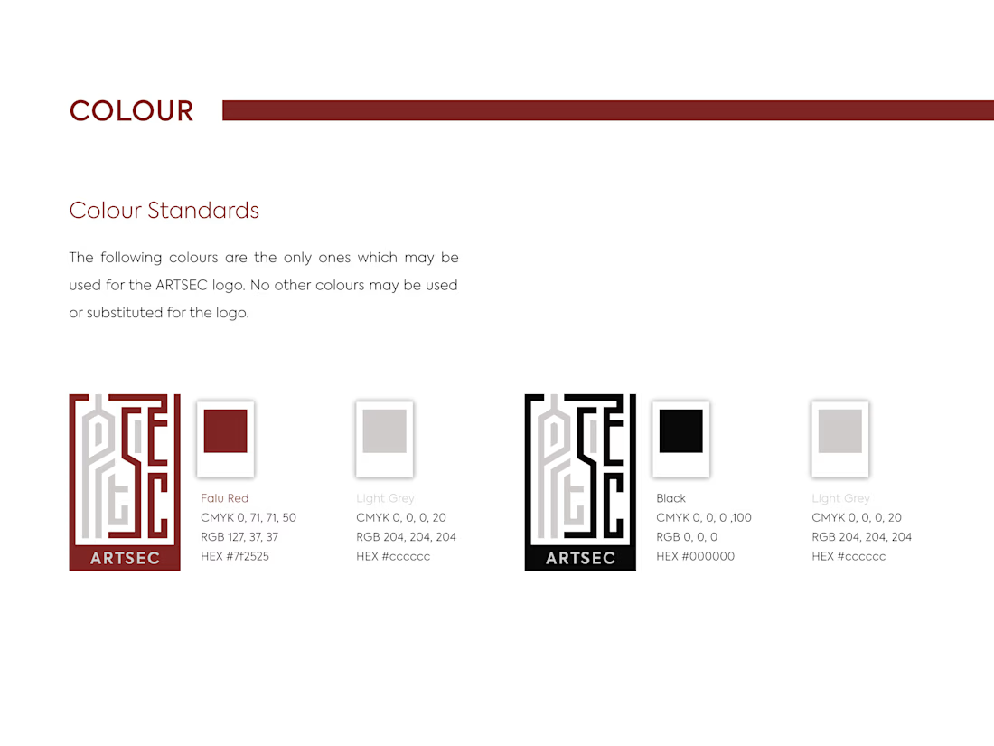
I developed a complete visual identity system for the brand, including the logo, colour palette, typography and usage guidelines.
The identity was designed to give ARTSEC a distinctive, consistent visual presence while reflecting its connection to African art and culture across print and digital applications.


Can't stop looking at this! 😍

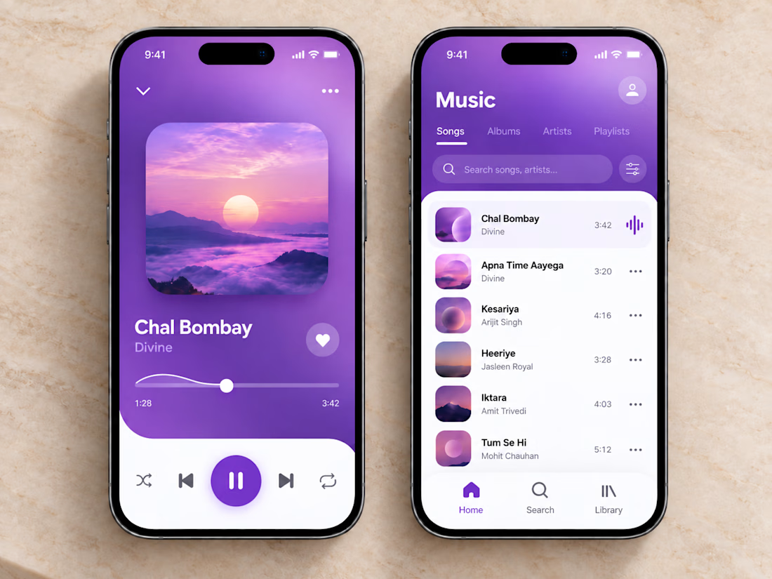
🎧💜 The clean and vibrant UI of this music app creates a calm, immersive listening experience, while smooth controls and simple navigation make finding and playing your favorite songs effortless.
🎶 Thoughtful organization, clear song lists, and a minimal player layout let you stay focused on the music without unnecessary clutter or extra clicks.


sick execution

Awesome


OCR extracts business names, formation dates, and addresses from uploaded documents automatically. But users still need to trust what the system found before anything gets submitted.
We designed the confirmation flow around editable fields that surface extracted data clearly....