The network for creativity
Join 1.25M professional creatives like you
Connect with clients, get discovered, and run your business 100% commission-free
Creatives on Contra have earned over $150M and we are just getting started
Back to feedPost


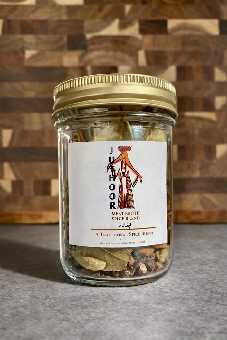
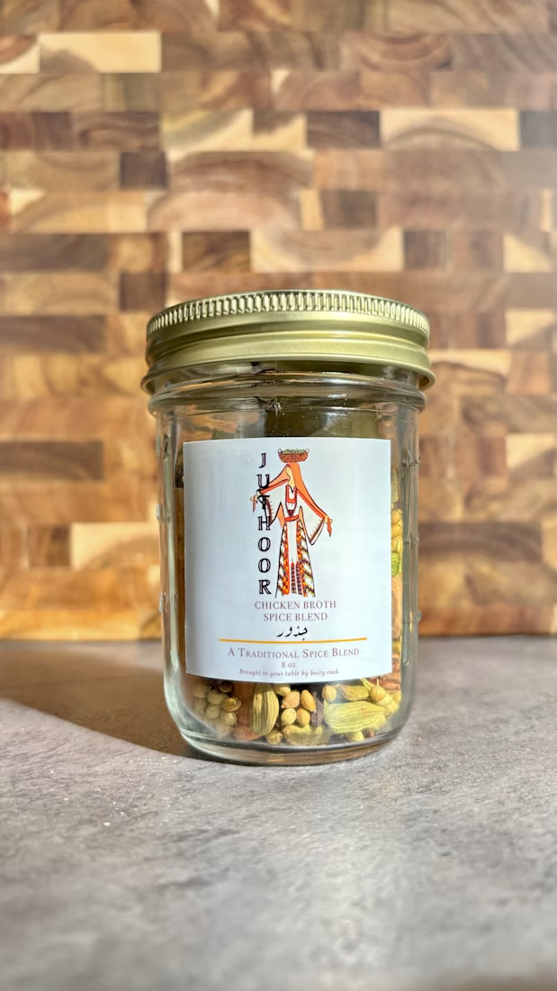
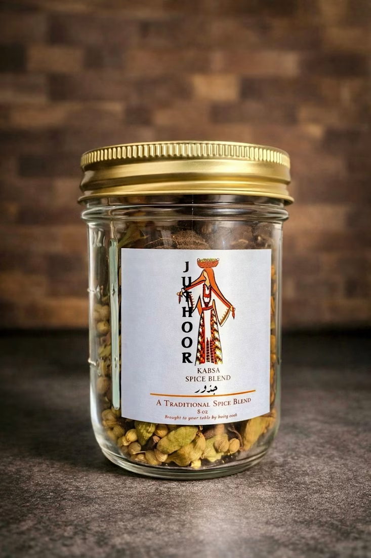
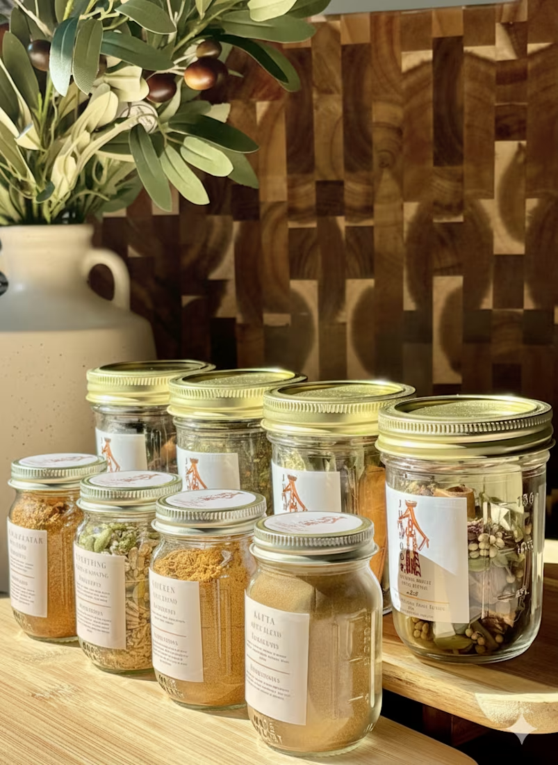

Thank You! It honestly is not me, but my wife she has a great eye for these things. She is a natural!
The network for creativity
Join 1.25M professional creatives like you
Connect with clients, get discovered, and run your business 100% commission-free
Creatives on Contra have earned over $150M and we are just getting started








Related posts

One of my first identity projects from 2021. 🥹
SVNT was a skincare brand built around inclusivity, accessibility, and shaping the future of beauty. My goal was to reflect that through a futuristic but clean visual identity, keeping the system modern and simple while giving the brand room to celebrate individuality.
Looking back at this project four years later, it’s interesting to see what decisions still feel relevant to me today.
Do you ever revisit your early work and realize your design instincts were already there?


Curious - how did you approach making futuristic not feel cold, to keep the inclusivity/accessibility warm? The balance here is really nice.


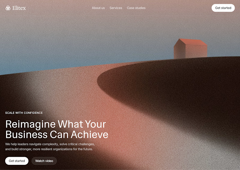
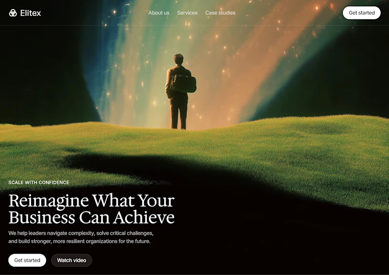

A feels more professional ❤️

My Top Featured Projects on @Contra Labs 🔥
⚡| NEXVOLU
⚡| HYDRUM VEIL
⚡| NOIRÉ
Each project explores a different direction, but the goal stays the same: build brands that stand out.
Which project is your favorite?
Drop the name below 👇


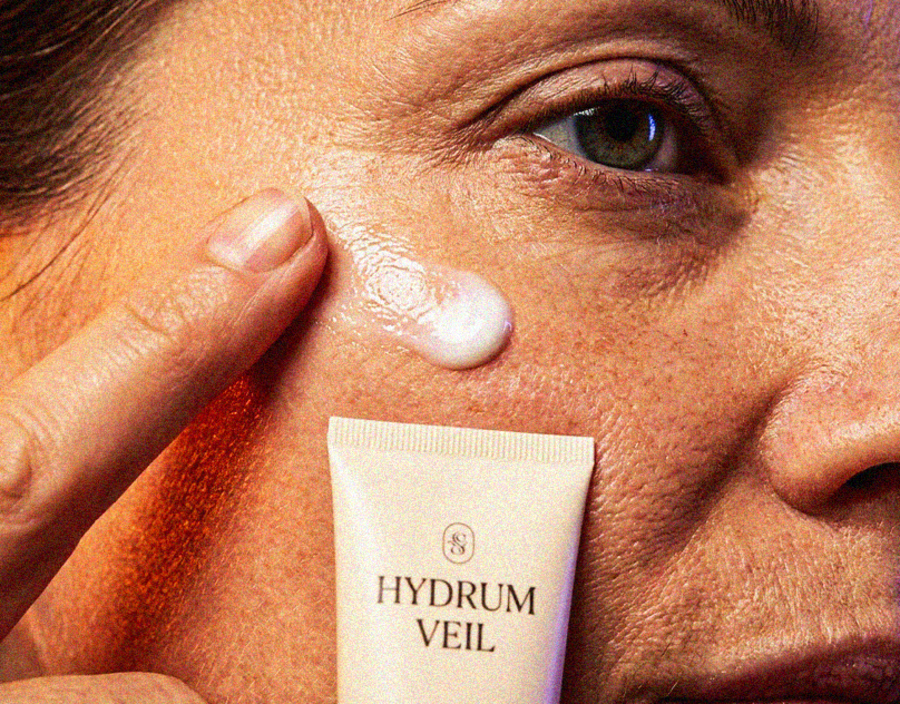
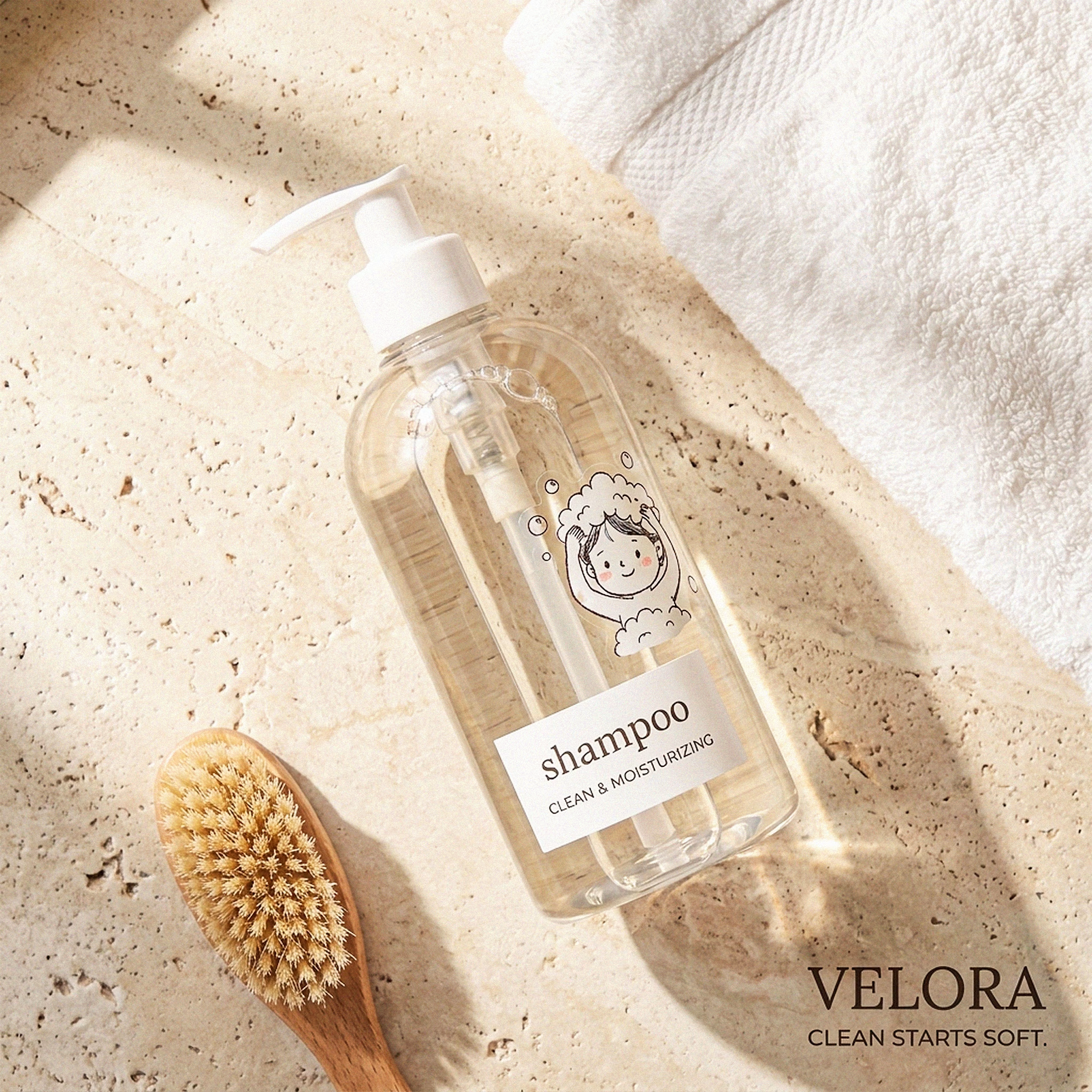
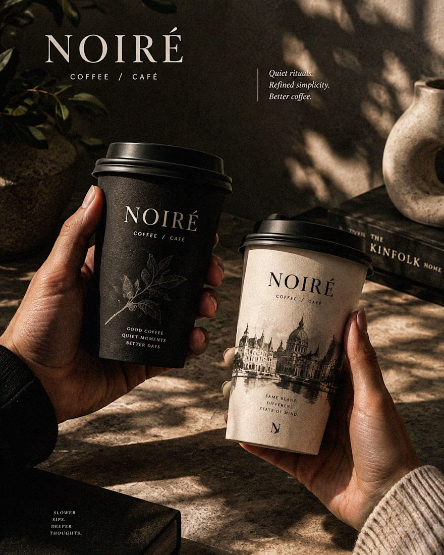

These are 🔥 Mine are all fav 🙌
Congo for Featured on @Contra HQ & @Contra Labs ... 😍