The network for creativity
Join 1.25M professional creatives like you
Connect with clients, get discovered, and run your business 100% commission-free
Creatives on Contra have earned over $150M and we are just getting started
Back to feedPost



Great work

Thank you sm

cool🔥
Thank you

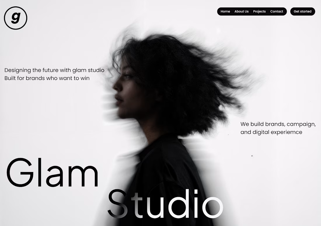
Strong use of negative space to let the typography breathe against a genuinely striking image. One thing I'd want to understand as a fellow designer: what's driving the decision to split 'Glam' and 'Studio' across two visual weights? Is there a specific hierarchy principle you're applying, or is it more intuitive/aesthetic?
It was intentional. My vision was if I put them in the same line, it would become to much on the image, it will make the design so generic. There was nothing special, I created this while I was new to designing.
The network for creativity
Join 1.25M professional creatives like you
Connect with clients, get discovered, and run your business 100% commission-free
Creatives on Contra have earned over $150M and we are just getting started










Related posts


Visual identity revision for a psychology and management consulting firm


handsome works! anyway did you use any ai to generate mockups on that? or you did manual

Hey Contra, I disappeared for a bit. Not because I stopped caring about design, I just needed a breather 🫂
I continued to work, but couldn't bring myself to post something here. Burnout caught up with me, and honestly that “you’re not good enough” voice doesn’t make a comeback any easier. Funny how you can work hard for years and impostor syndrome still shows up like it pays rent.
But I’m back, easing into it this time. I’ve also been posting some design content on my Insta along the way.
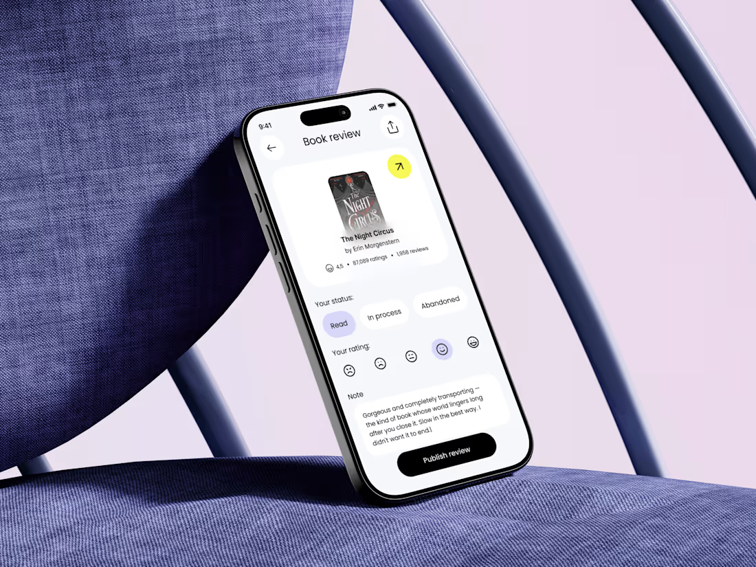
If you’ve been in that spot too: you’re not behind. Anyway, good to be here again🎉 For now you can take a look at one of the key screens of my new project that I can't wait to finish and show y'all!

Nice to see you here again 🎉 I'm waiting for the project updates 🤗


Apple Watch → Dynamic Island → Widget → Desktop Card → Mobile.
Same concept, different screens. Exploring how one UI adapts across devices.


Good work🔥👏👏