The network for creativity
Join 1.25M professional creatives like you
Connect with clients, get discovered, and run your business 100% commission-free
Creatives on Contra have earned over $150M and we are just getting started
Back to feedPost

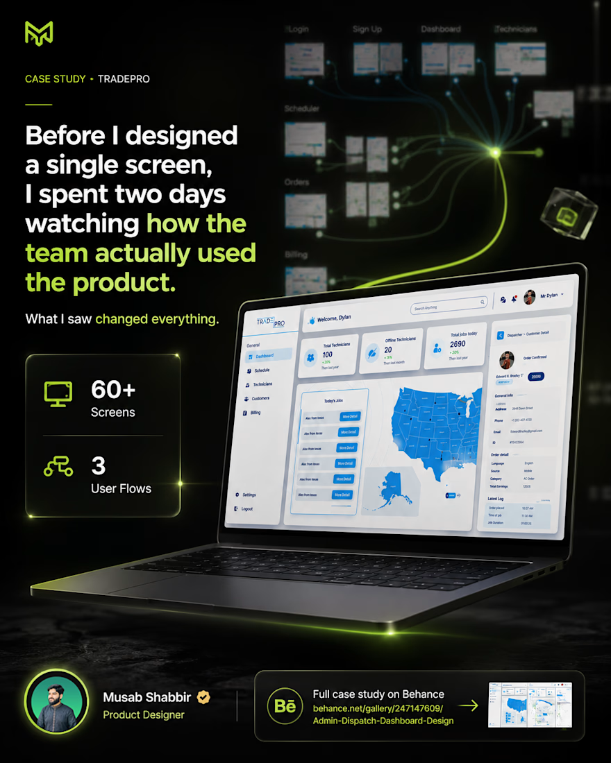
Before I designed a single screen I spent two days just watching how the team actually used the product. What I saw changed everything.
The client came to me with a few rough ideas. No detailed brief. No defined flows. Just a problem they could feel but couldn't explain.
Three months later we shipped 60+ screens across 3 completely different user flows.
Here is how it went.
The product served three types of users at the same time. Technicians on the ground. Admins managing the operation. Dispatchers assigning jobs and handling schedules. Each of them had completely different needs but they all had to live inside one product.
That was the real challenge. Not the screens. The logic holding them together.
We mapped everything before touching Figma.
Research first. Then user flows for all three roles. Then wireframes. Only after all of that did the actual UI work begin.
The flows we designed covered technician profiles, internal messaging, dispatcher job assignment, scheduling, billing, task management, and order details. Every screen had a reason. Every decision had a user behind it.
The hardest part was building clarity for a client who was still discovering what they actually needed. The brief kept evolving. So did the product.
That is the real work nobody shows in a portfolio.
Full case study is on my Behance. 60+ screens, 3 flows, every decision explained.
👉 behance.net/gallery/247147609/Admin-Dispatch-Dashboard-Design
#uiux #casestudy #productdesign #saasdesign #uxdesign #figma #dashboarddesign #uidesigner #designprocess #freelancedesigner
The network for creativity
Join 1.25M professional creatives like you
Connect with clients, get discovered, and run your business 100% commission-free
Creatives on Contra have earned over $150M and we are just getting started

Challenges
View all


Related posts


technical dashboard

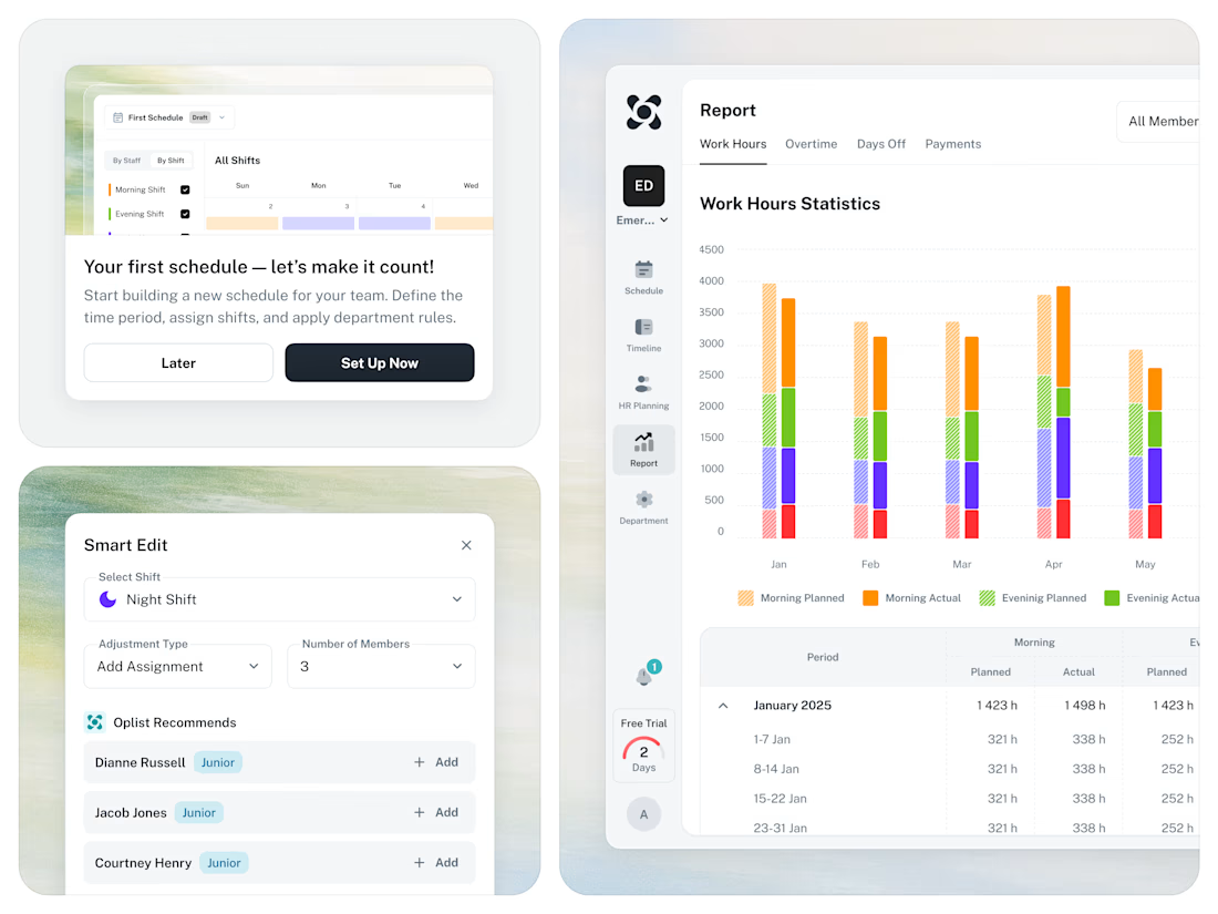
🚀 From Excel chaos to a clear SaaS workflow for staff scheduling.




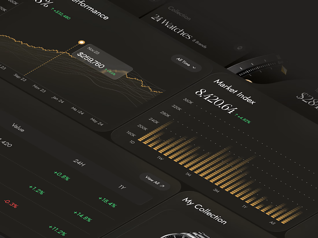
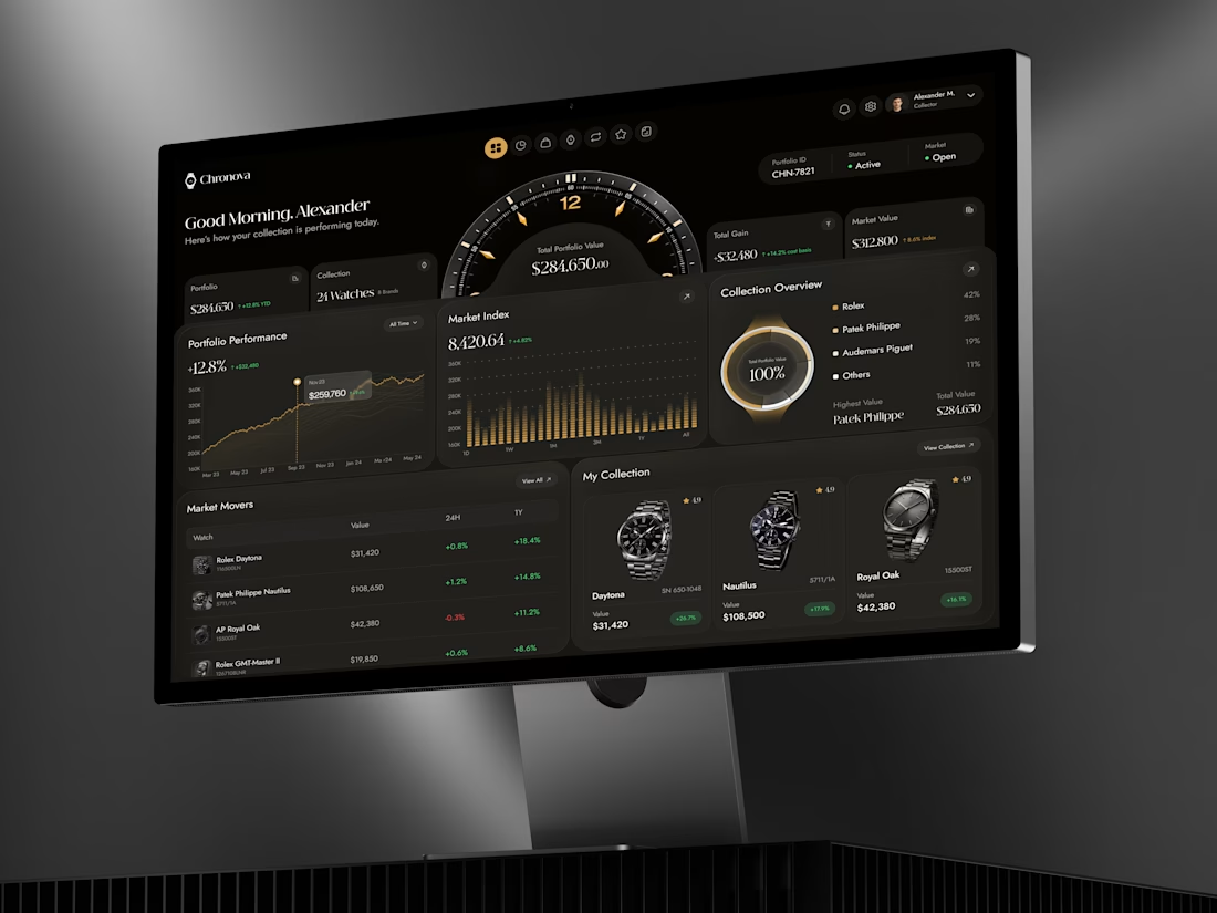
What if your watch collection had a dashboard this luxurious?
Meet Chronova. Built for collectors who care about every detail.
Would you use this?


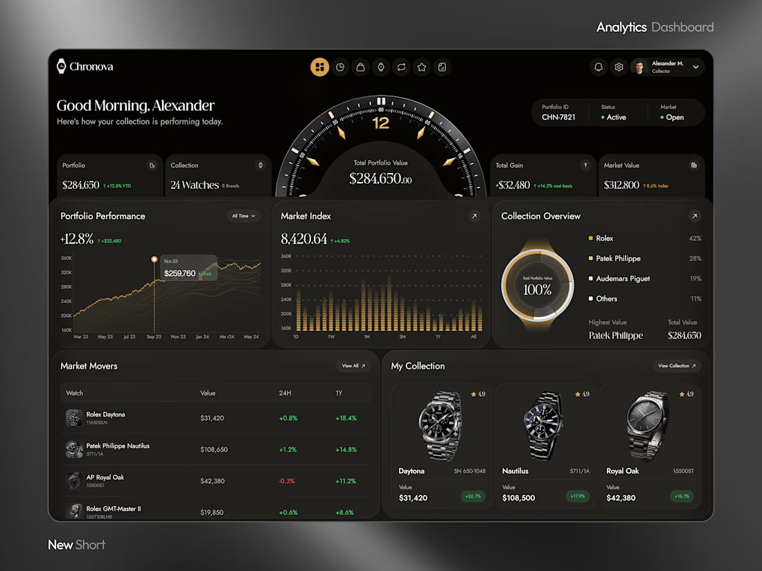

a dark dashboard makes sense here, the watches get to be the brightest thing on screen. how do you show a collection's value changing without it feeling like a trading app?