The network for creativity
Join 1.25M professional creatives like you
Connect with clients, get discovered, and run your business 100% commission-free
Creatives on Contra have earned over $150M and we are just getting started
Back to feedPost

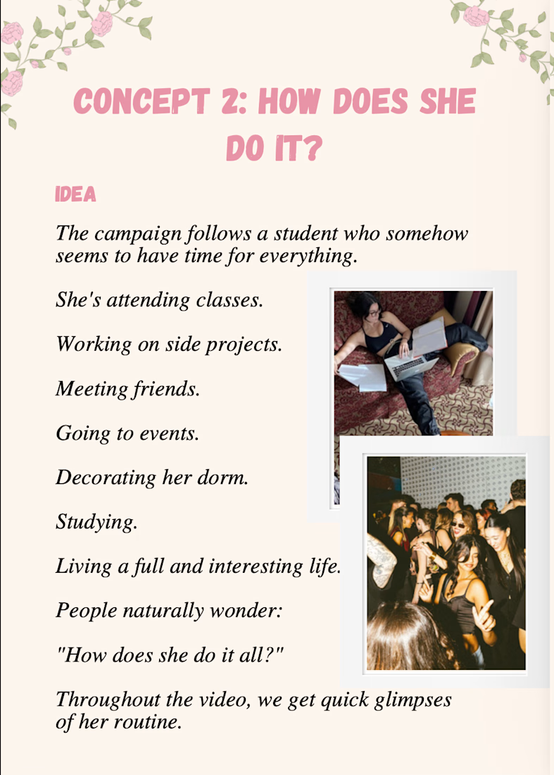
I created a marketing campaign for a skincare brand.


The network for creativity
Join 1.25M professional creatives like you
Connect with clients, get discovered, and run your business 100% commission-free
Creatives on Contra have earned over $150M and we are just getting started
Challenges
View all


Related posts

Client’s choice vs. Designer’s choice 👀
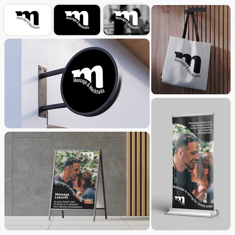
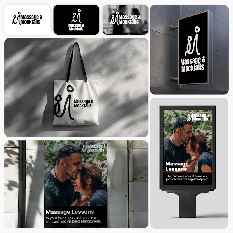
I’m currently working on a branding project for Massage & Mocktails — a concept built around couples learning massage together in a relaxed, social atmosphere.
These are two early, black & white directions from Stage 2 of my branding process, before moving into color, typography, and the full visual system.
The interesting part?
My client chose Concept 1. I chose Concept 2.
Now I’m curious what other creatives think.
Which direction would you choose — 1 or 2? And why?
Sometimes the most interesting part of branding is seeing how differently a client and a designer respond to the same brief.
21 voted
44%
27 voted
56%
48 votes
Closed

Concept 2 for me. That interlocking figure mark reads as two people meeting, which is the actual brief here, so it gives you more to build a system on. Concept 1 is the safer, more literal pick, which is usually why clients reach for it.

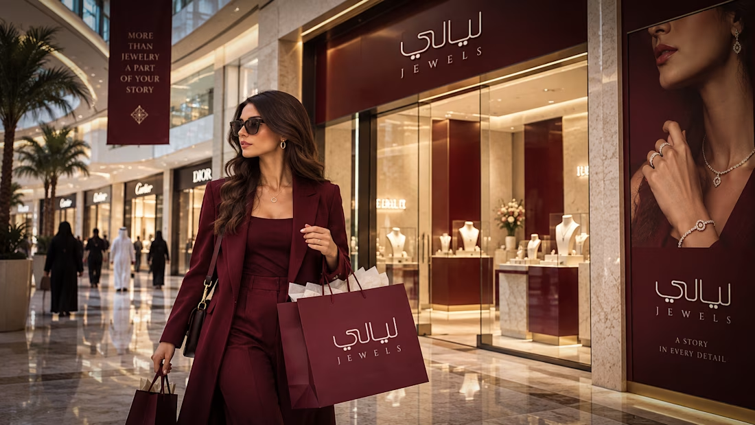
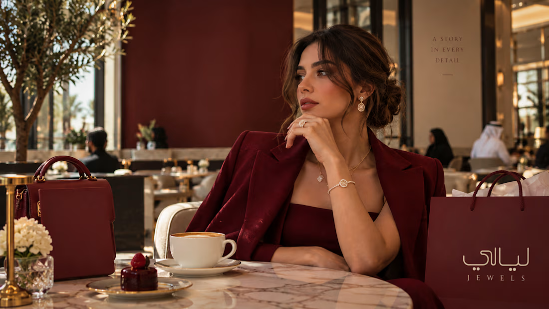
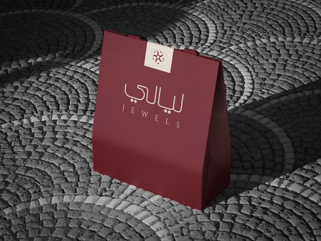


the burgundy color looks so good


What does “simple skincare” look like as a brand?
For Clairfair, I explored a soft, youthful visual identity built around a simple idea: care should feel gentle, approachable, and personal.
I developed the direction across the logo, typography, color palette, messaging, and facial-cream packaging keeping the system clean and minimal while adding subtle playful details through the soft pink palette, hearts, and expressive typography.
The goal wasn't to make skincare feel clinical or overly luxurious. It was to create something that feels friendly, confident, gentle, and easy to connect with.
I also explored how the identity could translate into a broader brand system rather than stopping at the logo.
Does this feel more like a skincare brand for teens, young adults, or both?

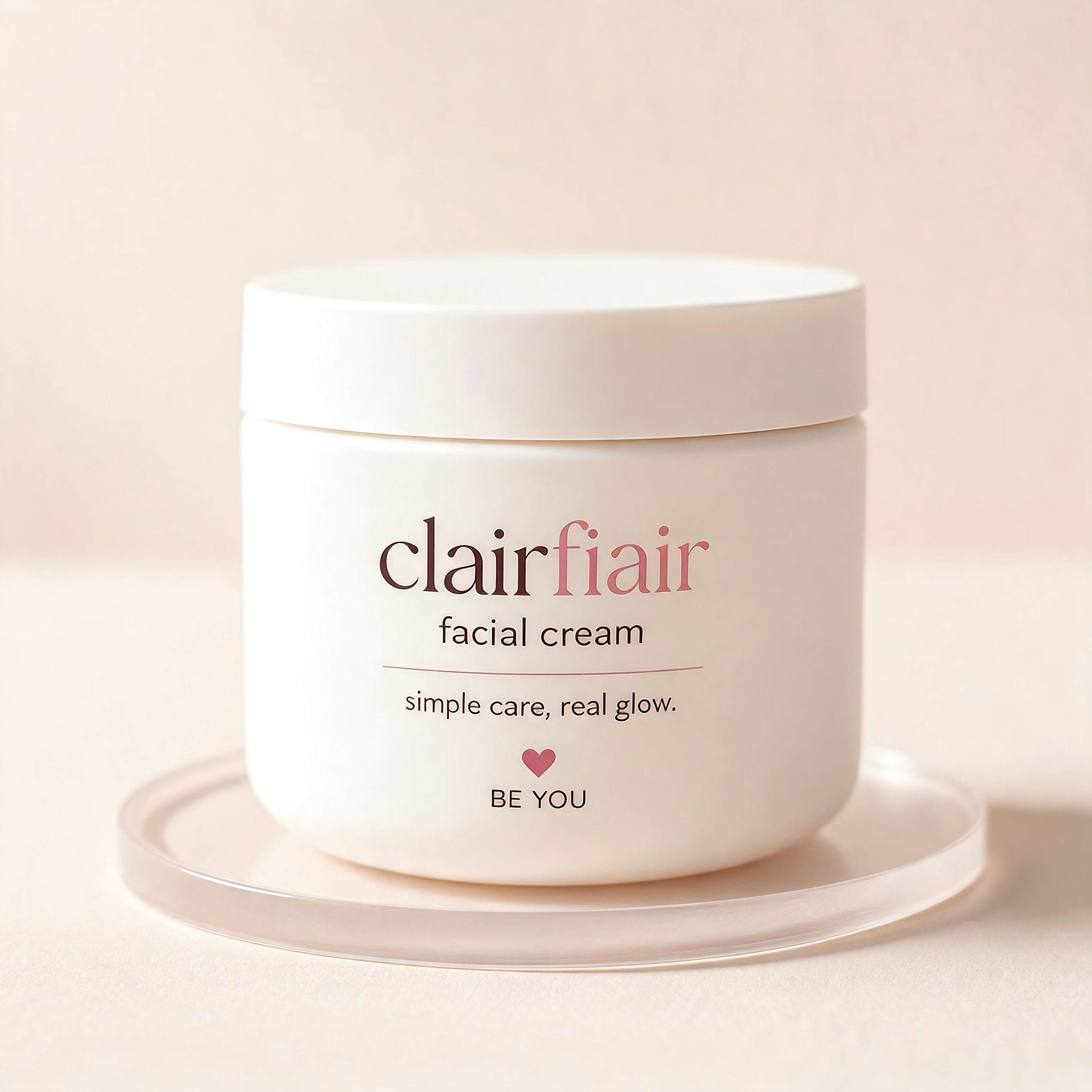
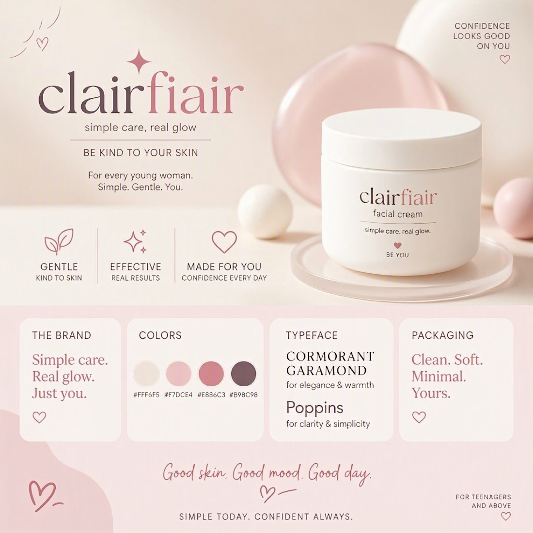

Teen-leaning to me, and the hearts are what tip it — they're the one element an older buyer would read as aimed at someone younger. The script wordmark and that muted rose palette on their own would sit fine in early-twenties territory. If you want it to stretch to both, the...