The network for creativity
Join 1.25M professional creatives like you
Connect with clients, get discovered, and run your business 100% commission-free
Creatives on Contra have earned over $150M and we are just getting started
Back to feedPost

Expense Tracker
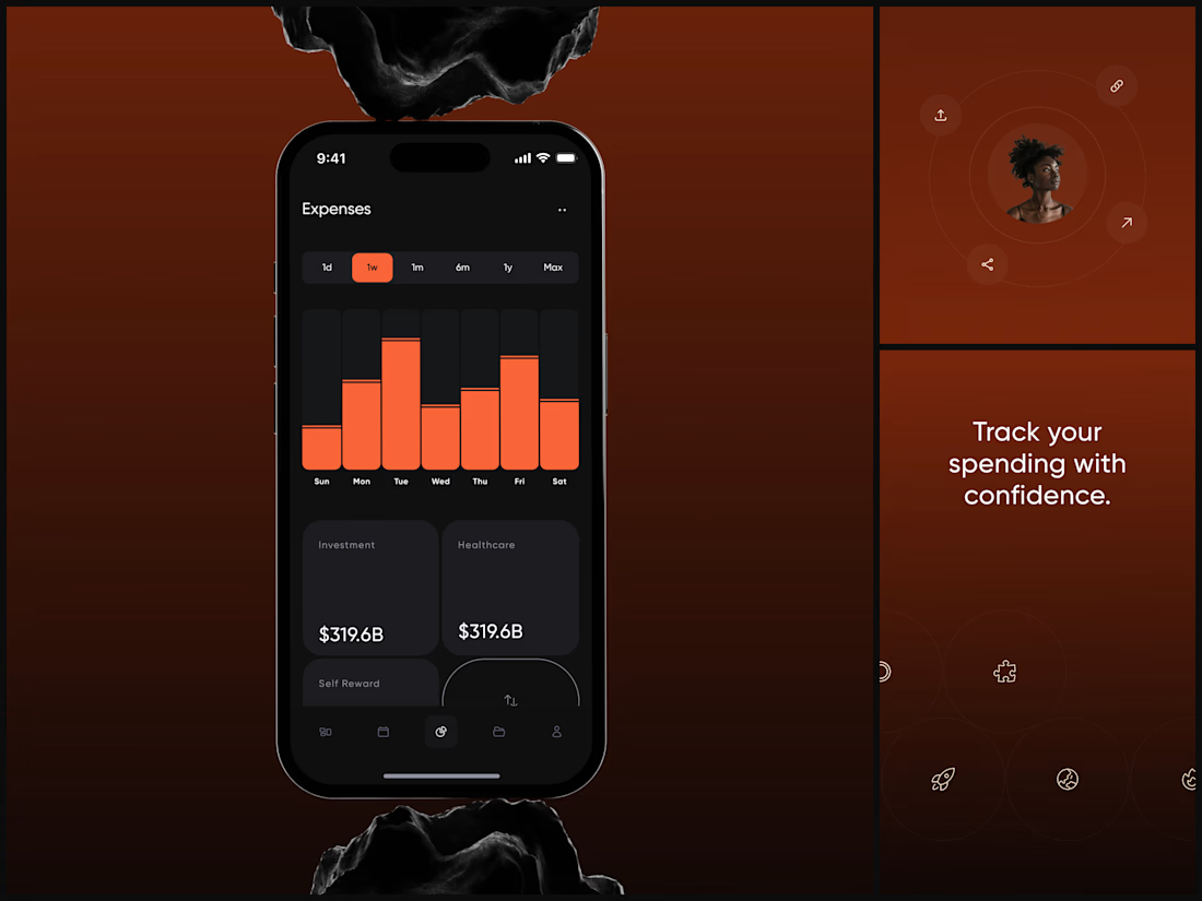
The dark UI isn't aesthetic. It's functional. When you're reviewing weekly spending at 11pm, your eyes need low-strain contrast that still makes the data pop.
The category cards sit below the chart for a reason. The chart answers "how much did I spend this week?" The cards answer "where did it go?"
Finance apps either look sterile or playful. This needed to feel like neither - it needed to feel powerful. Like your money is being managed by something that takes it seriously.
"Track your spending with confidence." Confidence. That word choice shaped every design decision.
#MobileDesign #UIDesign #Fintech #AppDesign #DarkUI #DataVisualization #ProductDesign #iOSDesign #ExpenseTracker #FigmaDesign


The network for creativity
Join 1.25M professional creatives like you
Connect with clients, get discovered, and run your business 100% commission-free
Creatives on Contra have earned over $150M and we are just getting started








Related posts

Built something that isn’t client work for a change.
Flowkidz. Short games that teach kids design, websites, AI, code and internet safety.


From the cover to what’s inside 👀
Thank you to everyone who voted in my cover test. This time, I’m trying two short previews of DCS 654: my library of 654 dessert-inspired colors and matching textures, with ready-made palettes for your own design work.
Which video makes you more curious to explore the library: A or B?
And what made you choose that one?
You can take a closer look here: https://dcs.mariya.design/
36 voted
61%
23 voted
39%
59 votes
Closed


I’d pick B. It makes the colors and textures feel more engaging and makes me want to explore the full library.


Super sleek presentation! ✨ The phone mockup with that purple gradient is looking premium. Clean editing!