The network for creativity
Join 1.25M professional creatives like you
Connect with clients, get discovered, and run your business 100% commission-free
Creatives on Contra have earned over $150M and we are just getting started
Back to feedPost

United4Digital is dedicated to empowering businesses with a comprehensive range of digital advertising solutions aimed at optimizing revenue potential. The company's mission is to help businesses maximize their revenue through a variety of digital ads, ensuring a seamless synergy between clients' objectives and their audience. United4Digital offers innovative solutions tailored to the dynamic landscape of digital marketing, including proprietary video streaming applications and exclusive exchanges for advertisers and publishers. Their cohesive approach focuses on managing the entirety of the advertising framework, digital monetization, and strategic planning, enabling businesses to thrive in the competitive digital marketplace.
The company specializes in providing scalable, high-quality, and trusted inventory across various platforms such as Display, Connected TV, InApp, and Audio. United4Digital's meticulous selection process handpicks top-tier publishers and emerging high-quality content, guaranteeing a valuable advertising experience for all their partners. They are committed to maintaining the utmost quality of traffic through strategic partnerships with leading data transparency providers and anti-fraud protection systems. United4Digital's dedication to excellence ensures that their clients receive nothing short of the best in traffic quality, helping them achieve their digital advertising goals effectively and efficiently.
Our team was responsible for building the United4Digital website from scratch, leading it through every stage from initial concept to deployment. We began by discussing requirements with the client and assisting them in selecting the appropriate technologies. The design phase involved using Figma and Illustrator to create the interface, starting with the logo and color scheme and progressing to the page layouts. We enriched the site with meaningful animations to enhance engagement and visual interest.
To build the website, we utilized a modern technology stack for optimal performance and user experience. The core framework was Next.js 14, complemented by Tailwind CSS and DaisyUI for efficient and cohesive styling. We used Framer Motion for animations, Lodash for complex JavaScript operations, and React-Hook-Form for seamless form management. Gray-Matter handled content parsing from Markdown files, while TypeScript ensured robust typing and reduced errors. Remark and Remark-HTML facilitated content rendering, and React-Google-Recaptcha enhanced security.
For analytics and site management, we integrated Cookiebot for cookie consent compliance, Google Analytics for tracking user behavior, Google Search Console for monitoring search performance, and Google Tag Manager for managing tracking codes and marketing tags. This comprehensive stack ensured a visually appealing, functional, secure, and compliant website.
Technologies: Figma, Illustrator, Next 14, tailwind, daisyui, framer-motion, lodash, react-hook-form, gray-matter, typescript, remark, remark-html, react-google-recaptcha.
Services: Cookiebot, Google analytics, Google search console, Google tag manager.


The network for creativity
Join 1.25M professional creatives like you
Connect with clients, get discovered, and run your business 100% commission-free
Creatives on Contra have earned over $150M and we are just getting started



Related posts

Excited to share the latest web redesign projects for Codex⚡
The goal was to pair technical credibility with a more approachable, modern financial aesthetic while preserving the depth and complexity that make Codex a high-profile data provider.
The result is a visual direction designed to resonate across the spectrum, from crypto builders and neofinance founders to enterprise-scale exchanges like Coinbase. 💻


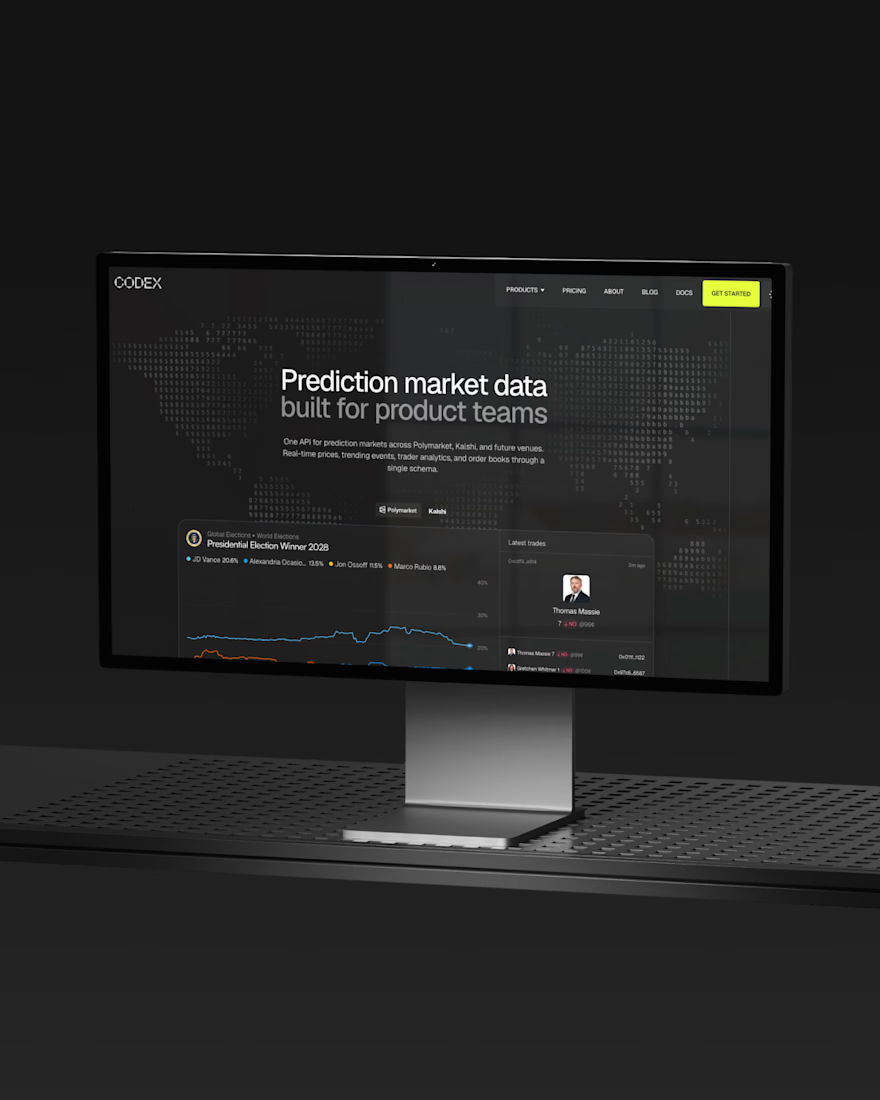
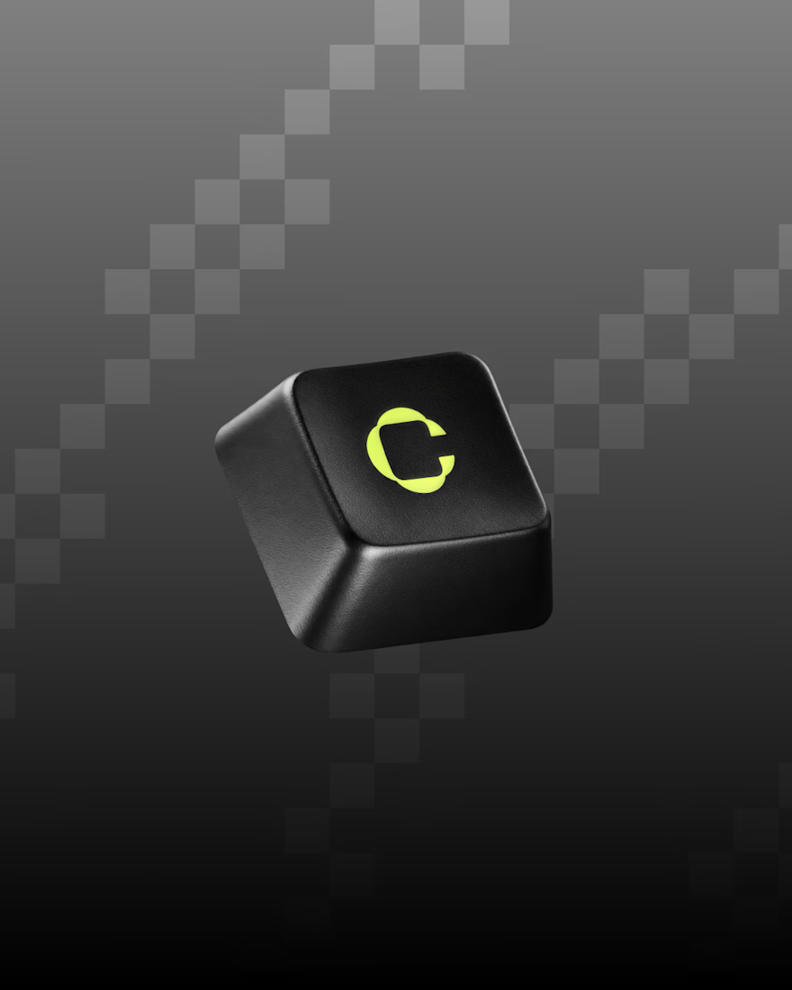
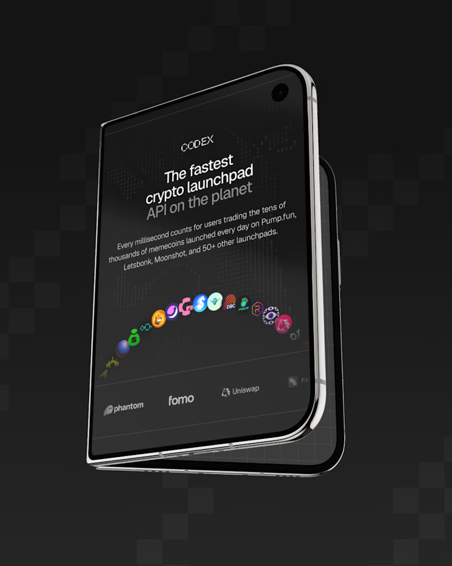

Love the logo on the keyboard key

First impressions happen in seconds. We made them count.
A landing page should do more than look good. It should tell a story, build trust, and make the next step feel natural.
We brought together bold visuals, thoughtful layouts, and clear messaging to create an experience that keeps visitors engaged from the first scroll to the final click.
Good design catches the eye. Great design gives people a reason to stay.
What's your next big idea?


45 colours, 5 ramps, 2 typefaces, 0 bold weights 🎨
That's the whole of Penwave's design system. Every colour is read from the app's Tailwind config, and each ramp has one job: cream for the page, beige for badges, tea green for avatars, celadon for every border, muted teal for all the text.
Instrument Serif sets the headings and the post body. Inter runs the interface, 300 to 600.
In the clip the palette builds a story card, colour by colour.
Do you give every colour in your system a job, or keep a few spare? 👇


To your question: one job per colour, with a single spare accent kept for promos. Cream for the page and celadon for borders is easy to hand over to a team. Why zero bold weights?