The network for creativity
Join 1.25M professional creatives like you
Connect with clients, get discovered, and run your business 100% commission-free
Creatives on Contra have earned over $150M and we are just getting started
Back to feedPost
45 colours, 5 ramps, 2 typefaces, 0 bold weights 🎨
That's the whole of Penwave's design system. Every colour is read from the app's Tailwind config, and each ramp has one job: cream for the page, beige for badges, tea green for avatars, celadon for every border, muted teal for all the text.
Instrument Serif sets the headings and the post body. Inter runs the interface, 300 to 600.
In the clip the palette builds a story card, colour by colour.
Do you give every colour in your system a job, or keep a few spare? 👇


To your question: one job per colour, with a single spare accent kept for promos. Cream for the page and celadon for borders is easy to hand over to a team. Why zero bold weights?

Keeping a spare promo accent is a smart touch!
On zero bold weights: Instrument Serif already has enough character and presence that regular weight headings stand out on their own. Skipping bold keeps the design light, clean, and intentional without overpowering the body text.
The network for creativity
Join 1.25M professional creatives like you
Connect with clients, get discovered, and run your business 100% commission-free
Creatives on Contra have earned over $150M and we are just getting started
Related posts


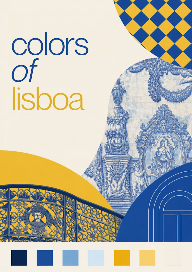
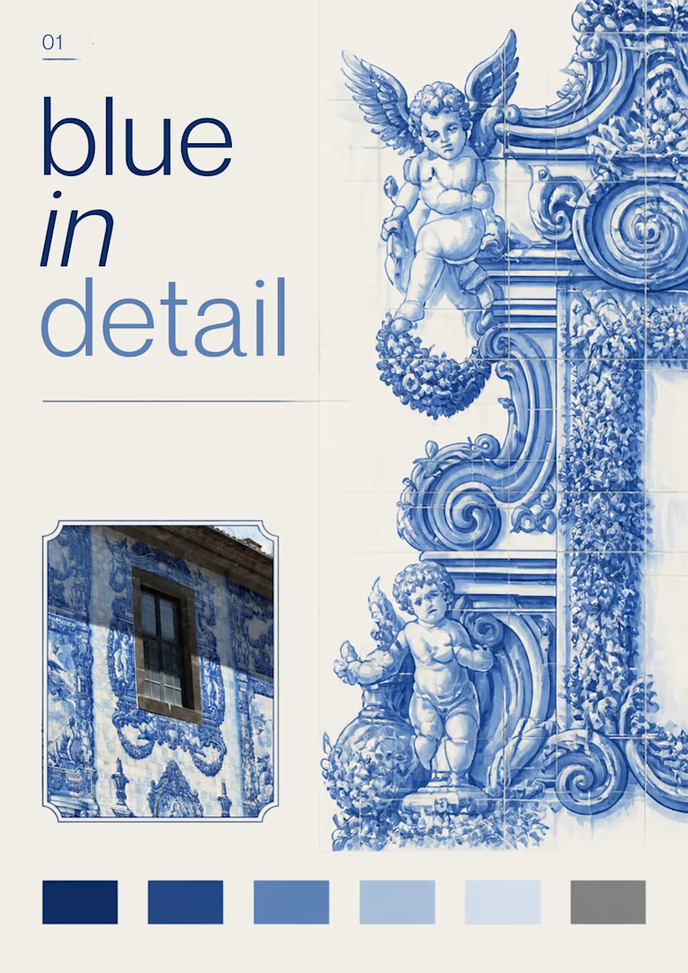
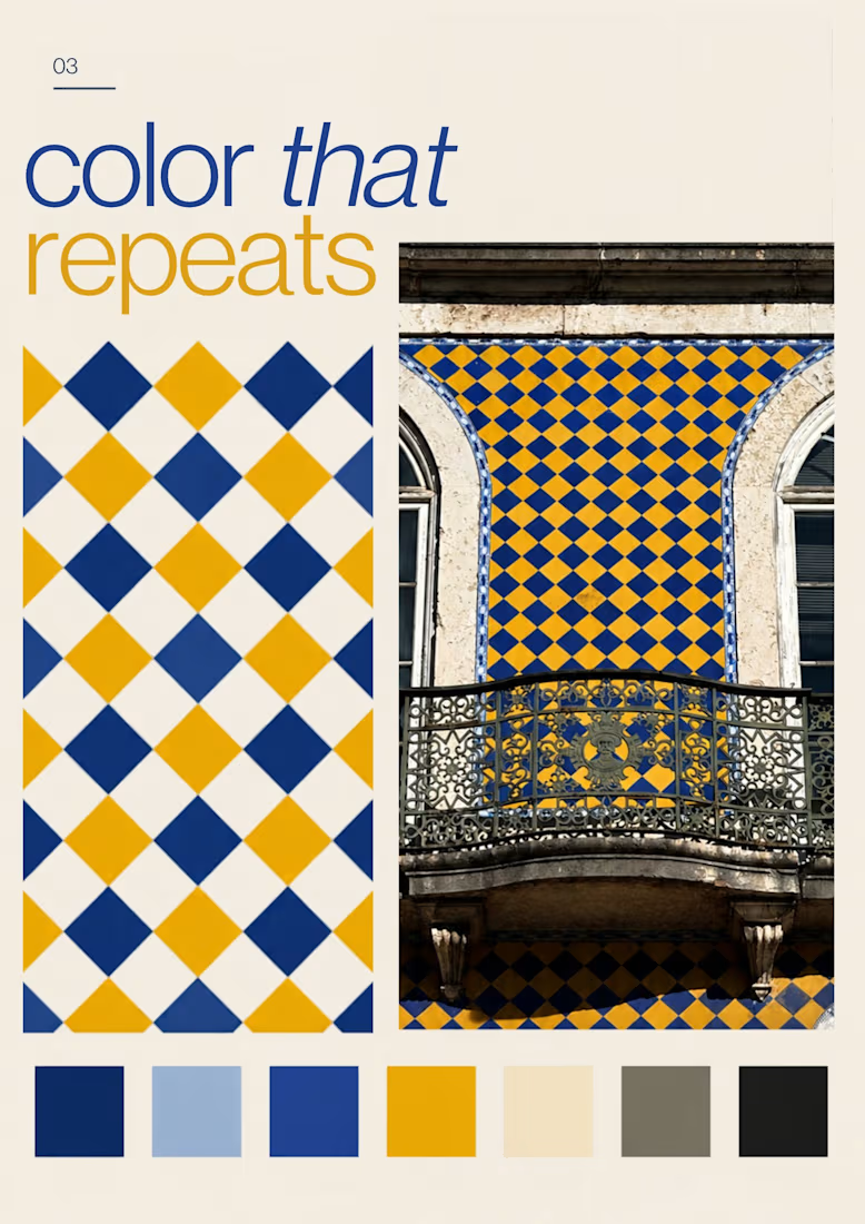
Turning the colors I notice around Lisbon into a series of posters, each inspired by a different photograph.
01 [Blue in Detail] started with the blue Portuguese tiles, exploring their intricate patterns, ceramic tones, and small details.
02 [Color on Repeat] explored the rhythm of blue and yellow tiles, using repetition as the starting point for the design.
I sampled colors from my photographs and used Canva Craft to explore layouts, typography, and graphic elements. Then I refined the designs by hand, adjusting the colors, spacing, and text.



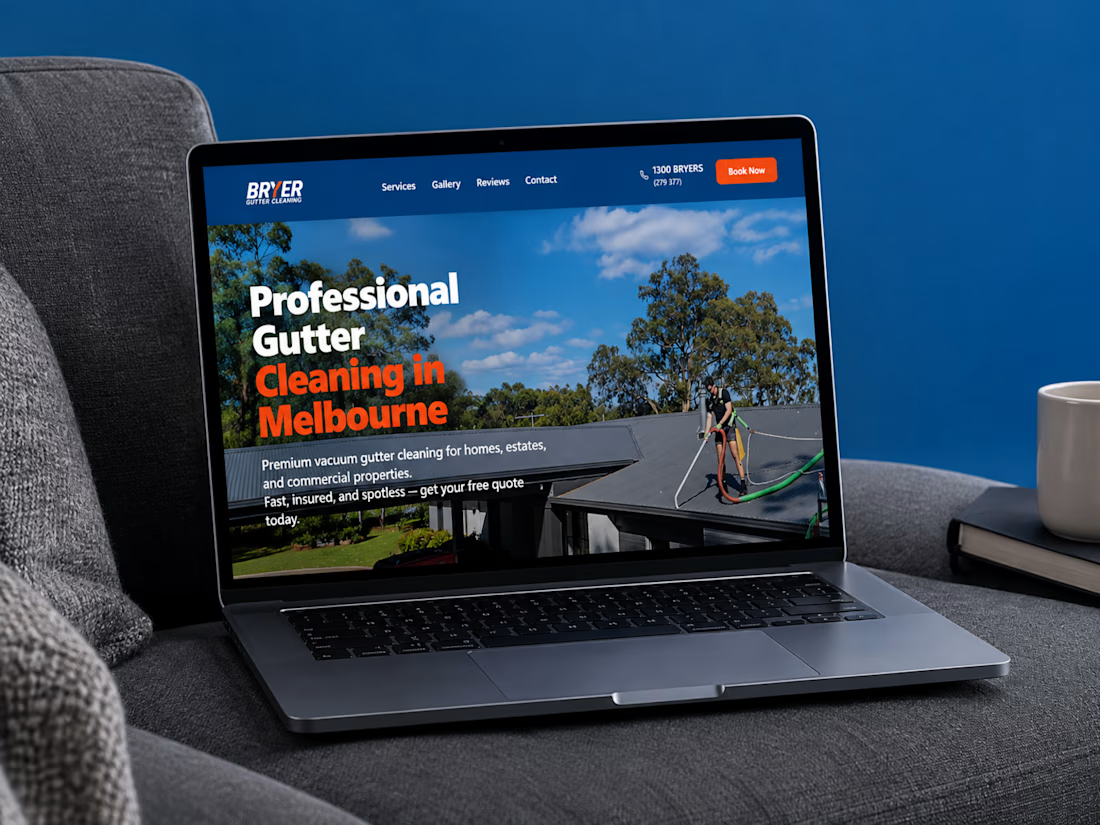
A great website should do more than look good, it should make choosing a business feel easy.
I recently completed a website project for Bryer, a Melbourne-based gutter and solar panel cleaning business.
The goal was to create a clean, professional online presence that communicates their services clearly, builds trust, and makes it easier for potential customers to request a quote.
Now, I’m curious:
When you visit a service-based business website, what matters most to you, the design, the information, or how easy it is to get in touch?
Let’s hear your thoughts! 👇
#WebDesign #Webflow #UXDesign #WebDevelopment #WebsiteDesign #Contra



this is amazing work

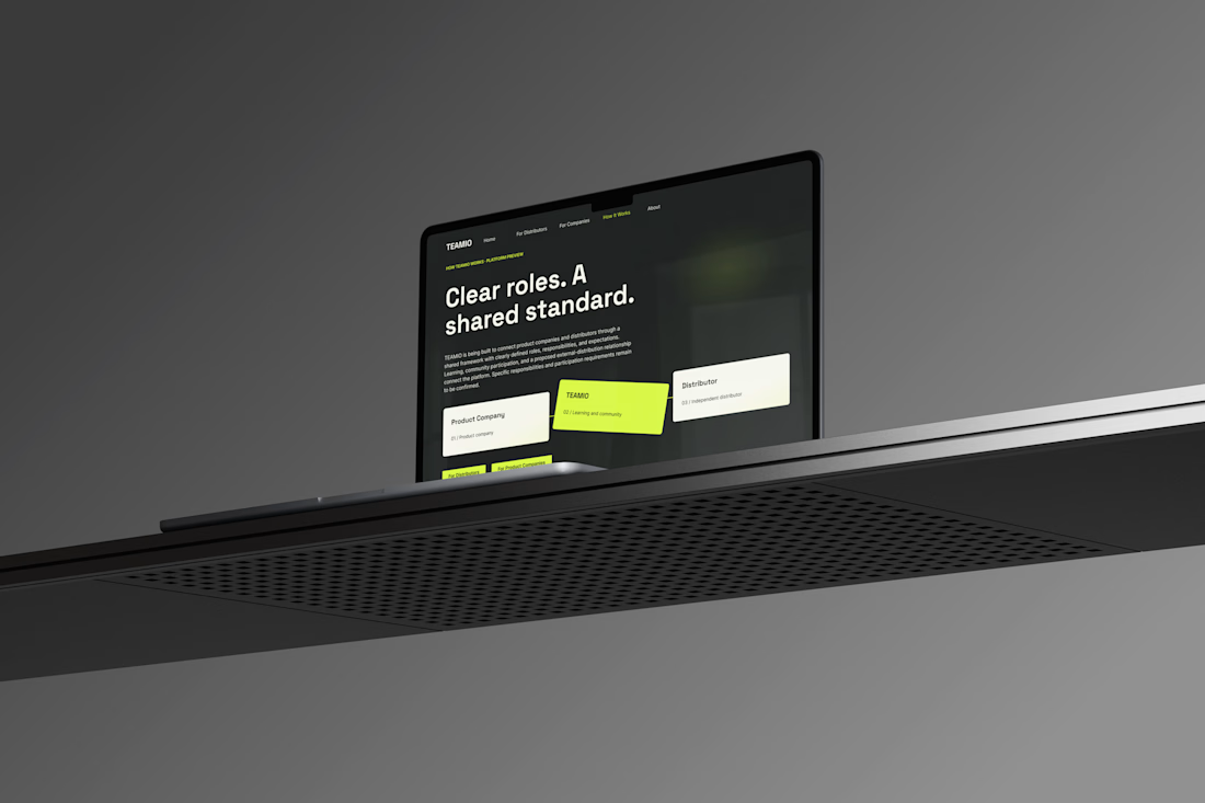
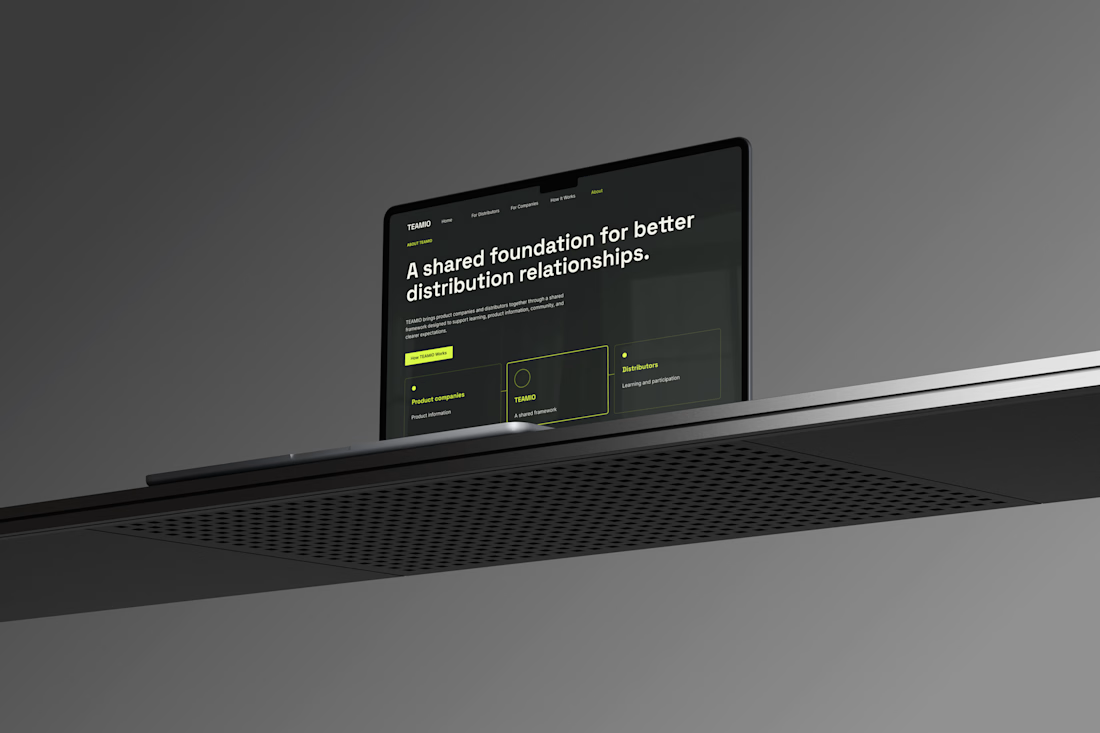
One produc Multiple experiences One cohesive design system
Meet TEAMIO a product I designed from the marketing website to the partner dashboard, bringing the entire experience together through thoughtful UX and consistent UI
Which screen is your favorite?



I like the colour combinations and the website vibes it's super elegant but still very creative 👏✅