The network for creativity
Join 1.25M professional creatives like you
Connect with clients, get discovered, and run your business 100% commission-free
Creatives on Contra have earned over $150M and we are just getting started
Back to feedPost

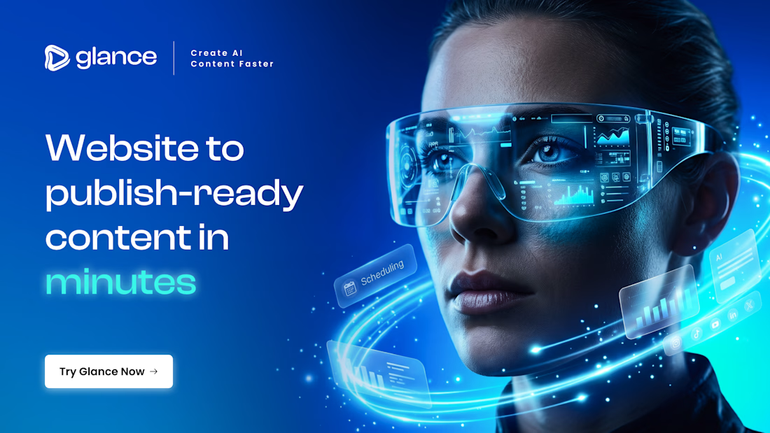
Glance — Reimagining AI Creation
When Glance first launched, its identity was anchored by a friendly robot mascot. It was approachable, but as AI technology evolved from a novelty into a high-speed engine for modern businesses and creators, the brand needed to evolve with it.
The goal was clear: move away from playful tropes and build an identity that feels established, powerful, and effortlessly fast.
Form Follows Function
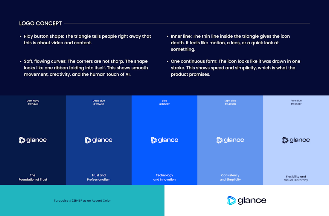
At the heart of concept is a symbol everyone understands instantly: the play button. It represents media, action, and forward momentum.
By softening the edges and folding the shape inward, the mark becomes a continuous ribbon drawn in a single fluid stroke. This seamless loop visually captures the core promise of Glance: taking raw URLs and turning them into publish-ready content without breaking stride.
The inner line acts as a lens, giving the mark depth and movement. It whispers speed without shouting, embodying the seamless fusion of artificial intelligence and human creativity.
The Palette of Digital Trust
To anchor this direction in enterprise-grade authority, we introduced a refined monochromatic blue palette. Deep midnight tones establish foundation and trust, while vibrant neon blue and turquoise accents convey innovation, speed, and energy.
This concept isn't just a logo redesign—it's a visual manifestation of content created faster, smarter, and with absolute confidence.
If you enjoyed this visual breakdown, hit Appreciate or drop a comment with your thoughts!


The network for creativity
Join 1.25M professional creatives like you
Connect with clients, get discovered, and run your business 100% commission-free
Creatives on Contra have earned over $150M and we are just getting started



Related posts


Amazing design!

Ovéa — care with character.
One skincare identity across bottles, jars and tubes. I designed the wordmark, pink-and-cobalt packaging system, campaign applications and digital mockups, then brought the collection into motion.
A consistent visual language, with room for each product to feel individual.
View the full case study. Building a skincare brand? Let’s talk about your identity and packaging.

Love the colour direction and the visual language. Everything feels so well thought out. The overall look is beautiful.

Happy to finally share the full NEXUS project 🙌
A few days ago I posted a small motion teaser. Now the whole thing is live on my profile: 12 pages designed in Figma, a design system, and a homepage I built in HTML, CSS and JS with every interaction working.


12 pages in Figma plus a design system, then hand coding the homepage with every interaction working is a great way to show the concept holds up, Sofiia. Nice to see the teaser turn into the full project.