The network for creativity
Join 1.25M professional creatives like you
Connect with clients, get discovered, and run your business 100% commission-free
Creatives on Contra have earned over $150M and we are just getting started
Back to feedPost

Contra Post — Qube Baby Shop
Qube Baby Shop — Playful Logo Design
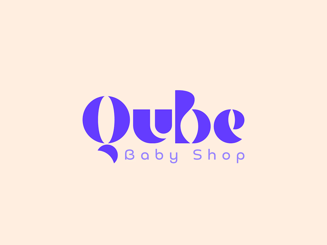
A playful and distinctive logo concept created for Qube Baby Shop, designed to feel friendly, modern, and memorable.
The identity combines bold custom letterforms with soft negative-space details, creating a visual language that feels energetic and approachable while maintaining a clean, contemporary look.
The vibrant purple adds a fun and expressive personality, making the identity suitable for packaging, social media, storefronts, and digital applications.
What I worked on:
• Custom Logo Design
• Wordmark Design
• Visual Identity Direction
• Color Palette
• Brand Presentation
Designed by Morium Munni — Logo & Brand Designer
#LogoDesign #BrandIdentity #BabyBrand #BabyShop #Wordmark #Branding #VisualIdentity #LogoDesigner #GraphicDesign #BrandDesign

The network for creativity
Join 1.25M professional creatives like you
Connect with clients, get discovered, and run your business 100% commission-free
Creatives on Contra have earned over $150M and we are just getting started











Related posts

Brand Expressions -- Olivir



Thats so crazy!!!!!! Seeing this I feel we humans are still far better than AI

Logos from my archive.
A good logo doesn't really have to tell what you do; it's meant to tell a story. Here are some with their unique stories.
¹ Unik Mindz — inspired by Michelangelo’s 'Creation of Adam'; human creativity sparked by a higher source.
² Nutrift — reflecting the idea of weekly cycles and continuous meaningful progress.
³ Nestform — built to reflect furniture that adapts and transforms to different living spaces.
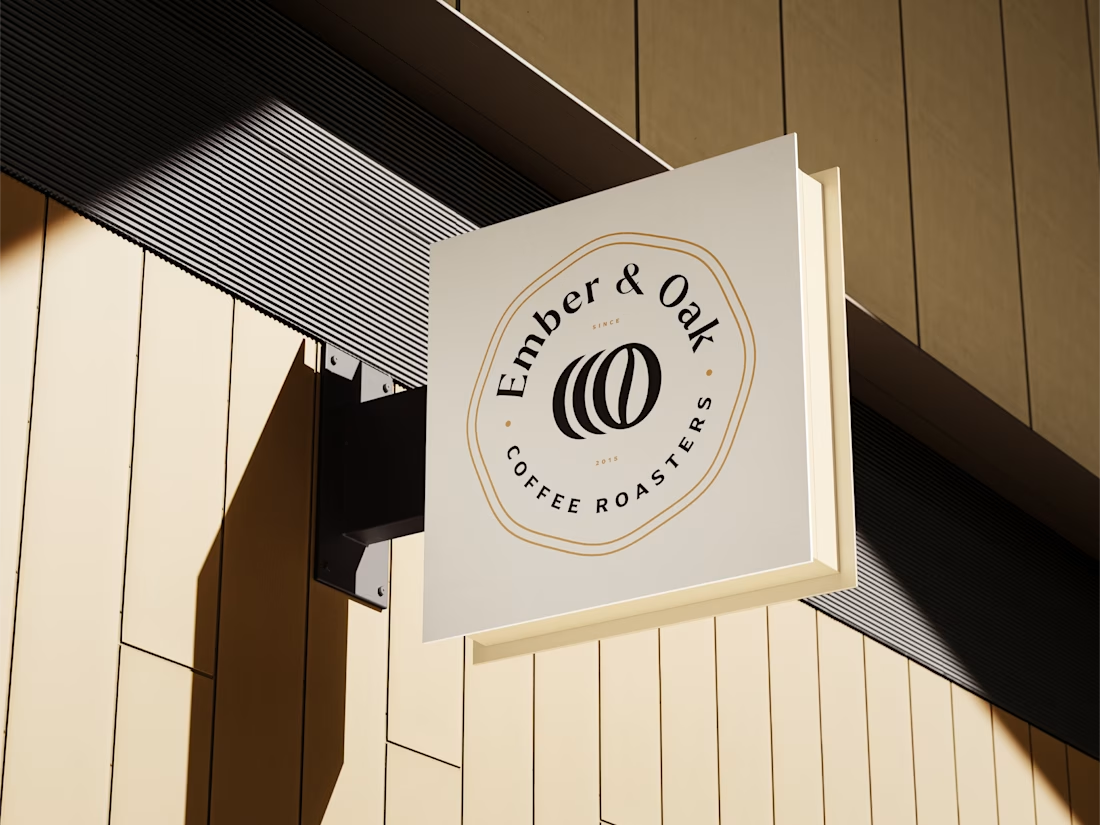
⁴ Ember & Oak — built around the truth that coffee is defined by its transformation, with the mark capturing the entire roasting journey.
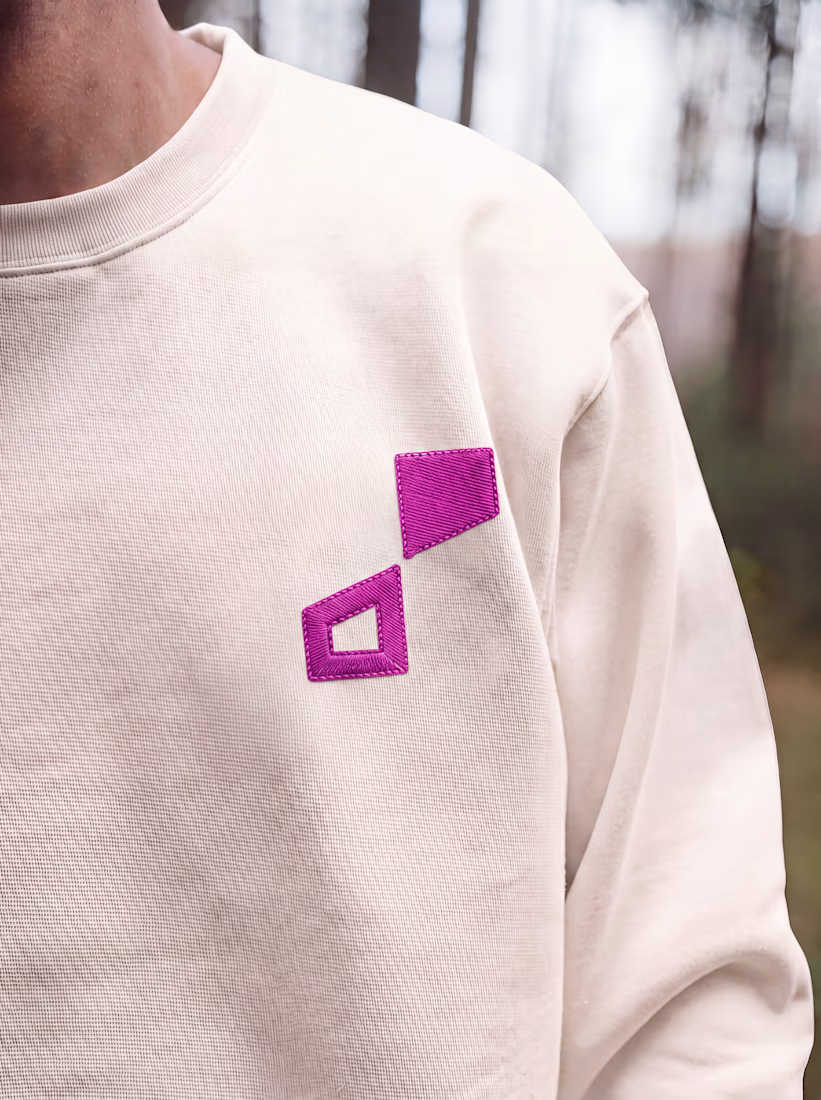
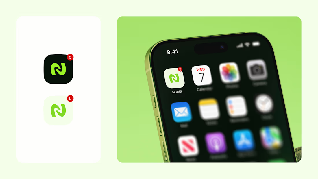
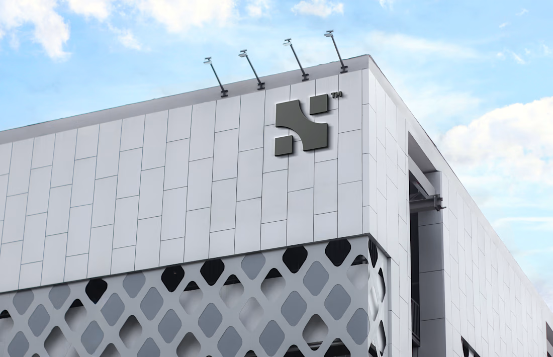

Do you usually find the story first and draw toward it, or does the story get written once the mark takes shape? The weekly-cycle idea behind Nutrift reads like it could have gone either way.

Have you ever designed packaging for a brand that never launched? 👀
Surprisingly, it’s happened to me more times than I expected.
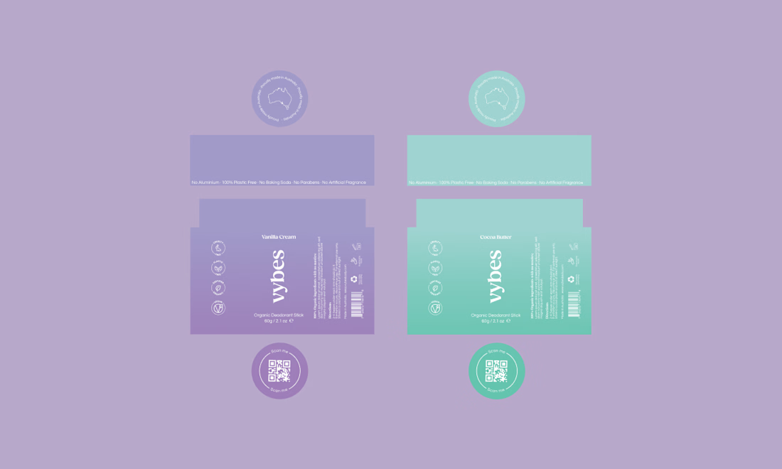
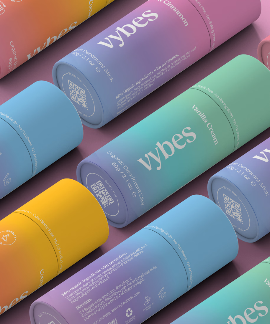
Vybes was an organic deodorant brand from Australia I worked on, designing packaging for a product that, in the end, never made it to market.
It’s a weird feeling putting so much thought into packaging for a product that people will never see on a shelf.
How many unreleased projects are hiding in your folders? 😂