The network for creativity
Join 1.25M professional creatives like you
Connect with clients, get discovered, and run your business 100% commission-free
Creatives on Contra have earned over $150M and we are just getting started
Back to feedPost


The network for creativity
Join 1.25M professional creatives like you
Connect with clients, get discovered, and run your business 100% commission-free
Creatives on Contra have earned over $150M and we are just getting started











Related posts

Title: Proper Form — Brand Identity & Visual Language
A brand identity for Proper Form built around a more modern, movement-driven take on recovery and healthcare.
The visual system extends the logo into a complete language through color, typography, imagery and layout, creating a consistent identity across different brand touchpoints.
Created by Lepisov Branding in collaboration with @Creative Mints
Logo design: Ilya Gorchanyuk
Creative direction: Dmitry Lepisov
Brand identity: Lepisov Branding × Creative Mints


Using the logo mark as the big graphic across the layouts is smart. The purple to pink gradient gives recovery a more energetic feel.

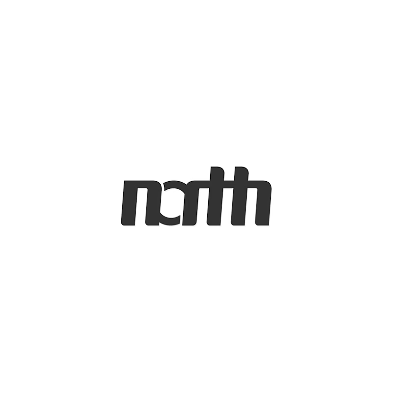
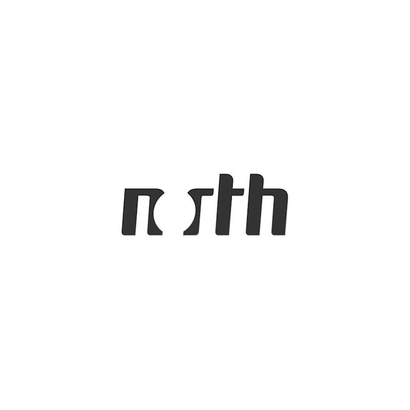
Hey everyone! 👋 Working on two wordmark directions for a client and would love a quick typographic gut check from fellow designers.
Which of these two options feels more readable to you? Drop your vote and let me know your thoughts below.
Thanks
8 voted
73%
3 voted
27%
11 votes
Closed

Hey Dumitru! 👋 Great exploration! The first option (nth) has super strong character - that custom n with the curved stem + connected sth ligature feels very bold and editorial. For readability though, the sth connection is a bit tight at small sizes - might read as "rth" at...

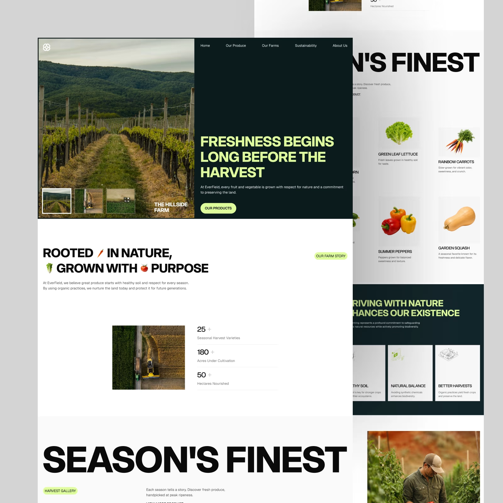
EverField — Farm & Produce Website. One of the favorite hero sections from this exploration.
Big imagery, bold type, and a simple split layout. Does this direction work for an agriculture brand?