The network for creativity
Join 1.25M professional creatives like you
Connect with clients, get discovered, and run your business 100% commission-free
Creatives on Contra have earned over $150M and we are just getting started
Back to feedPost
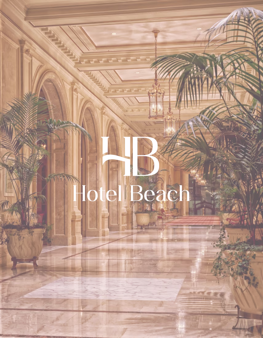
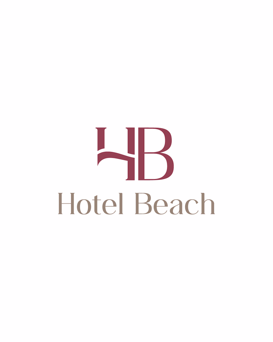
Exploring elegance through simplicity.
This logo concept combines the initials H and B into a refined monogram designed for a hospitality brand.
The flowing line subtly evokes the sea, while the typography and neutral color palette aim to convey comfort, sophistication, and trust.
My design process focuses on creating visual identities that are timeless, scalable, and memorable across both digital and print applications.
What do you think: should a hospitality logo prioritize symbolism or simplicity?
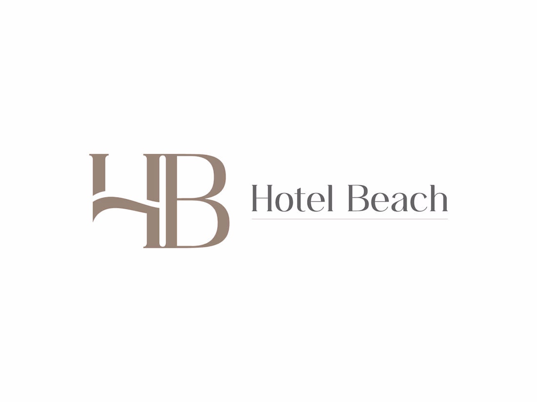
The monogram works really well, especially the stacked version with the flowing connector between H and B. Using the subtle line to evoke water without being literal is a nice restraint. The warm sand tones suit hospitality perfectly.
The network for creativity
Join 1.25M professional creatives like you
Connect with clients, get discovered, and run your business 100% commission-free
Creatives on Contra have earned over $150M and we are just getting started
Related posts
Crafting an Iconic Brand Identity. Check it out 👇
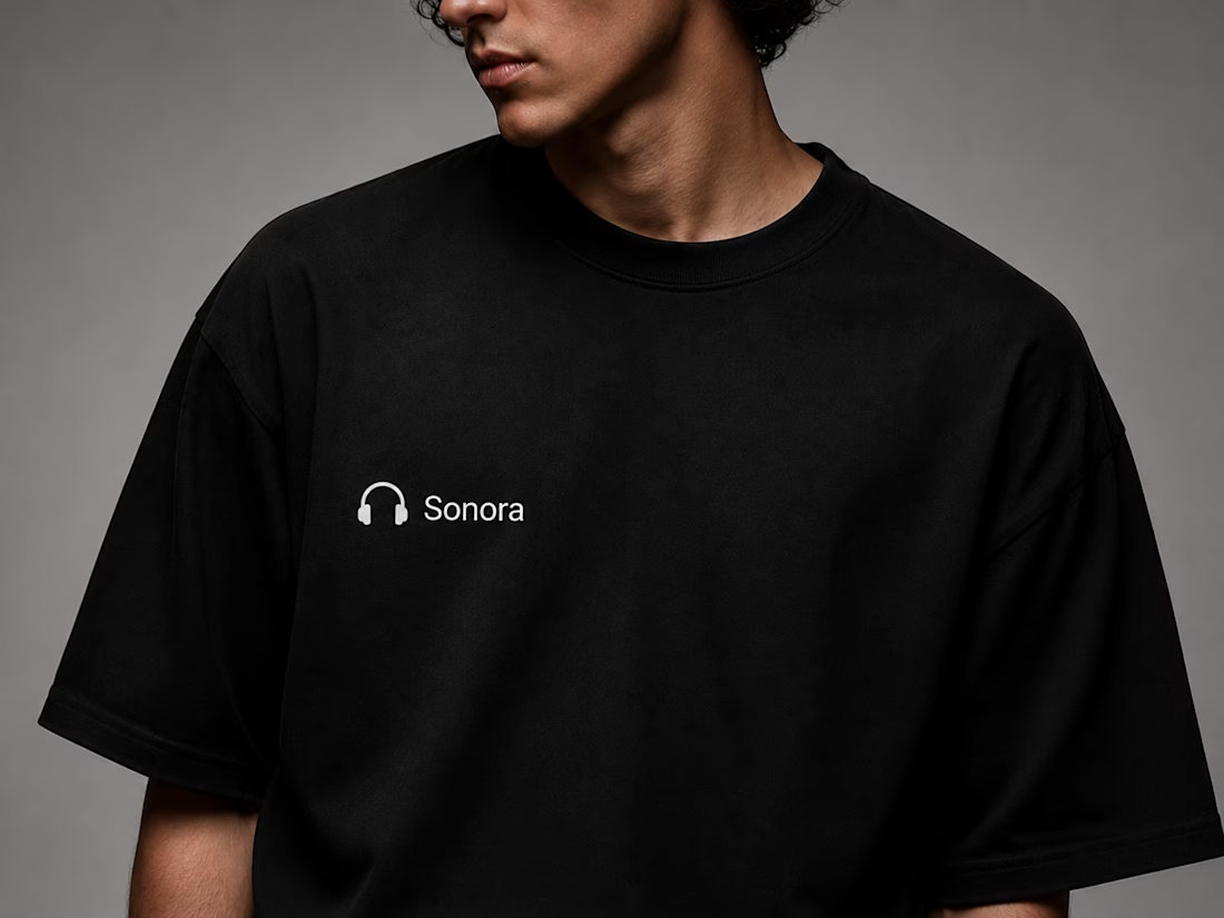
Every great brand begins with a clear vision. For Sonora, the goal was to create a premium identity that feels modern, memorable, and timeless. From the first sketch to the final brand system, every detail was designed with purpose.
This project showcases a complete branding journey—featuring a distinctive logo, carefully selected typography, a refined color palette, and versatile brand applications across digital and physical touchpoints. The result is a cohesive visual identity that reflects Sonora's commitment to innovation, quality, and exceptional audio experiences.
A strong brand is more than just a logo; it's a story, a personality, and a lasting impression. Every element works together to build recognition, trust, and consistency across every customer interaction.
✨ Brand Strategy
🎨 Logo Design
🔤 Typography System
🎯 Color Palette
📦 Brand Applications
👕 Merchandise Design
💻 Digital Experience
💬 What do you think about this branding? I'd love to hear your feedback in the comments!
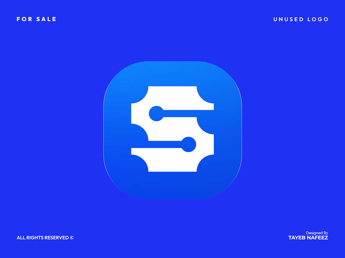
S Letter Logo — Circuit Node Mark for Tech & SaaS Brands
A geometric "S" monogram built from circuit-inspired node connections, designed for tech, SaaS, AI, and cybersecurity brands that want to signal connectivity and precision.
The mark reads clearly as an "S" while the connected nodes suggest data flow, networks, and systems — making it a natural fit for platforms, dev tools, fintech products, or security companies looking for a smart, modern identity.
What's included:
Vector logo files (AI, EPS, SVG, PDF)
Multiple color variations
Icon-only and full lockup versions
Ready for trademark filing
Fully customizable — colors, proportions, and pairing typography can be adjusted to match your brand.
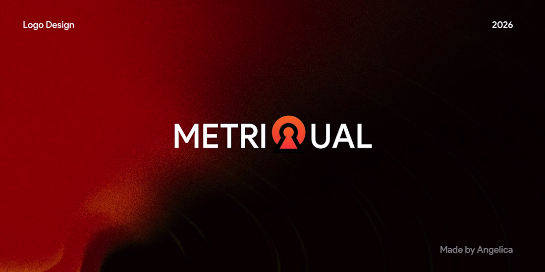
Every logo should tell a story.
For this AI SaaS concept, I merged the letter Q with a keyhole to symbolize secure access and trust.
Do you prefer logos with hidden meanings or clean, straightforward marks? #BrandIdentity #LogoDesign #SaaS
claen
Challenges
View allTrending
Claude
Claude has entered the design space. How are you using Claude Design?
Contra University
Learn from expert creatives how to earn more using next-gen AI tools.
fifaworldcup2026
The World Cup is here and the whole world's watching. How are you designing for the world stage?
creativeaiflow
Creative AI workflows are evolving. What tools do you use, and what are their strengths and weaknesses?
freelancerlife
Freelancer life is wins, pivots, and everything in between. What’s yours right now?