The network for creativity
Join 1.25M professional creatives like you
Connect with clients, get discovered, and run your business 100% commission-free
Creatives on Contra have earned over $150M and we are just getting started
Back to feedPost

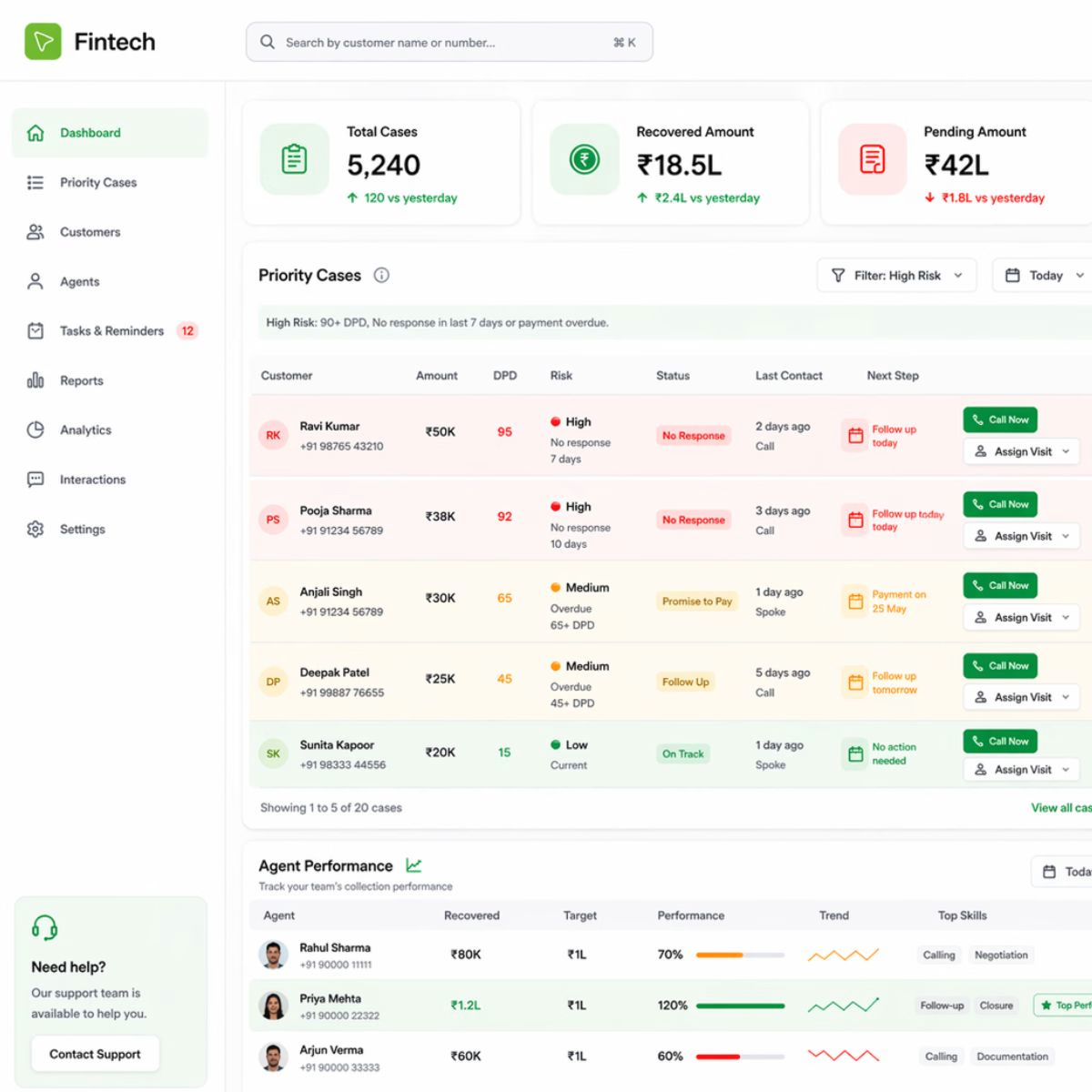
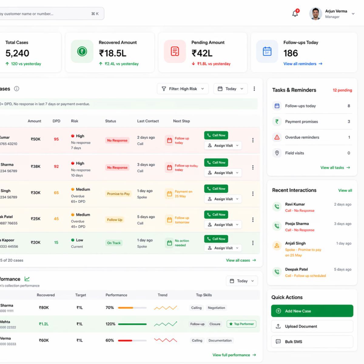
Most debt recovery dashboards show data.
But they don’t help teams take action.
So I designed a simple UX concept to improve recovery workflows
– Added follow-up tracking
– Prioritized high-risk customers
– Made actions clearer (Call / Visit)
Goal: reduce missed follow-ups and improve recovery efficiency.
Would love feedback.
#UXDesign #Fintech #ProductDesign
The network for creativity
Join 1.25M professional creatives like you
Connect with clients, get discovered, and run your business 100% commission-free
Creatives on Contra have earned over $150M and we are just getting started
Related posts

Casemate: making malware analysis feel calm instead of scary
Cybersecurity websites usually look the same: black background, green code, a hooded guy. I wanted to try the opposite for Casemate, a concept for a malware analysis tool.
The idea is simple: the product keeps a suspicious file in a sealed chamber and watches what it does. So I put a bug frozen in amber in the middle of a canyon. It’s dangerous and under control at the same time, and you get it without reading a word.
Then I made sure the page still works for a security lead who wants facts. The stats sit right next to the headline: threats isolated, latency, endpoints covered.
The hardest part was keeping it warm without losing trust. I stayed with one terracotta colour, wide capitals and mono labels, so it reads like a serious tool and not a poster.
I’m taking on new projects for SaaS and tech teams. If you have a product that’s hard to explain in one glance, send me a message.
What do you think, would you trust a security product with a canyon on the homepage?


I love it! It feels so calm, and I would definitely try it! This is amazing, Kris. I never thought cybersecurity could be this cool ❤️🔥
Landing page design for Lumo — banking for freelance life
Banks sell control — dashboards, charts, a card floating at fifteen degrees. Freelancers don't want control over their money. They want to stop thinking about it in the gap between sending an invoice and the money landing.
That gap is what the page is built on. The product sits in a meadow instead of on a dark grid, because the promise isn't "manage your finances better" — it's "we handle the part that keeps you up." And the strongest line on the page isn't a feature: no waiting for Monday. Freelancers don't lose weekends to fees. They lose them to timing.
The proof follows the same rule. One freelancer, one number — 4% lost on every international payment. A percentage someone can check against their own account beats any adjective.


great visuals 🙌

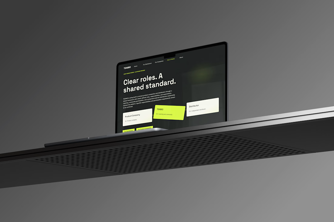
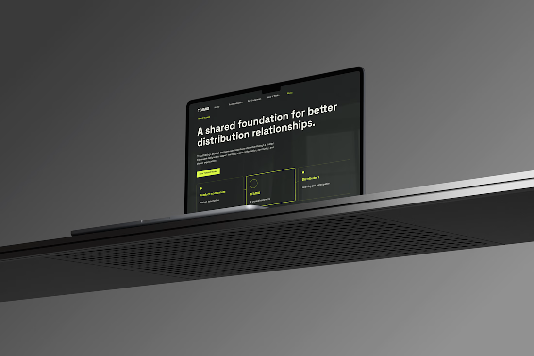
One produc Multiple experiences One cohesive design system
Meet TEAMIO a product I designed from the marketing website to the partner dashboard, bringing the entire experience together through thoughtful UX and consistent UI
Which screen is your favorite?



I like the colour combinations and the website vibes it's super elegant but still very creative 👏✅