The network for creativity
Join 1.25M professional creatives like you
Connect with clients, get discovered, and run your business 100% commission-free
Creatives on Contra have earned over $150M and we are just getting started


The network for creativity
Join 1.25M professional creatives like you
Connect with clients, get discovered, and run your business 100% commission-free
Creatives on Contra have earned over $150M and we are just getting started











Related posts

Pulse Athletics... Branding & App design✨
Check it out
#app #sport #productdesign #uiuxdesign #uidesigner #uxdesigner #pulse #branding #brandidentity #brandstrategy #brandguidelines #logo #homepage


That's really stunning app design🔥🔥🔥
Great job Ziva🎉🎉🎉

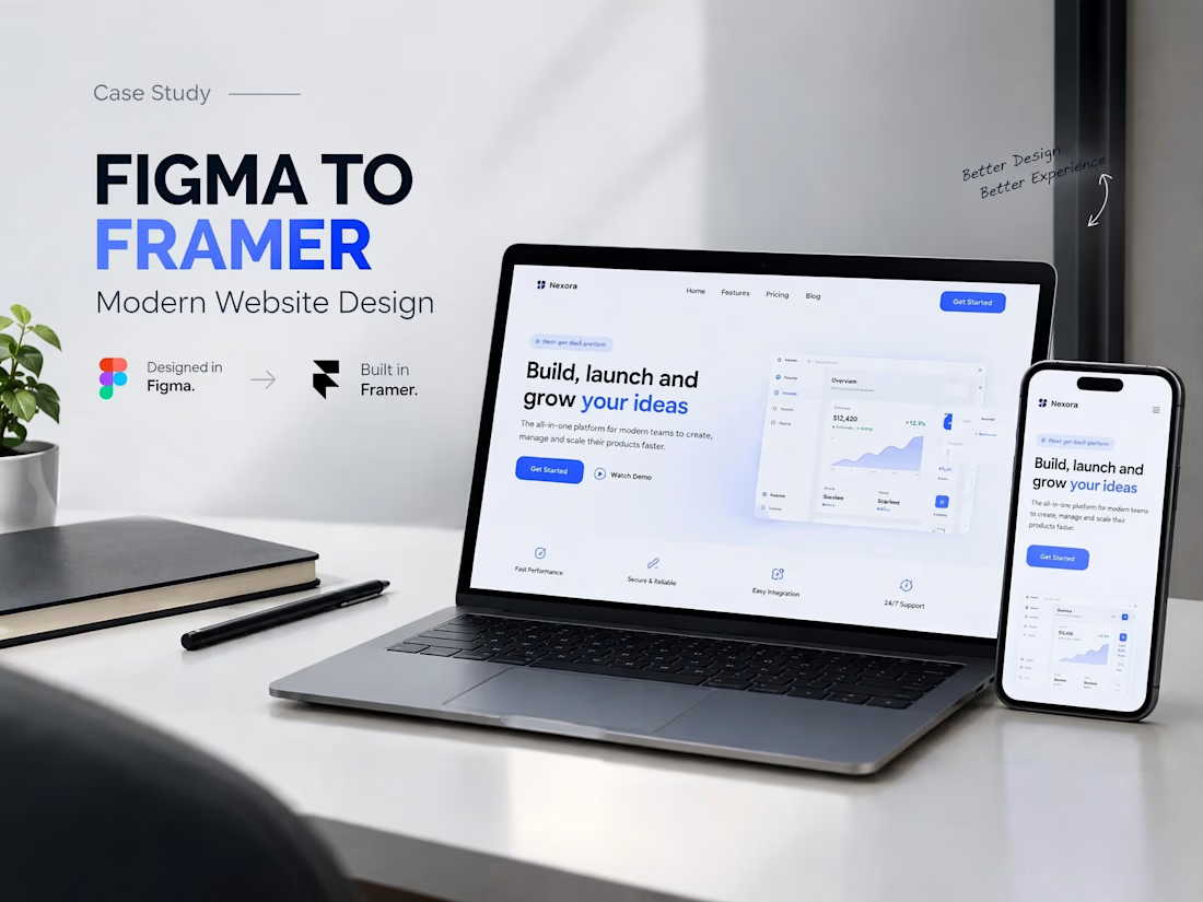
A modern SaaS website concept designed in Figma, featuring clean layouts, intuitive navigation, consistent visuals, and a user-friendly experience across different screen sizes.


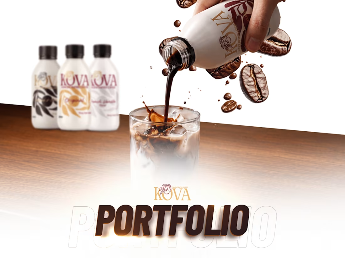
KOVA is a coffee concentrate made for busy mornings and long workdays: rich, smooth coffee that's quick to make and easy to enjoy.
I brought KOVA to life online, with one consistent look across every channel:
Website: designed and managed on Shopify, built around the product and easy to buy from
Social media: content and reels that keep the feed fresh and on brand
Ads: campaigns that put KOVA in front of the people it's made for
Need a website, content and ads that work together? Message me here on Contra. Which part of this project would you like to see in more detail?

Oh that's unique great job Awais 🎉🎉🎉
The visuals and motion effects are great ❤️❤️