The network for creativity
Join 1.25M professional creatives like you
Connect with clients, get discovered, and run your business 100% commission-free
Creatives on Contra have earned over $150M and we are just getting started
Back to feedPost


The network for creativity
Join 1.25M professional creatives like you
Connect with clients, get discovered, and run your business 100% commission-free
Creatives on Contra have earned over $150M and we are just getting started


Related posts

This morning: a design exploration.
Tonight: a whole brand.
Calling. Numbered, glitched, answered.
Case study dropping soon.
Pick up.


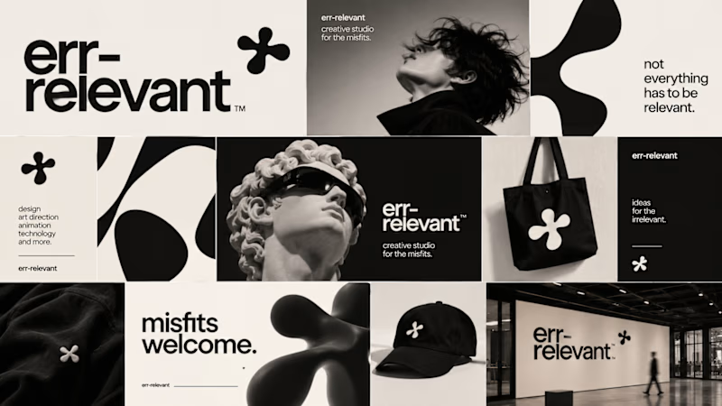
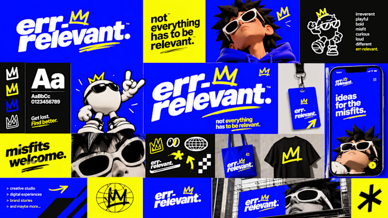
Before we begin working on any branding project, we use Curative Intelligence to explore ideas, challenge conventional thinking, and establish the creative direction.
Err-relevant is something particularly fun that we're developing at The RLVNT Studios.
Now, I'd love your inputs. Which visual direction do you think we should take forward into the main production stage?
8 voted
67%
4 voted
33%
12 votes
Closed

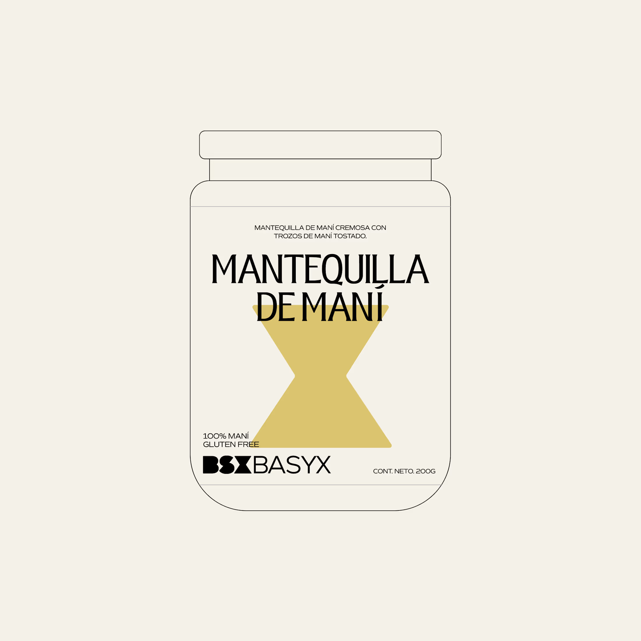
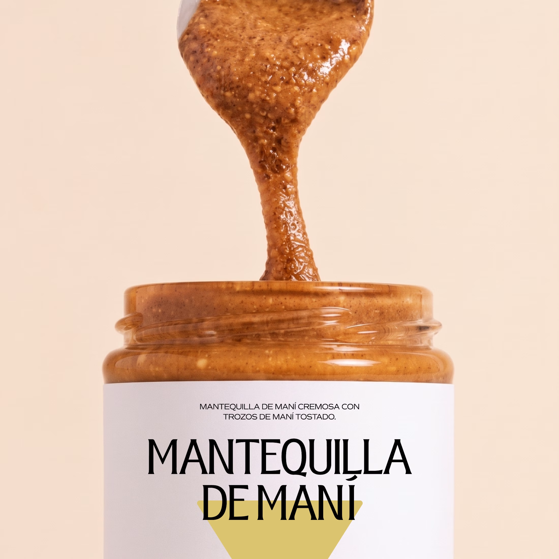
Minimal packaging is not less work. It’s MORE decisions 🤍
On a recent project, I spent a whole day on one thing: the spacing between two phrases in a label. Nobody will ever notice it. But everyone will feel it.
When there is nothing else on the label, every small adjustment has to carry the brand.
Do you also lose hours on details no client will ever mention? 😅

So true. A whole day on the spacing between two phrases sounds about right, and it's exactly why good packaging just feels right.