The network for creativity
Join 1.25M professional creatives like you
Connect with clients, get discovered, and run your business 100% commission-free
Creatives on Contra have earned over $150M and we are just getting started
Back to feedPost

SIVO — Packaging Design & Product Mockups
My ready-to-drink cocktail brand. This project showcases three flavors—Spritz, Cosmo, and Caipirinha—through bold typography, distinctive color palettes, and a consistent visual identity.
The mockups explore how the can designs work together as a product range, creating a premium presentation for digital marketing and brand development.

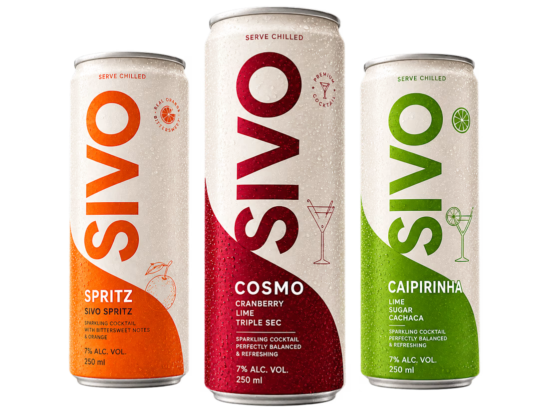

Giving each flavor its own palette while keeping the typography locked is the right call for a range. It makes the three cans read as a family on shelf and in a collection grid. For RTD cocktails I'd also check how the flavor name holds up on a multipack box, since that's often...
The network for creativity
Join 1.25M professional creatives like you
Connect with clients, get discovered, and run your business 100% commission-free
Creatives on Contra have earned over $150M and we are just getting started
Challenges
View all


Related posts




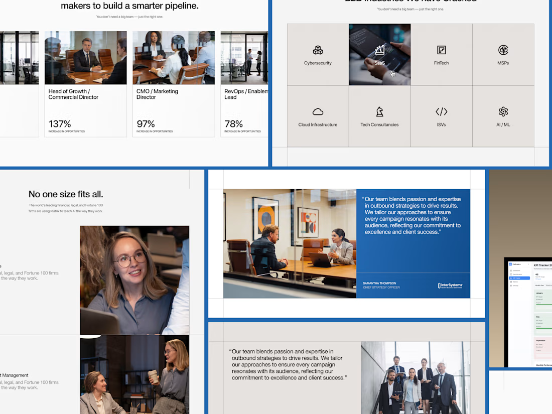
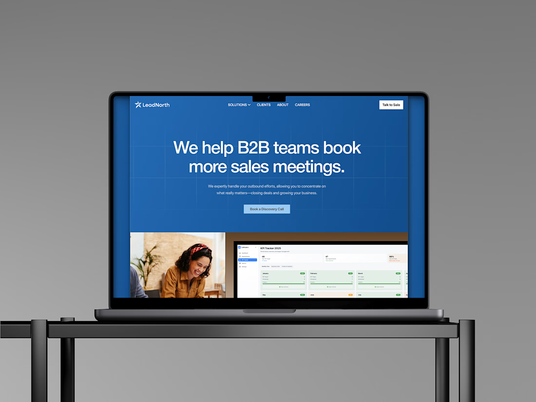
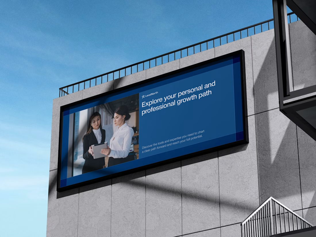
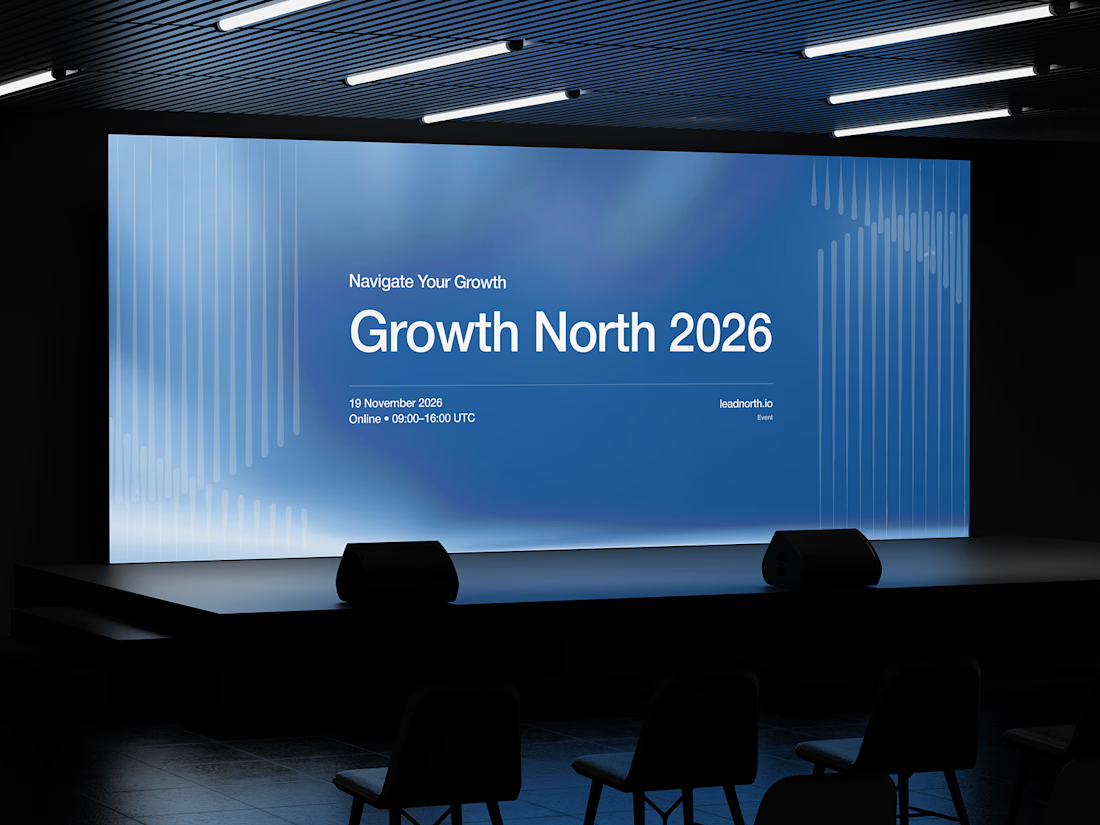


That saturated cobalt blue carries cleanly from the laptop hero onto the outdoor billboard and the Growth North 2026 stage screen.


This is one of the most beautiful pieces of art I have ever seen, with a deep message. Great work😍

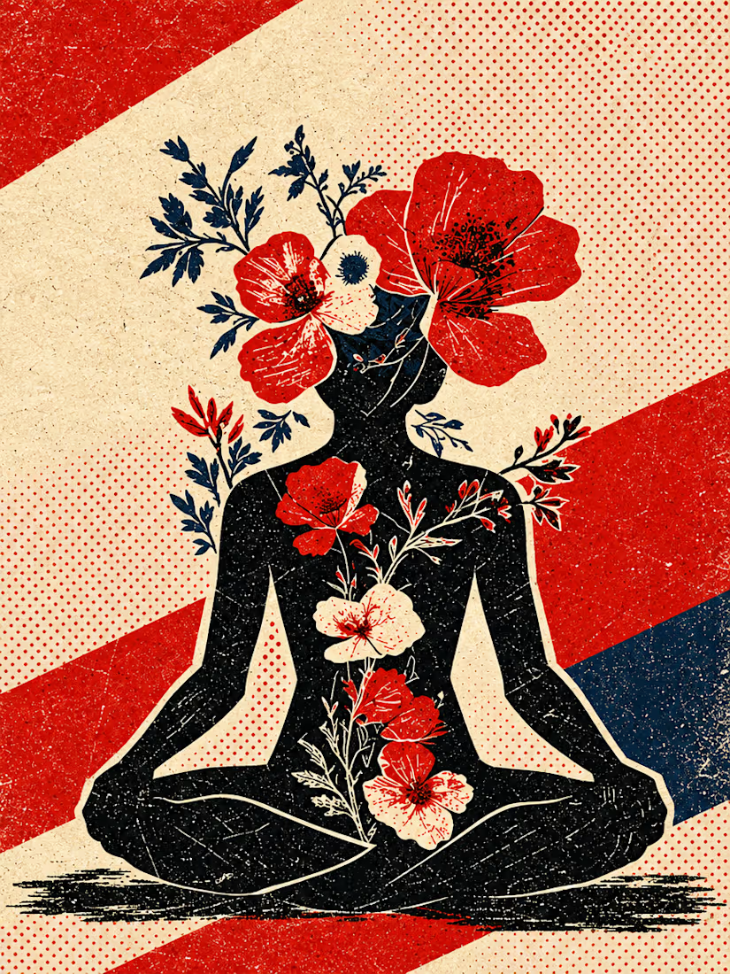
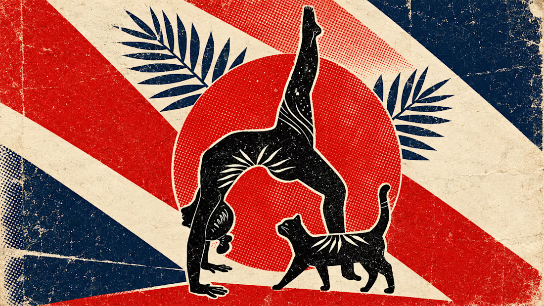
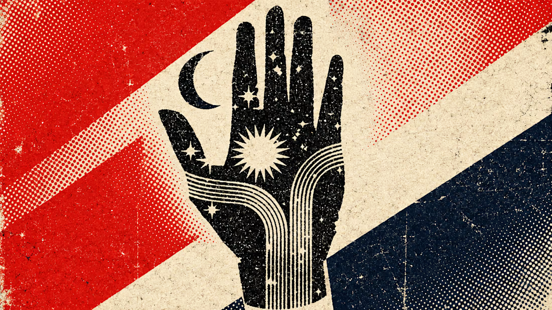
What happens when propaganda designed to erase the self gets pointed at the self instead?
Soviet propaganda spent 70 years trying to erase the individual soul in favour of the collective machine. I pointed that exact visual language at the thing it was built to suppress.
I kept...

beautiful work!