The network for creativity
Join 1.25M professional creatives like you
Connect with clients, get discovered, and run your business 100% commission-free
Creatives on Contra have earned over $150M and we are just getting started
Back to feedPost
Taste Test
Two futures, two philosophies, same road.
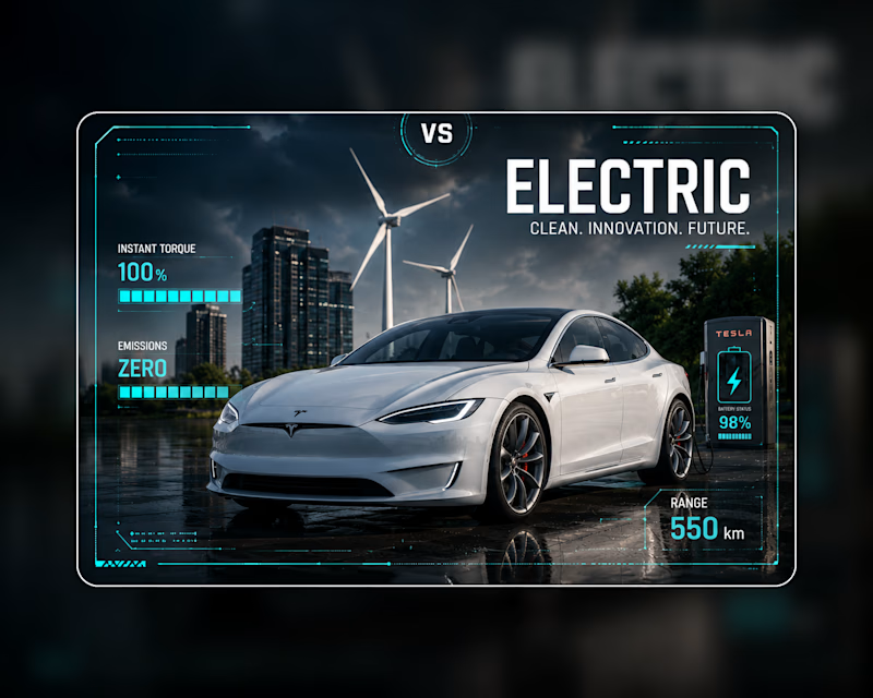
One runs on cyan and quiet, instant torque, zero emissions, a clean-energy world rendered in cool light and calm precision.
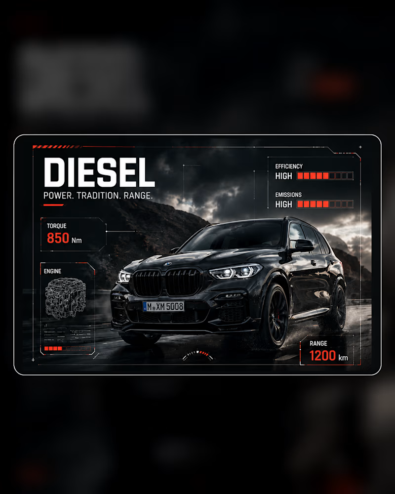
The other runs on red and rumble, brute torque, deep range, tradition that refuses to apologize for its power.
The design mirrors the divide: one interface breathes and glows, the other grips and burns.
Same story told two ways, and the palette does half the talking. Which side of the future are you driving into? 👇
#automotivedesign #brandidentity #uidesign
15 votes
Ends in 1d
Electric


Really interesting approach here. While the red and cyan color divide is the immediate hook, what caught my eye is the subtle difference in the background grid systems you used for each interface. The sharp, rigid lines on the diesel side give it a distinctly heavy, mechanical...

I like Diesel option😍
Electric

"The palette does half the talking" is a good summary of the whole exercise, cyan/glow vs red/grip communicates the philosophy before anyone reads a word. Did you start from the color story and build the UI around it, or land on the interfaces first and pick the palette to match?


started from the emotional read: cyan for the electric side because it feels clean, calm, almost clinical, the future as something engineered. Red for diesel because it's heat, combustion, aggression, power that announces itself. Once those two associations were locked, every UI...
"Palette-first keeps every element pointing at the same idea" is a good way to put it, that's the difference between a mood board and an actual design system. Makes sense why it reads so cohesive. Thanks for breaking that down.
The network for creativity
Join 1.25M professional creatives like you
Connect with clients, get discovered, and run your business 100% commission-free
Creatives on Contra have earned over $150M and we are just getting started
Related posts

Hi 😉
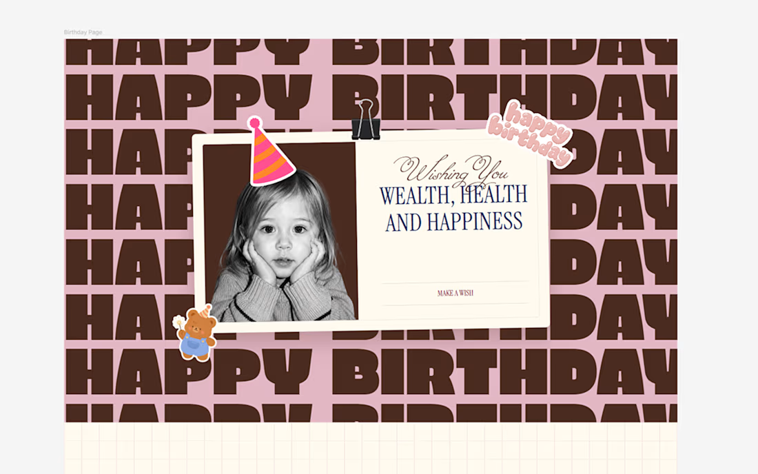
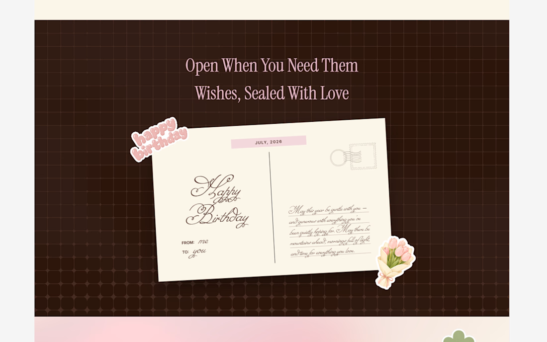
I wanted to create something more memorable for my friend's birthday. I believe the best gifts are the ones you make yourself, so instead of buying a card, I designed an interactive birthday experience in Wonder.🙌
The experience begins with opening an envelope and continues through draggable Polaroid memories, interactive vinyl records, heartfelt birthday wishes, and a birthday cake where the user can blow out the candle to complete the celebration.
Built using Wonder Chat, shader generation, and Wonder MCP to take the project from concept to a fully interactive React experience while preserving the original design.
🚀 Wonder file: https://app.wonder.so/ruslana-prymak/files/019f2e58-9a87-7317-8bc1-2312f228dd9c
😍 Live demo: https://birthday-site-green-psi.vercel.app
😊 Social Link: https://x.com/ruslana_prymak/status/2074218583765442740?s=20


This is amazing


Tech Recruit is an award-winning technology recruitment agency connecting top tech talent with innovative companies across AI, software, robotics, life sciences, semiconductors, and more.
For this project, we designed three interconnected websites for different markets: the global platform, USA Tech Recruit, and European Tech Recruit. To differentiate them while keeping the brand consistent, each received its own primary color identity: blue for the global site, yellow for the US, and green for Europe.



Homepage of the website I designed and built in Webflow for Clara Fois - Illustrator and Graphic designer from Italy 🎨
See it live: clarafois.com
Project of the day and Top 100 Websites in Art, Design & Culture 2025 on We.directory 💯


So cool 🚀.
Love the scroll flow








Trending

Claude
Claude has entered the design space. How are you using Claude Design?

Contra University
Learn from expert creatives how to earn more using next-gen AI tools.
fifaworldcup2026
The World Cup is here and the whole world's watching. How are you designing for the world stage?
creativeaiflow
Creative AI workflows are evolving. What tools do you use, and what are their strengths and weaknesses?
freelancerlife
Freelancer life is wins, pivots, and everything in between. What’s yours right now?