The network for creativity
Join 1.25M professional creatives like you
Connect with clients, get discovered, and run your business 100% commission-free
Creatives on Contra have earned over $150M and we are just getting started
Back to feedPost

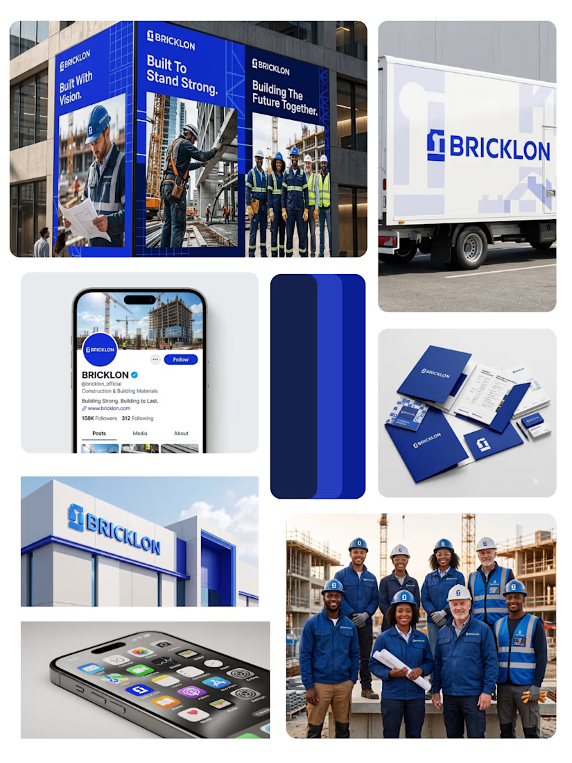
Visual Identity for BRICKLON
A visual identity concept for BRICKLON, a construction and building-materials brand.
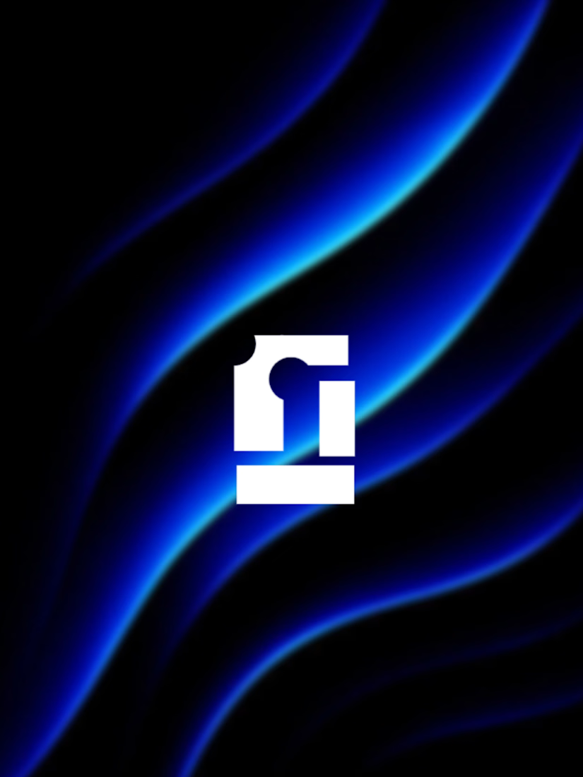
For the logo, I combined geometric forms inspired by building blocks and structural foundations to represent the strength and stability that construction is built upon. The symbol reflects the idea of individual elements coming together to form a strong and lasting structure.
For the typography, I selected Croogla for its bold, geometric character, which complements the structured nature of the logo and reinforces the brand's strong and modern personality. Geom was introduced as a complementary typeface for digital and social media applications, providing a clean and readable balance.
I then explored the visual identity across real-world brand applications to understand how the logo and overall system would translate beyond the screen from workwear and ID cards to vehicles, signage, digital platforms, and other brand touchpoints.
The network for creativity
Join 1.25M professional creatives like you
Connect with clients, get discovered, and run your business 100% commission-free
Creatives on Contra have earned over $150M and we are just getting started





Related posts


Collage

Ceya Logo & Visual Identity, 2025.
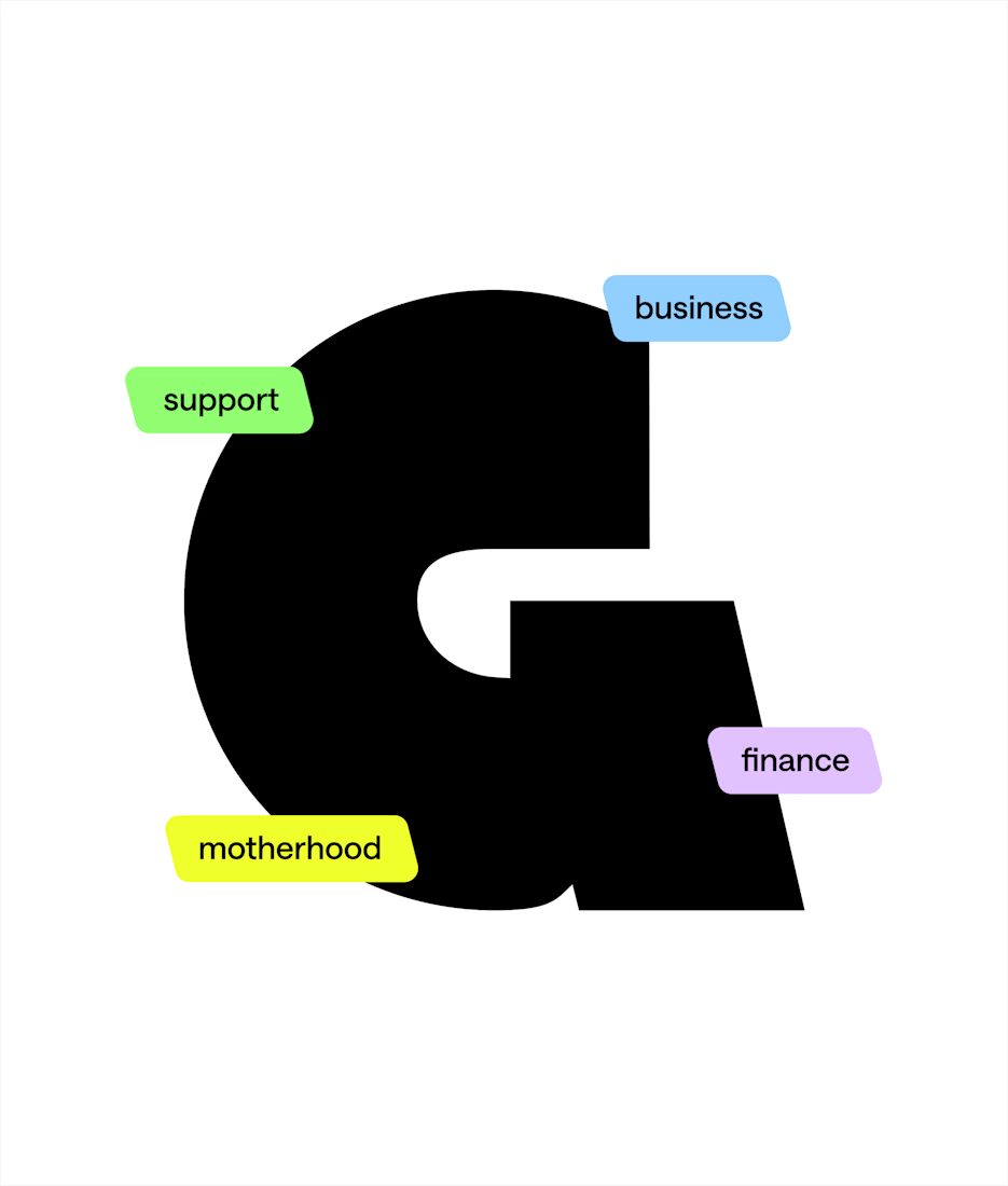
Two offset circles, one idea: a partner that’s always alongside you. 🟢🔵
Full case study in my portfolio.
Got a project ? Let's talk about it.

Great visual identity it was so attractive and unique 🎉🎉🔥🔥



Wow, I love the colors 😍