The network for creativity
Join 1.25M professional creatives like you
Connect with clients, get discovered, and run your business 100% commission-free
Creatives on Contra have earned over $150M and we are just getting started
Back to feedPost

Ceya Logo & Visual Identity, 2025.
Two offset circles, one idea: a partner that’s always alongside you. 🟢🔵
Full case study in my portfolio.
Got a project ? Let's talk about it.

Sick 🙌

The offset green/blue circles read instantly as “alongside” without needing a wordmark explain — nice restraint on a dark field. Curious how tight the overlap gets at favicon/social sizes; that’s usually where this kind of dual-circle mark either stays legible or turns into a blob.


Wow 😍 looks amazing

Seeing the construction circles behind the C makes the offset idea click. The clean crescent holds up well.

Great visual identity it was so attractive and unique 🎉🎉🔥🔥

Your visual thinking is great; nice work

Two offset circles forming a C is a clean way to say "a partner always alongside you". The idea is simple enough to hold at small sizes, and the crescent cut gives it just enough character to be ownable.
The network for creativity
Join 1.25M professional creatives like you
Connect with clients, get discovered, and run your business 100% commission-free
Creatives on Contra have earned over $150M and we are just getting started





Related posts




🔥 🔥






Great work!

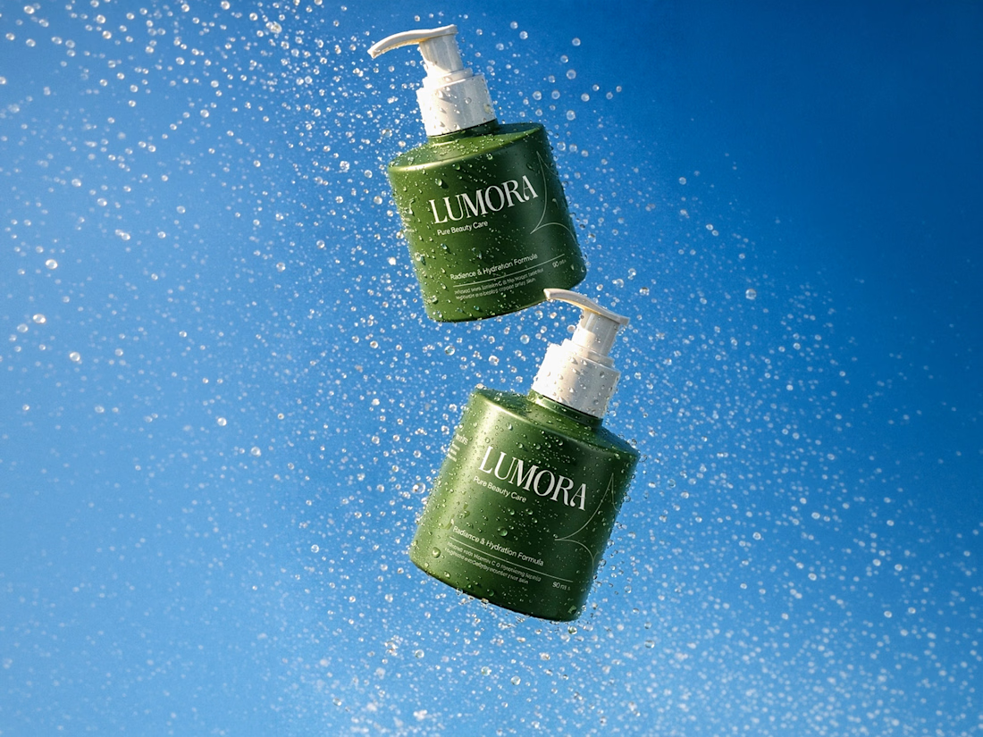
Wellness brand exploration
- Logo and identity exploration done in Figma
- Mockups done with @Kittl
- Brand video - Claude Opus 5.5

Love this!