The network for creativity
Join 1.25M professional creatives like you
Connect with clients, get discovered, and run your business 100% commission-free
Creatives on Contra have earned over $150M and we are just getting started
Back to feedPost

I have seen founders lose an investor's attention the exact second their financial slide appears.
When I engineered this specific layout, I had one single goal.
Absolute control over the reader's focus.
The most common mistake founders make is treating a financial slide like a dumping ground for raw Excel charts.
They throw every possible data point onto the canvas and hope the investor will somehow extract the right story.
That never happens.
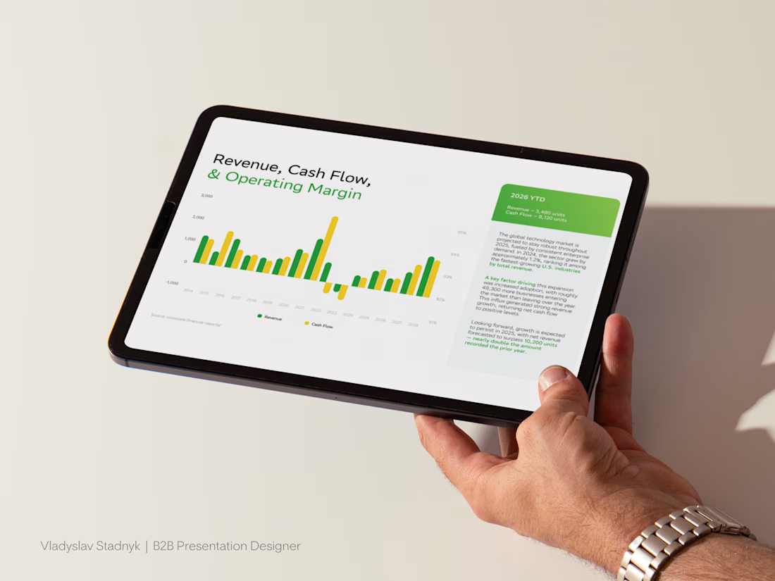
When I designed the architecture for this financial slide, my primary task was to completely remove cognitive friction.
I intentionally positioned the macro trend on the left side of the canvas.
Then I built a rigid green container on the right specifically for the 2026 YTD metrics and paired it with a tight context block.
This reading pattern is strictly engineered.
The investor absorbs the big picture first.
Then their eyes are instantly pulled to the main result locked inside the green box.
Only after they register that hard traction do they read the explanation of why those numbers matter.
Professional commercial design is never about making data look pretty.
It is about turning dry numbers into a highly controlled business narrative.
Stop letting chaotic charts ruin your pitch.
If you want your financial slides to be absolutely flawless and command investor attention, send me a message 📩
Presentation DesignpresentationtemplateslidedesignPitch Deck DesignerUI DesignAdobe PhotoshopFigmaGoogle Slides


The network for creativity
Join 1.25M professional creatives like you
Connect with clients, get discovered, and run your business 100% commission-free
Creatives on Contra have earned over $150M and we are just getting started



Related posts


Which homepage would make you more likely to explore the platform?
HackStack features bold typography, teal gradients, and a centered layout focused on AI tools and automation. DataVistaHQ uses purple accents, a split layout, and a prominent dashboard preview to introduce its business intelligence platform.
I would like your perspective on the visual design, clarity, and first impression. Which approach communicates its value more effectively and makes you want to take the next step?
Vote for your preferred design and share what influenced your choice: the colors, headline, layout, dashboard preview, or overall presentation.
#WebDesign #AIWebsites #UIUXDesign #SaaSDesign #TransformedDesign


2 voted
17%

10 voted
83%

12 votes
Closed

Visually, I lean toward DataVistaHQ, but the cognitive load is really high. The value proposition and the stats feel like they're competing for attention.
On the other hand, HackStack has a much better visual hierarchy. The value proposition and CTA group immediately give me a...


Dark!

🚀 Just completed the UX/UI design and website redesign for Spartan SEM!
The goal was to bring their refreshed brand identity to life with a modern, conversion-focused website and a better user experience.
Really enjoyed working with the team and seeing the design go live!


This is amazing