The network for creativity
Join 1.25M professional creatives like you
Connect with clients, get discovered, and run your business 100% commission-free
Creatives on Contra have earned over $150M and we are just getting started
Back to feedPost

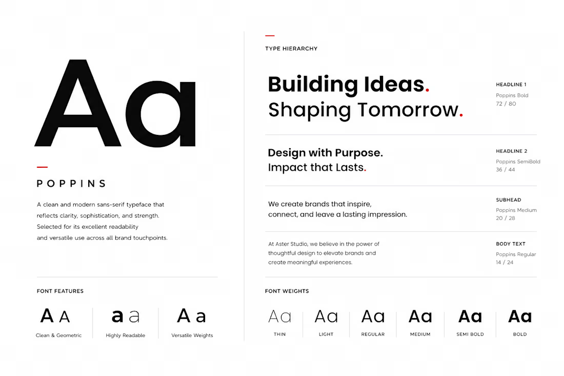
Typography is a fundamental part of a brand identity, influencing how information is communicated and how the brand is perceived. For Aster Studio, a modern sans-serif type system was selected to reinforce clarity, professionalism, and visual consistency across all communication channels. The chosen typography reflects the studio's commitment to clean design while ensuring readability in both digital and print environments.
A clear hierarchy was established by defining specific styles for headings, subheadings, body text, and supporting content. This structured approach improves the user experience by making information easier to navigate while maintaining a cohesive visual language throughout the brand. Careful attention was also given to spacing, alignment, font weights, and scale to create balanced compositions that feel refined and intentional.
Beyond aesthetics, the typography system was designed for flexibility. Whether applied to presentations, websites, social media, business stationery, marketing materials, or brand guidelines, the typefaces work together to create a consistent and recognizable identity. This approach ensures every piece of communication reflects the same level of professionalism, helping strengthen the brand's credibility and long-term recognition.


The network for creativity
Join 1.25M professional creatives like you
Connect with clients, get discovered, and run your business 100% commission-free
Creatives on Contra have earned over $150M and we are just getting started
Related posts


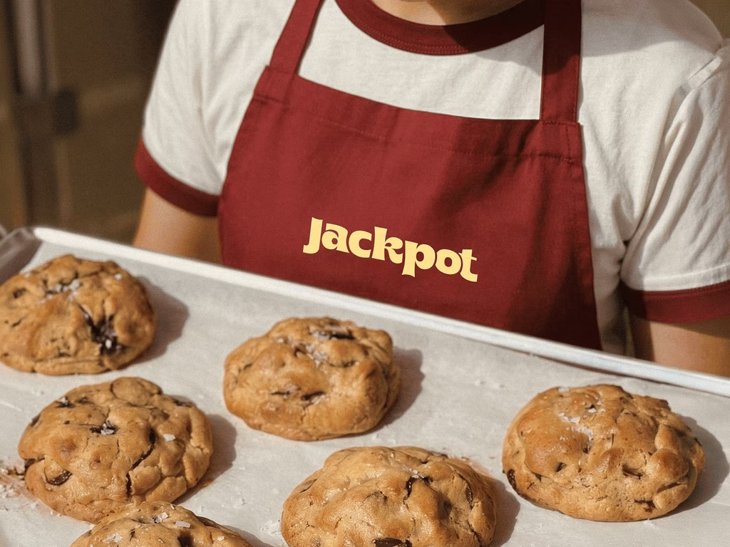
Added a new case study! This was such a fun project: a rebrand for a local cookie company.
Our goal was to transform the brand into something that felt like an everyday celebration through bold typography, playful details, and a fresh visual identity.
Brand DesignCreative DirectionGraphic DesignAdobe IllustratorAdobe Photoshopfoodandbeveragebrandrefreshbranddesigner

COol

Which visual design style do you prefer? Help me decide.
19 voted
63%
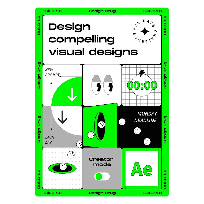
11 voted
37%
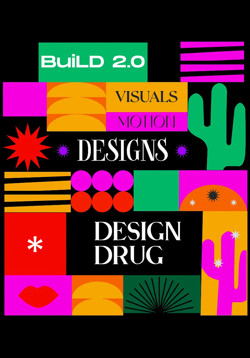
30 votes
Closed

Option 1




Nice 👍








Trending

Claude
Claude has entered the design space. How are you using Claude Design?

Contra University
Learn from expert creatives how to earn more using next-gen AI tools.
fifaworldcup2026
The World Cup is here and the whole world's watching. How are you designing for the world stage?
creativeaiflow
Creative AI workflows are evolving. What tools do you use, and what are their strengths and weaknesses?
freelancerlife
Freelancer life is wins, pivots, and everything in between. What’s yours right now?