Adeogun Emmanuel - Brand Designer | ContraWork by Adeogun Emmanuel
Adeogun Emmanuel

Adeogun Emmanuel

Visual Designer for Modern Brands

New to Contra

Adeogun is ready for their next project!

Cover image for The final presentation brings together
The final presentation brings together every stage of the Aster Studio brand identity into one cohesive and unified visual system. From the initial strategy and creative direction to the logo development, typography, color palette, supporting graphic elements, and real-world applications, every component was carefully designed to communicate a consistent and memorable brand experience. This project demonstrates how strategic thinking and thoughtful design work together to create an identity that is both visually compelling and highly functional. The objective was to develop a timeless identity capable of adapting across a wide range of digital and print environments without losing its clarity or recognition. Each design decision was made with scalability, usability, and long-term consistency in mind, ensuring that the brand remains effective across marketing materials, social media, business stationery, presentations, signage, merchandise, and future brand extensions. This project reflects my approach to brand identity design—combining research, strategy, creativity, and technical execution to build brands that are meaningful, adaptable, and built to last. Rather than delivering only a logo, the outcome is a complete identity system designed to strengthen brand recognition, establish credibility, and create lasting value for businesses across every customer touchpoint.
1
1
62
Cover image for Brand mockups are an essential
Brand mockups are an essential part of presenting a complete identity system because they demonstrate how the brand performs in real-world environments. For Aster Studio, a range of mockups was created to showcase the visual identity across various physical and digital applications, allowing the branding to be experienced beyond static design files. These presentations help bridge the gap between concept and reality by illustrating how the identity functions in practical use. The mockups include applications such as office signage, branded stationery, packaging, promotional materials, merchandise, and digital devices. Each application was carefully selected to reinforce the versatility of the identity while maintaining consistency with the established logo, typography, color palette, and supporting graphic elements. The clean presentation highlights how every component works together to create a unified and professional brand experience. Beyond enhancing the visual presentation, these mockups provide clients with a realistic preview of how their brand could appear in everyday business environments. This stage strengthens confidence in the identity system, demonstrates its adaptability across multiple touchpoints, and emphasizes the importance of consistency in building a memorable and recognizable brand.
0
36
Cover image for Business stationery is one of
Business stationery is one of the first physical touchpoints between a brand and its audience. The business card for Aster Studio was designed to reflect the same level of professionalism, simplicity, and attention to detail found throughout the brand identity. Rather than serving only as a contact card, it functions as an extension of the brand, reinforcing credibility and leaving a lasting impression during client interactions and networking opportunities. The layout follows a clean and minimal approach, allowing the logo, typography, and brand colors to communicate clearly without unnecessary distractions. Every design element was carefully aligned to create visual balance while ensuring readability and functionality. Premium spacing, consistent typography, and strategic use of the brand's signature colors contribute to a refined presentation that aligns with the overall identity system. This application demonstrates how the visual identity performs in real-world print environments while maintaining consistency with the brand guidelines. The result is a professional business card that strengthens brand recognition, communicates trust, and provides a memorable experience for potential clients and business partners.
0
37
Cover image for A strong brand identity must
A strong brand identity must remain consistent across digital platforms, making social media an essential part of the overall branding system. For Aster Studio, a collection of branded social media assets was developed to ensure every post, announcement, promotion, and campaign reflects the same professional visual identity. The objective was to create templates that are visually engaging while maintaining a clean, modern, and recognizable appearance. Each design follows the established brand guidelines, incorporating the approved color palette, typography, logo usage, and graphic elements. A structured layout system was created to provide flexibility for different content types while preserving consistency across all platforms. This approach allows the brand to communicate effectively without sacrificing its visual identity or overall professionalism. Beyond aesthetics, these assets were designed to improve efficiency by providing reusable templates that simplify future content creation. Whether promoting services, sharing updates, or engaging with audiences, the social media system ensures every piece of communication strengthens brand recognition, builds trust, and delivers a cohesive experience across digital channels.
4
8
145
Cover image for Supporting graphic elements play an
Supporting graphic elements play an important role in extending a brand beyond its logo. For Aster Studio, a collection of custom patterns, geometric shapes, and visual assets was developed to create a richer and more flexible identity system. These elements were designed to complement the primary branding while maintaining consistency across every customer touchpoint. Each graphic element follows the same visual principles established throughout the identity, including clean geometry, balanced spacing, and the brand's signature color palette. Rather than serving as decorative additions, these assets help reinforce recognition, improve visual storytelling, and provide designers with a consistent system that can be applied across marketing materials, presentations, social media, packaging, and digital experiences. The pattern system also introduces depth and personality without competing with the logo or core identity. By using these elements strategically, the brand remains visually engaging while preserving clarity and professionalism. Together, they create a cohesive visual language that strengthens brand recognition, enhances communication, and ensures consistency across a wide range of applications and future creative projects.
0
22
Cover image for Typography is a fundamental part
Typography is a fundamental part of a brand identity, influencing how information is communicated and how the brand is perceived. For Aster Studio, a modern sans-serif type system was selected to reinforce clarity, professionalism, and visual consistency across all communication channels. The chosen typography reflects the studio's commitment to clean design while ensuring readability in both digital and print environments. A clear hierarchy was established by defining specific styles for headings, subheadings, body text, and supporting content. This structured approach improves the user experience by making information easier to navigate while maintaining a cohesive visual language throughout the brand. Careful attention was also given to spacing, alignment, font weights, and scale to create balanced compositions that feel refined and intentional. Beyond aesthetics, the typography system was designed for flexibility. Whether applied to presentations, websites, social media, business stationery, marketing materials, or brand guidelines, the typefaces work together to create a consistent and recognizable identity. This approach ensures every piece of communication reflects the same level of professionalism, helping strengthen the brand's credibility and long-term recognition.
1
44
Cover image for Color plays a critical role
Color plays a critical role in shaping how a brand is perceived. For Aster Studio, the color palette was intentionally developed to communicate confidence, professionalism, and creativity while maintaining a clean and modern aesthetic. Each color was carefully selected to support the brand's personality and create a consistent visual experience across every touchpoint. The combination of black, white, and red establishes a strong visual hierarchy. Black represents sophistication, authority, and reliability. White creates clarity, balance, and simplicity, allowing the identity to breathe and remain timeless. Red serves as the primary accent color, introducing energy, confidence, and visual emphasis without overwhelming the overall design. Beyond aesthetics, the palette was created with versatility in mind. The colors perform effectively across digital interfaces, printed materials, packaging, social media, and large-scale applications while maintaining excellent contrast and accessibility. This cohesive color system strengthens brand recognition, ensures consistency across all communications, and provides a flexible foundation for future brand growth.
0
12
Cover image for A strong visual identity requires
A strong visual identity requires more than a single logo. To ensure flexibility across different platforms and applications, a complete system of logo variations was developed for Aster Studio. Each version was designed to maintain the brand's integrity while adapting seamlessly to different formats, backgrounds, and communication needs. The identity includes primary, secondary, icon, horizontal, and monochrome variations, allowing the brand to remain consistent whether displayed on websites, social media, business stationery, packaging, merchandise, or large-scale signage. Every variation follows the same design principles, proportions, and visual language, ensuring recognition regardless of where the logo appears. This adaptable system allows the brand to respond to different design requirements without compromising its visual identity. By creating multiple approved versions of the logo, the brand remains professional, scalable, and instantly recognizable across both digital and print environments, providing a cohesive experience for every audience interaction.
0
13
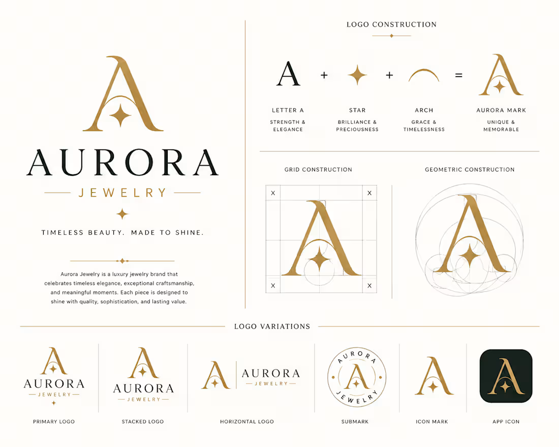
Cover image for The logo construction process focused
The logo construction process focused on creating a mark that is both visually distinctive and structurally balanced. Every element was carefully developed using geometric principles, consistent proportions, and intentional spacing to ensure the logo remains clear, scalable, and recognizable across all applications. Rather than relying on decorative elements, the design embraces simplicity and precision, allowing the identity to communicate professionalism and confidence at any size. The construction system establishes clear relationships between shapes, alignment, and spacing, ensuring the logo maintains its integrity whether it appears on digital platforms, printed materials, signage, or branded merchandise. This structured approach also creates a solid foundation for future brand expansion. By following a well-defined construction system, the identity remains flexible while preserving consistency across every touchpoint. The result is a timeless logo that reflects the studio's commitment to thoughtful design, strategic branding, and lasting visual impact.
0
18
Cover image for The visual direction for Aster
The visual direction for Aster Studio was established through careful exploration of design references, architectural forms, typography, color relationships, and modern branding systems. This stage was essential in defining the overall personality of the brand before creating any visual assets. The moodboard was developed to communicate a clean, contemporary, and premium aesthetic that reflects creativity, precision, and professionalism. Every reference was selected to reinforce the brand's positioning as a trusted visual design studio capable of delivering strategic and impactful branding solutions. Rather than simply collecting inspiration, this process helped identify a consistent design language that would guide every creative decision throughout the project. The moodboard ensured that the logo, typography, color palette, layouts, and supporting brand assets all worked together as one cohesive identity. By establishing a clear creative direction from the beginning, the final brand system remains visually consistent, memorable, and adaptable across both digital and print applications.
2
1
55
Cover image for Every successful brand begins with
Every successful brand begins with a clear purpose before any visual elements are created. For Aster Studio, the objective was to develop a brand identity that reflects creativity, professionalism, and trust while maintaining a modern and minimal aesthetic. The strategy focused on positioning the studio as a premium creative partner for businesses seeking high-quality branding and visual design solutions. The visual direction was inspired by simplicity, structure, and confidence, ensuring that every design decision aligned with the brand's values and long-term vision. Rather than following short-term trends, the identity was built to remain timeless, adaptable, and recognizable across different industries and platforms. This strategic foundation guided every stage of the project—from logo development and typography selection to color choices and brand applications—resulting in a cohesive identity system designed to create lasting impressions and meaningful connections with clients.
0
29
Cover image for Aster Studio is a modern
Aster Studio is a modern visual design and branding studio created to help businesses communicate with clarity, confidence, and consistency. This project explores the complete development of a premium brand identity, from strategic thinking to practical applications. The goal was to create a timeless visual system that reflects professionalism while remaining flexible across both digital and print environments. Every element of the identity was designed to work together seamlessly—from the logo and typography to the color palette, brand assets, and mockups. Rather than focusing on aesthetics alone, the project emphasizes functionality, scalability, and long-term brand recognition. The result is a cohesive identity that strengthens credibility, improves visual consistency, and creates a memorable experience across every customer touchpoint.
0
32
Cover image for A vibrant event poster created
A vibrant event poster created to promote a music festival using bold typography, engaging visuals, and a clear information hierarchy. The design is optimized for both social media promotion and print, ensuring maximum audience engagement.
0
92
Cover image for A premium product advertisement concept
A premium product advertisement concept designed to highlight a modern energy drink with bold visuals, dynamic typography, and high-impact branding. The design focuses on grabbing attention while communicating energy, performance, and a strong brand identity across digital marketing platforms.
0
52
Cover image for This is a concept X
This is a concept X (Twitter) banner designed for a fictional cryptocurrency exchange called Nexora. The goal was to create a modern, high-converting banner that communicates trust, innovation, and professionalism. I focused on clean typography, a premium Web3 visual style, strong branding, and a user-friendly layout to help the brand stand out on social media.
0
55
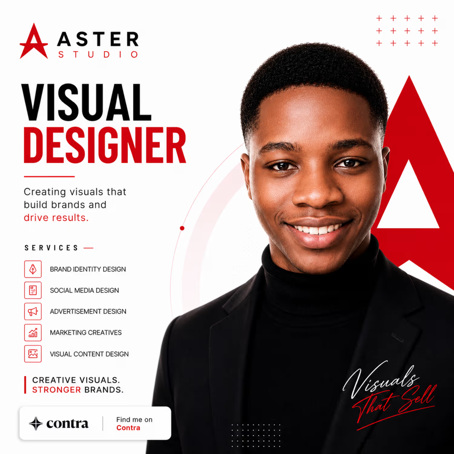
Cover image for Aster Studio is a branding
Aster Studio is a branding concept created to showcase my approach to modern visual design. I developed a clean and professional identity using bold typography, a red-and-white color palette, and a strategic layout that helps businesses stand out. This project demonstrates my ability to create designs that strengthen brand identity and communicate clearly with target audiences.
0
61