The network for creativity
Join 1.25M professional creatives like you
Connect with clients, get discovered, and run your business 100% commission-free
Creatives on Contra have earned over $150M and we are just getting started
Back to feedPost

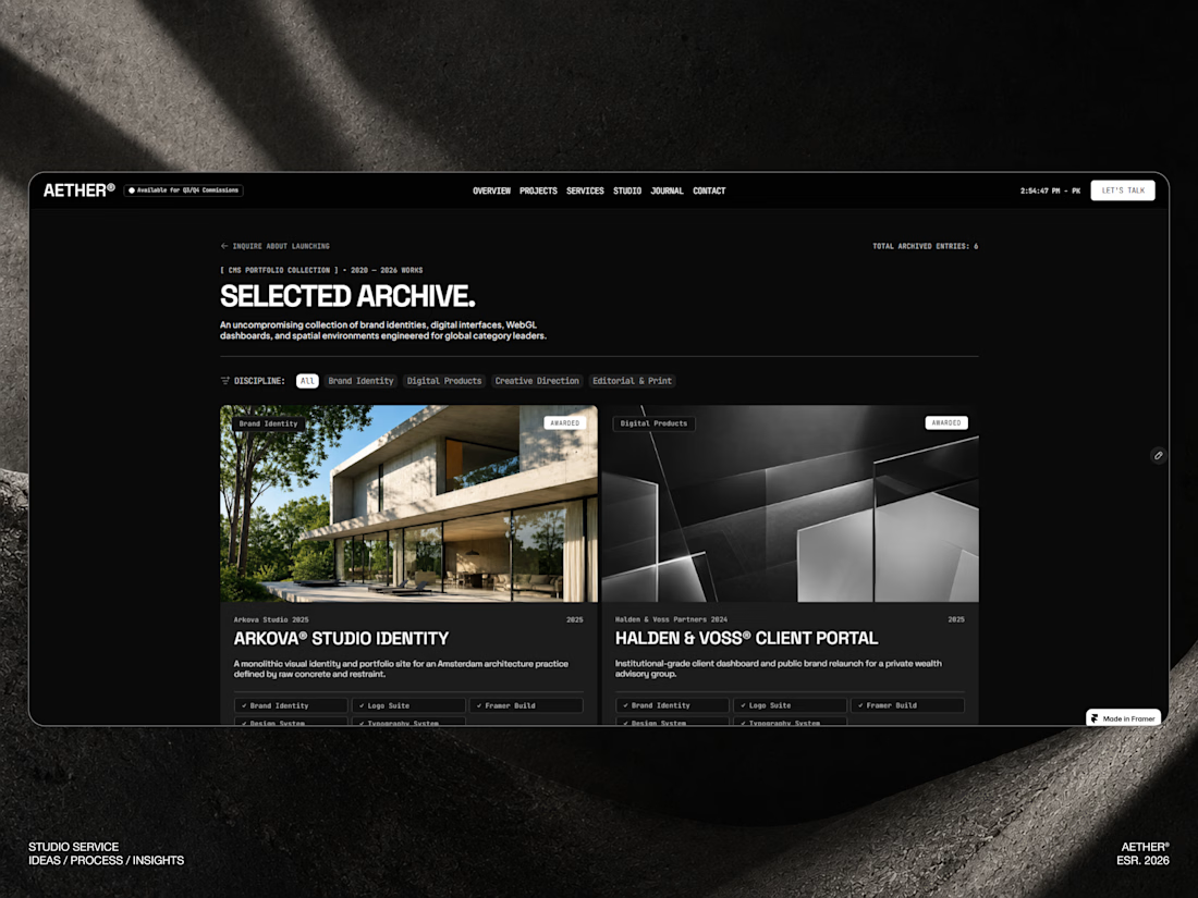
A question I keep coming back to while building templates: what actually separates a "nice-looking" site from one that still feels sharp on page 5?
For AETHER, the answer was restraint one rule, applied everywhere: nothing gets added unless removing it makes the design worse.
Curious how other creators here think about consistency vs. flexibility in a design system where do you draw that line?


That restraint rule is such a strong filter—repeating it across type, spacing, and interaction is what makes a multi-page system feel sharp instead of merely polished.
The network for creativity
Join 1.25M professional creatives like you
Connect with clients, get discovered, and run your business 100% commission-free
Creatives on Contra have earned over $150M and we are just getting started



Related posts

New here, so I'm slowly filling in my portfolio and getting to know the place. So far I like it.
Here's an extract from Software Intelligence, a Framer site I designed and built a few months ago for an enterprise data consulting startup.
The visual idea mirrors what they do with data: compact blocks that animate, break apart and recompose, like charts taking shape. Few effects, all consistent, everything managed through the CMS.
If you have a minute, take a look at the full case study.
I'd love to know what you think, especially whether the motion supports the content or ends up overpowering it.

You're very welcome, Francesco — glad the note landed. The motion in that extract really does the heavy lifting for the content, so keep sharing your work here. Looking forward to seeing what's next from you. ✌️

Framer agent templates are out, and seven of mine are in 🔥
Plakat, Datum, Halation, Parallel, Tender, Signal and Oda.
An agent template is built for Framer's agent to work on. Every colour and text style has a name that says what it's for, there's a design system page, and skills that tell the agent how the site fits together.
So you can ask for a rebrand, a new section or a whole new page. The agent works with the template's own styles and components and doesn't have to guess.
All agent templates: https://www.framer.com/marketplace/templates/?agent=true
Mine, also in HTML and React: https://no-code.supply/templates

Naming every colour and text style by purpose so the agent knows what it's touching is the part I think most templates will need to catch up on. Congrats on getting seven in at launch, Lauri!


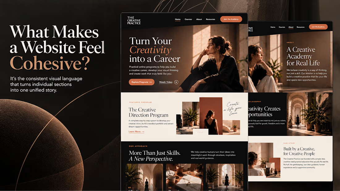
What makes a website feel cohesive?
It’s not just the colors.
It’s not just the typography.
And it’s definitely not about making every section look the same.
A cohesive website is built when every visual decision feels like part of the same story, from typography and imagery to spacing, buttons, cards, and even the smallest details.
The goal isn’t repetition.
It’s creating a visual language that people recognize and remember.
That’s when a website starts to feel like a brand, not just a collection of sections.
Well put, Serge. Consistent spacing, buttons and cards do more for that feeling than making sections match, and they are usually the first things to drift as a site grows.