The network for creativity
Join 1.25M professional creatives like you
Connect with clients, get discovered, and run your business 100% commission-free
Creatives on Contra have earned over $150M and we are just getting started
Back to feedPost
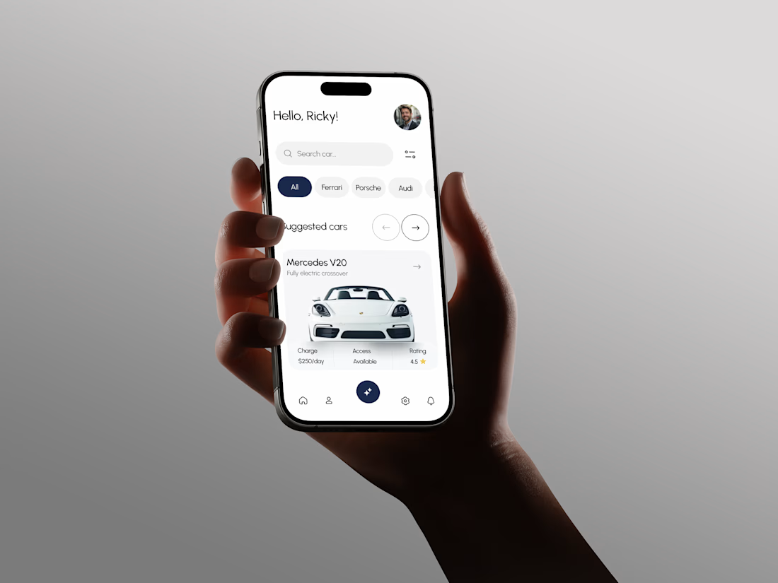
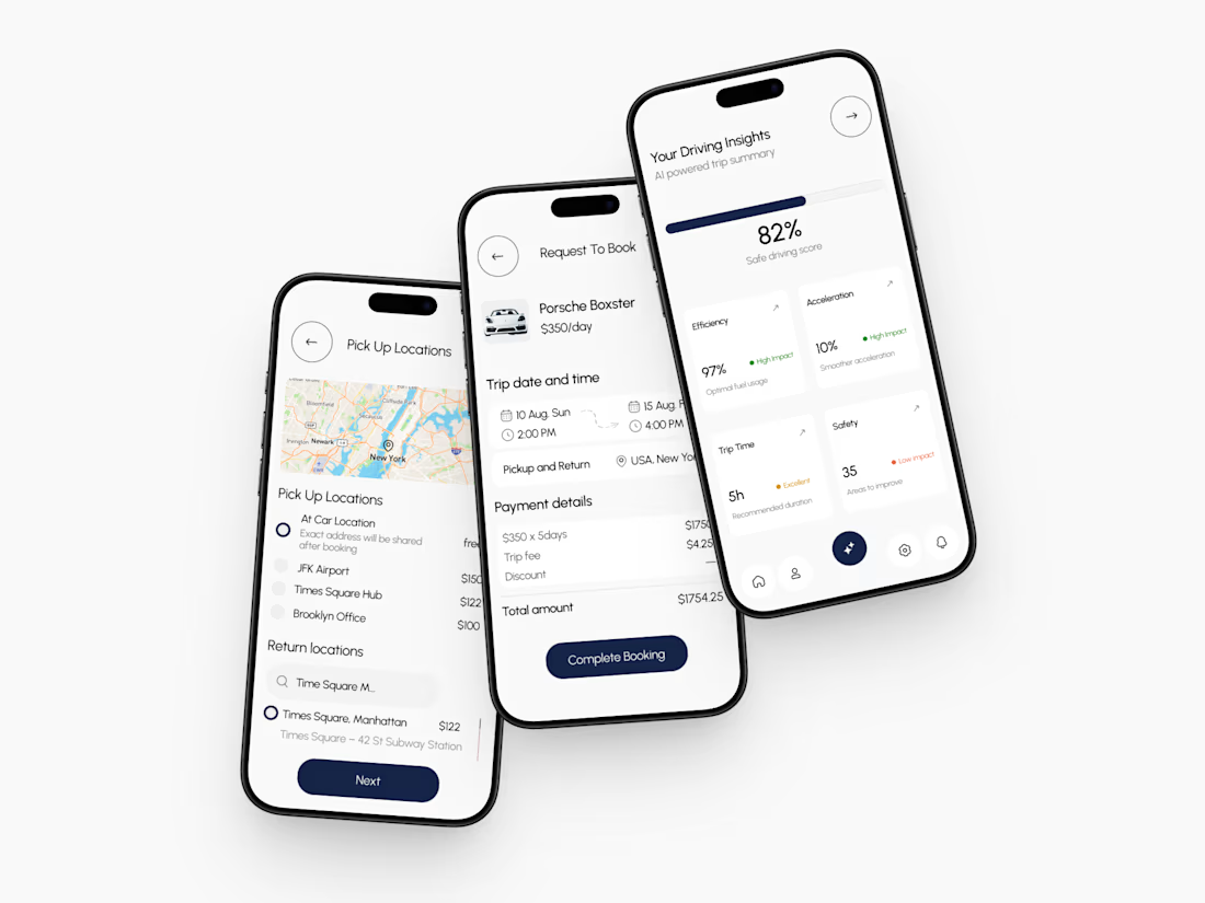
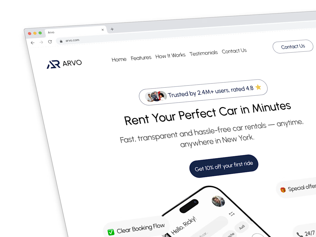
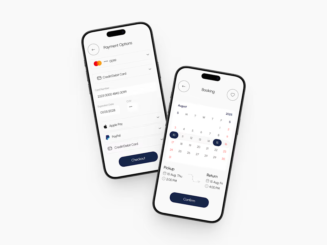
Trying to make the morph a little smoother for my app.. fade the type out, reshape the card, fade it back in. feels way less chaotic than springing every glyph mid-resize.


Clean work!

Thanks Bella 🙏


Great work🔥👏👏
Much appreciated 🙏

Premium work
Thank you very much 🙏

The design is sleek!
Appreciate it mate!!!
You're welcome mate!

Reshaping the card while fading the text out and back in is such a subtle trick, most people would never notice how many micro steps go into making something feel less chaotic. What did the janky version look like before you split it into those fades?
I didn’t even want to capture it lol… it looked really awful. When the card is in it’s morphing state the text then breaks to adapt to the card and it didn’t look nice at all… so I thought it would be nice to fade the text out then appear back when the card has completed its morphing.


Sicckkk
Thanks 🙏😝


Looks much cleaner this way. Nice little detail.

The network for creativity
Join 1.25M professional creatives like you
Connect with clients, get discovered, and run your business 100% commission-free
Creatives on Contra have earned over $150M and we are just getting started





Related posts

Winder is a bold brand identity built around a geometric W-inspired symbol, combining sharp angles and forward movement to represent progress, speed, and direction.
The identity uses a striking red and deep burgundy palette, supported by clean typography and a consistent visual system across brand guidelines, digital applications, and product mockups.
Progress in Motion.




Great logo it feels it really has an identity 🎉🎉

Still waiting to hear back from @Contra HQ
So I did what any designer would do: I made the card myself 😂
Brushed metal. Laser-engraved logo. Holographic Mastercard rings. Full 360° spin. I'm going to keep polishing this until the real one shows up in my mailbox. Your move, Contra 👀
(Concept / fan design, not an official Contra product..Yet 🙌 )


“Okay, this looks WAY too good 🔥 Contra needs to make this real 👀”


Professional work