The network for creativity
Join 1.25M professional creatives like you
Connect with clients, get discovered, and run your business 100% commission-free
Creatives on Contra have earned over $150M and we are just getting started
Back to feedPost

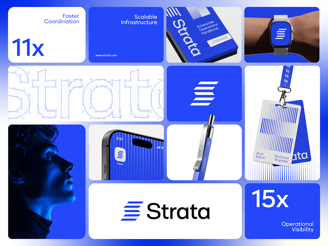
Strata’s brand runs on one colour, one shape and one rule. Restraint was the strategy.
I designed the brand identity for Strata, an enterprise SaaS platform that connects fragmented systems, data, workflows and teams. A product that removes chaos can’t have a chaotic brand, so every element earns its place: “Every layer, working as one.”
One shape: Five horizontal layers forming a subtle S. It works as the logo, a pattern and a rhythm for layouts.
One colour: Strata Blue #2447F9, carried by near-black and white. Solid only, never a gradient.
One rule: Complexity, organized into movement. If a layout feels busy, it’s wrong.
Structure: Modular grids, strong alignment and architectural spacing across every surface.
Imagery: Single-colour portraits in Strata Blue, so even the photography follows the system.
Fewer elements, used with discipline, scale further than more elements used loosely.
If your enterprise SaaS company needs a brand that stays consistent as it grows, let’s talk.
#VisualIdentity #SaaSBranding #B2BBranding #BrandDesign


The network for creativity
Join 1.25M professional creatives like you
Connect with clients, get discovered, and run your business 100% commission-free
Creatives on Contra have earned over $150M and we are just getting started
Related posts

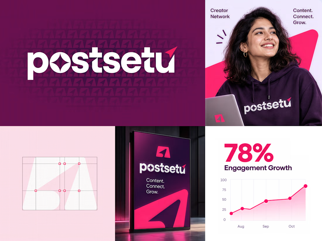
A brand identity built for creators, connection, and scalable growth! 🚀✨
Here is a fresh visual concept for Postsetu! The goal was to build a modern, high-energy brand language that seamlessly merges community networking with measurable content growth.

Great work

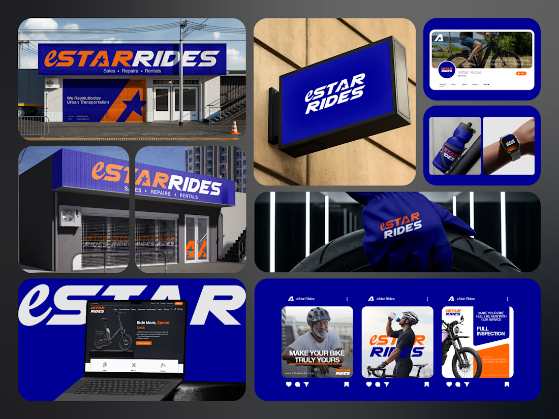
If you sell e-bikes, repairs and rentals, your brand should feel energetic before the customer even walks into the shop.
That was the challenge behind eStar Rides.
The brand needed to feel modern, confident and instantly recognizable across both physical locations and digital touchpoints.
So the identity was built around:
🟠 High-energy orange for visibility and impact
🔵 Deep electric blue for trust and technology
⭐ A bold star-led symbol for direction and recall
🔤 Custom typography with a strong, performance-driven feel
📱 A visual system designed to stay consistent everywhere
Then the identity was carried across:
Storefront signage
Retail environments
Website
Social media
Merchandise
Water bottles
Wearables
Campaign graphics
Digital applications
The goal was not just to make eStar Rides look modern.
It was to make the brand feel established, distinctive and ready to compete.
Because strong mobility branding should communicate:
Energy.
Freedom.
Confidence.
Reliability.
Before a customer even starts comparing options.
eStar Rides
Built for the ride.
What gives the brand the strongest presence?
A. The orange + blue palette
B. The custom wordmark
C. The storefront applications
D. The complete visual system
Drop A, B, C or D below.
If you are building a mobility, automotive, e-bike, transportation or tech-driven service brand and your visuals still feel generic, send me a message.
I help businesses build identities that feel more recognizable, credible and commercially ready.
#BrandIdentity #MobilityBranding #AutomotiveBranding #VisualIdentity #LogoDesign #RetailBranding #CreativeDirection #TransportationBranding



e bikes need branding with this kind of energy,, most of them look like appliance brands

Two warm ups today, both might become full case studies:
Parlata: an audio-postcard service that records and archives local dialects. Every recording becomes a small printed card with a QR link.
MODULO: an Industrial IoT brand. Olive, navy, one wobbly blob.
One is warm and human. One is technical and playful. Which would you want to see go all the way?
31 voted
63%
18 voted
37%
49 votes
Closed
Love it