The network for creativity
Join 1.25M professional creatives like you
Connect with clients, get discovered, and run your business 100% commission-free
Creatives on Contra have earned over $150M and we are just getting started
Back to feedPost

"His work has always exceeded my expectations... an exceptional ability to present businesses in a professional, polished, and compelling manner."
Long-term partnerships like this are the clearest signal of quality — not a one-off gig, but a client who keeps coming back because the work keeps performing.
Available for: M&A advisory decks, investor pitch decks, CIMs, valuation reports, SaaS marketing pitch decks.
investorpitchdeckinvestorsInfographic DesignPresentation DesignVisual DesignGoogle SlidesKeynoteMicrosoft PowerPoint


The network for creativity
Join 1.25M professional creatives like you
Connect with clients, get discovered, and run your business 100% commission-free
Creatives on Contra have earned over $150M and we are just getting started




Related posts

Visual Experiment
A compilation of recent visual tests, focusing on atmospheric lighting, fast-paced rhythm, and high-contrast color treatment. Designed to explore the boundaries between cinematic realism and abstract motion.
Everything handled from initial style framing to final color grading and typography integration.
Tools: After Effects, DaVinci Resolve
Created by Johan Vane


The lighting and color treatment create a strong atmosphere.


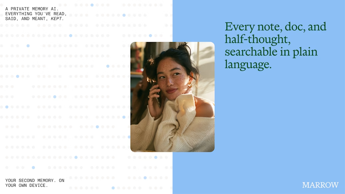
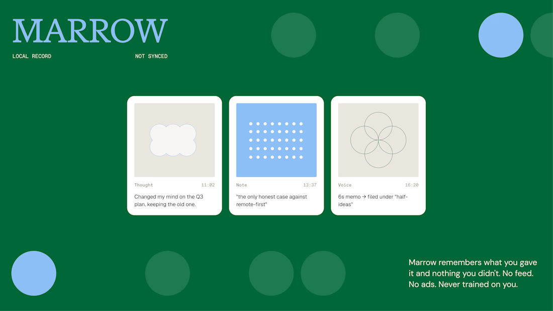
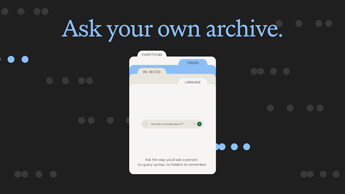
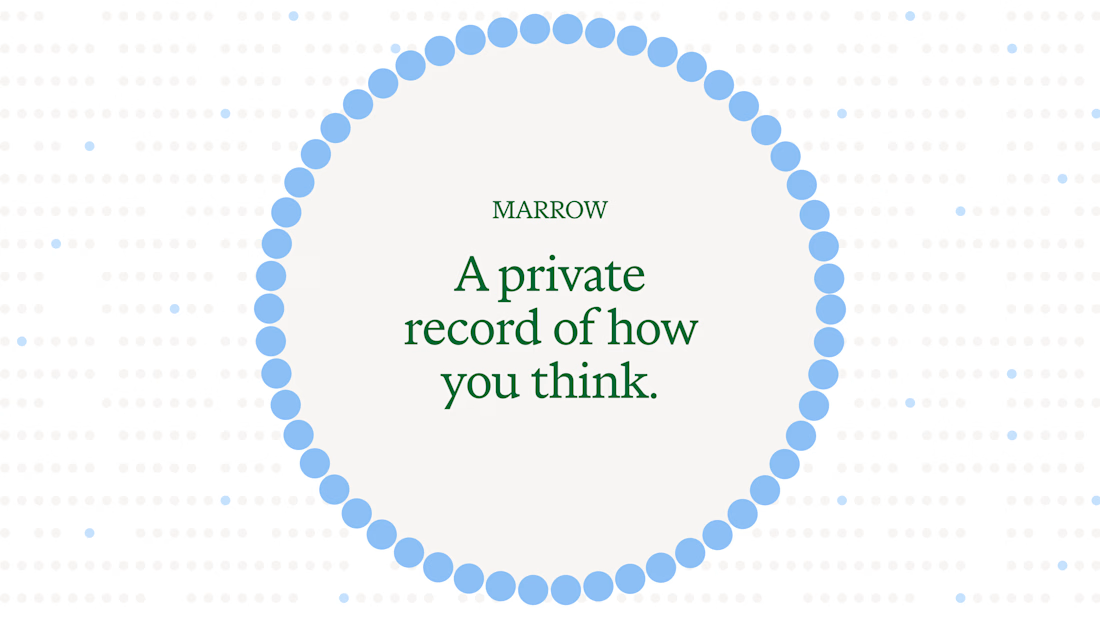

The dotted textures add a really nice layer to the whole identity.

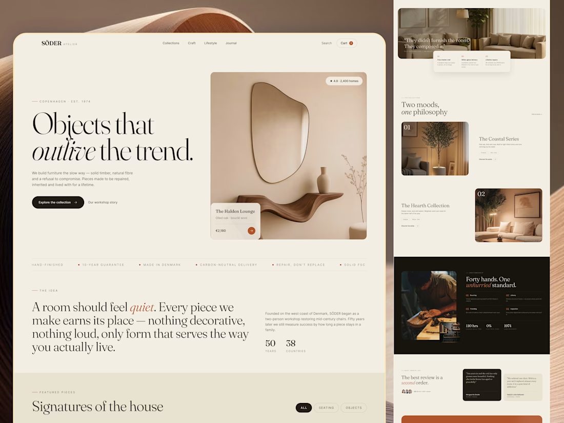
Most furniture websites try to help you buy faster. This concept for SÖDER ATELIER explores a different idea:
What if the experience helped you choose better?
The design is built around the values shown throughout the concept craftsmanship, natural materials, longevity, repairability, and thoughtful living. So instead of treating the homepage like a catalogue, the experience gives space to:
→ The story behind the pieces
→ Curated collections
→ Craft and material details
→ Long-term value
→ Customer perspectives
→ Clear product discovery
The visual language stays quiet and editorial, letting the furniture carry the attention. Because when a product is made to live with for years, the website shouldn't make it feel disposable.
SÖDER ATELIER — a responsive furniture e-commerce exploration.
🏀 Full Design Showcase – Better View on Dribbble.
↗ Furniture E-commerce Product Website


The homepage sells longevity, and Signatures of the house still gives you category chips to browse by. Curious whether the product page carries the craft and repairability fields too.