The network for creativity
Join 1.25M professional creatives like you
Connect with clients, get discovered, and run your business 100% commission-free
Creatives on Contra have earned over $150M and we are just getting started
Back to feedPost

Update: a proper walkthrough of Brasswater Gauge 🎬
49 seconds, one chapter per part of the machine: the valve plays, water is the timeline, the tank shows the buffer, the reel cabinet jumps between scenes, and the red lamp puts it all to sleep.
Live demo: https://brasswater-gauge.netlify.app
#videojsskinschallenge


The network for creativity
Join 1.25M professional creatives like you
Connect with clients, get discovered, and run your business 100% commission-free
Creatives on Contra have earned over $150M and we are just getting started



Related posts


Niceee

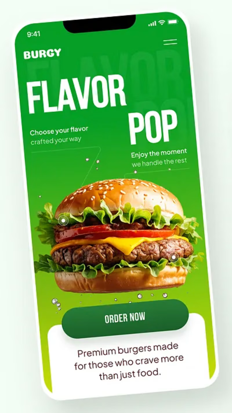
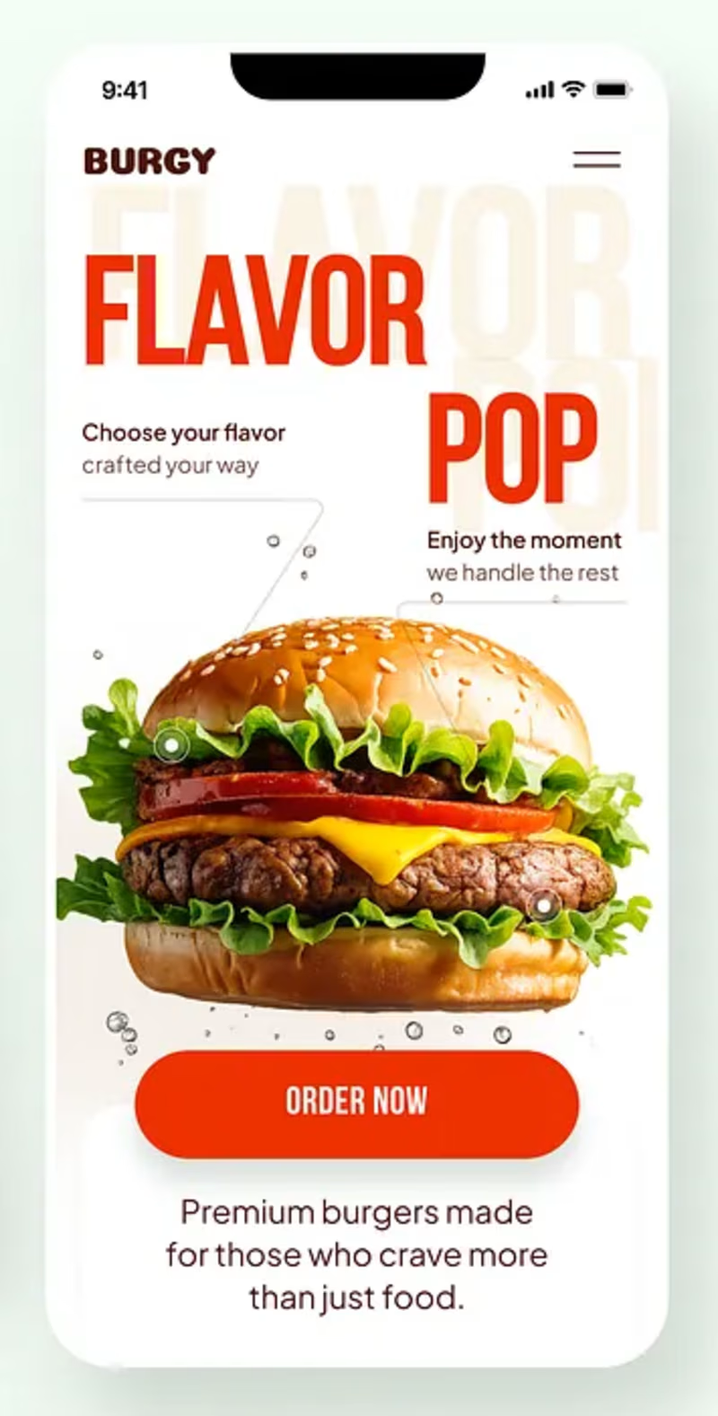
Burgy, a mobile concept for burger ordering. 🍔
Bold type, premium food visuals, and a fast path from craving to checkout.
Two color directions for the hero screen. Which one converts better?
Vote and tell me why 👇
Poll options: 🟢 Green | 🔴 Red
#UIDesign #MobileApp #FoodApp #AppDesign #UX #RestaurantApp
13 voted
43%
17 voted
57%
30 votes
Closed

Green for me, and I'd bet on it converting better too. The red version is loud in the way every food app is loud, while the green makes the burger the hero and the screen instantly recognizable in a feed. The green background also gives the white FLAVOR POP type far more contrast, so the message lands a beat faster.

How I designed Parti, my architecture template for Framer, and the phone review that changed its hierarchy.


Your material-page revision gives the phone layout its own reading sequence. The change to thumbnail rows with full-row links seems particularly useful for showing that a material entry opens another page. How did you distinguish those clickable rows from the non-interactive project facts?