The network for creativity
Join 1.25M professional creatives like you
Connect with clients, get discovered, and run your business 100% commission-free
Creatives on Contra have earned over $150M and we are just getting started
Back to feedPost

Bistro & Parker's - Restaurant, Food Menu & Takeout Ordering Website
Role: Web Designer & Developer | UI/UX | Restaurant Website | Webflow.
Parker's Bistro is a premium dine-in and takeout restaurant that needed a mouth-watering, conversion-focused website to turn hungry visitors into orders.
The Problem:
Old site didn't showcase food quality. No clear menu structure, no separation between dine-in vs. takeout, no chef story, no customer testimonials. Losing orders to delivery apps.
What I Did:
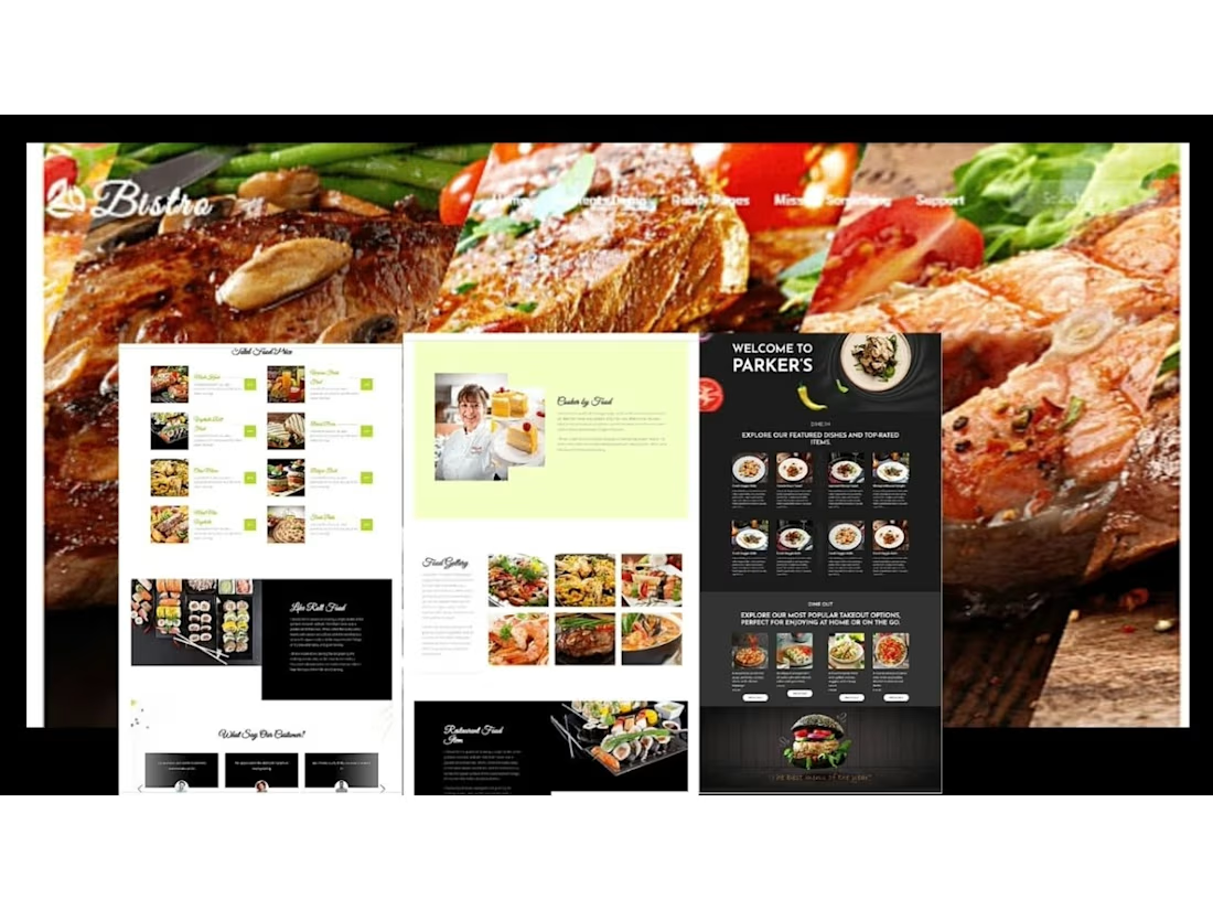
Designed craving-inducing hero: Diagonal steak, salmon & green beans montage with "Bistro" branding - instant appetite appeal
Built dual-concept layout: Light "Bistro" version + Dark "Welcome to Parker's" version for day/night menu feel
Created structured food menus: Skilled Food Menu with 8 dishes, Featured Dishes & Top-Rated Items (8 dishes), Most Popular Takeout Options (4 dishes) - each with image, price, add-to-cart
Added storytelling sections: "Baked by Food" with chef profile (female chef with cakes), "Life Roll Food" sushi story, "Food Gallery" 6-image grid, "Restaurant Food Idea"
Included social proof: "What Say Our Customer?" testimonials
Designed for conversions: Dine In vs. Dine Out sections - "Perfect for enjoying at home or on the go", clear burger CTA footer - "The best burger of the place"
Used black and lime accent for premium steakhouse feel, contrasted with white/light green for fresh bakery
Fully responsive, SEO-optimized, fast loading, optimized for food photography
Result:
Restaurant website that makes you hungry instantly. Clear separation of dine-in experience vs. takeout convenience, builds trust with chef story and gallery, drives direct orders instead of third-party commissions.
Tools Used:
Figma, WordPress, Elementor, Restaurant UI, Food Menu Design, Responsive Design, UI/UX.


The network for creativity
Join 1.25M professional creatives like you
Connect with clients, get discovered, and run your business 100% commission-free
Creatives on Contra have earned over $150M and we are just getting started
Related posts

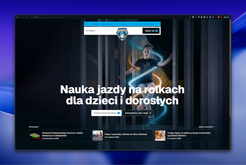
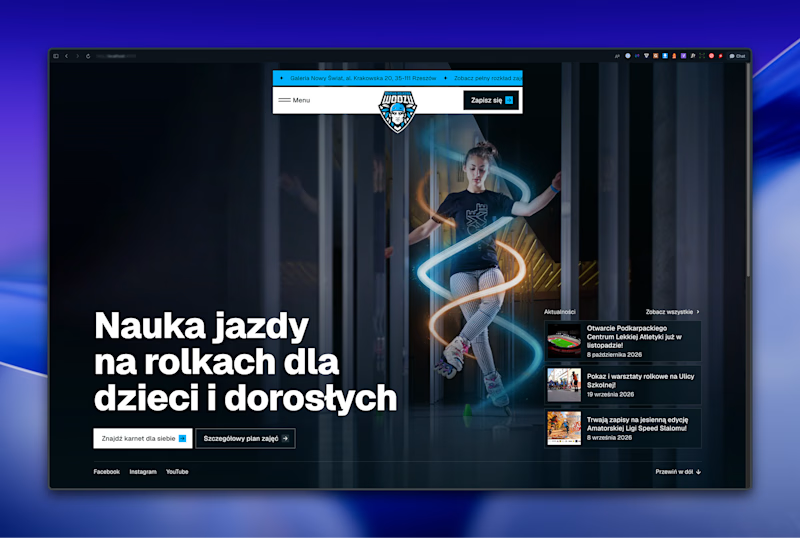

Left aligned for me. With that much body copy next to the headline it reads cleaner.


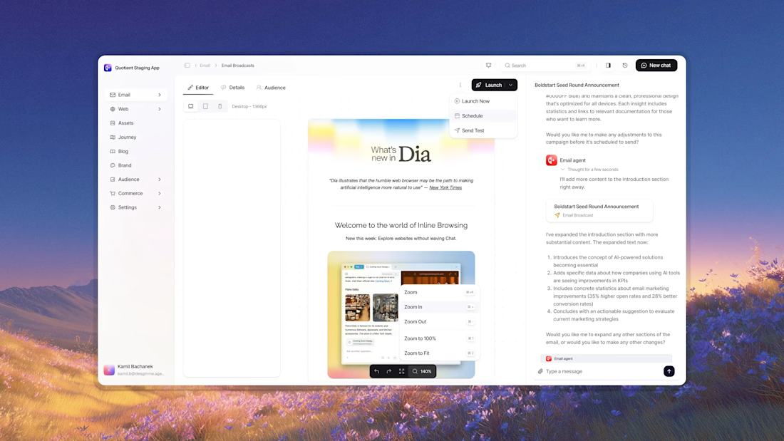


Awesome dude

Proper Form — Social Media Branding System
A flexible social media system created for Proper Form as part of the wider brand identity.
The template system was designed to adapt across different post formats, banners and platforms while maintaining a consistent visual language.
Rather than repeating one rigid layout, the system gives the brand room to vary composition, imagery and content while remaining clearly recognizable.
Created by Lepisov Branding in collaboration with Creative Mints.
Logo design: Ilya Gorchanyuk
Creative direction: Dmitry Lepisov
Brand identity + social system: Lepisov Branding × Creative Mints


This is how a social system should work: strong enough rules that the brand reads at thumbnail size, loose enough that the feed never looks copy-pasted. Do you hand clients a Figma kit for this, or build it in something their team edits themselves?