The network for creativity
Join 1.25M professional creatives like you
Connect with clients, get discovered, and run your business 100% commission-free
Creatives on Contra have earned over $150M and we are just getting started
Back to feedPost

New project: CULTURE, a frozen yogurt brand identity built entirely with AI.
I designed the mascot, the packaging system, the social campaigns, and the photography direction, all generated and art directed from the ground up.
This is what AI-powered creative direction actually looks like when it's done with intention.
Check out the full project below.


The mascot living in the cup is what holds the system together, not just the pack. Photography and the yogurt character stay in one tone, so the AI direction still reads as a single brand.

The hand-drawn mascot popping out of a real photo instead of sitting in an all-illustrated scene is such a fun contrast, makes it feel more alive. Which part of the AI workflow took the most iteration, mascot consistency or the photo direction?
The network for creativity
Join 1.25M professional creatives like you
Connect with clients, get discovered, and run your business 100% commission-free
Creatives on Contra have earned over $150M and we are just getting started

Challenges
View all


Related posts


Outstanding 😊


The low-poly scene already has a strong sense of place, and the 60fps browser target makes the interaction feel ambitious in the best way. I especially like how the restrained palette lets the “Explore the Silo” typography lead the experience.

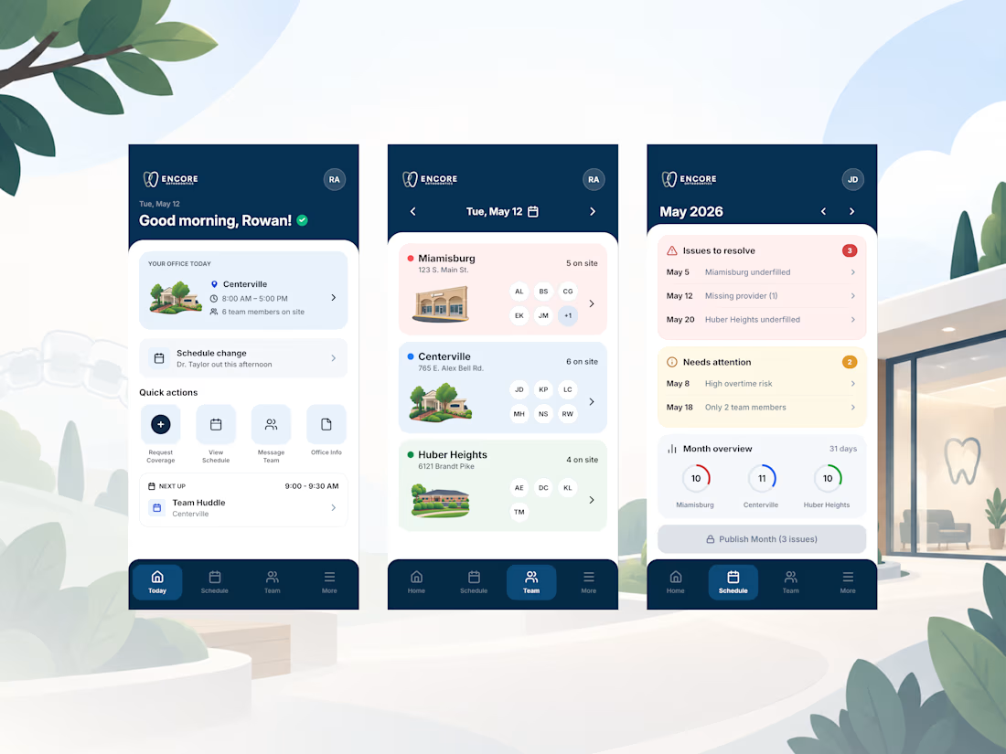
Finishing up a mobile app design for Burke Orthodontics! (rebranding to Encore Orthodontics)
Check it out


Outstanding