The network for creativity
Join 1.25M professional creatives like you
Connect with clients, get discovered, and run your business 100% commission-free
Creatives on Contra have earned over $150M and we are just getting started
Back to feedPost

This is print advertising for a Minas Gerais tourism campaign, transcreated from Portuguese for an English-speaking, in-flight readership. The brief wasn't literal translation; it was to make the copy land with the same emotional pull in English that it had in the original. So I rebuilt it for rhythm and concision, keeping it sensory and invitational while tightening it to work as display advertising. It shows my commercial brand voice alongside my EN/PT transcreation — a different muscle entirely from my editorial writing.


The network for creativity
Join 1.25M professional creatives like you
Connect with clients, get discovered, and run your business 100% commission-free
Creatives on Contra have earned over $150M and we are just getting started
Related posts


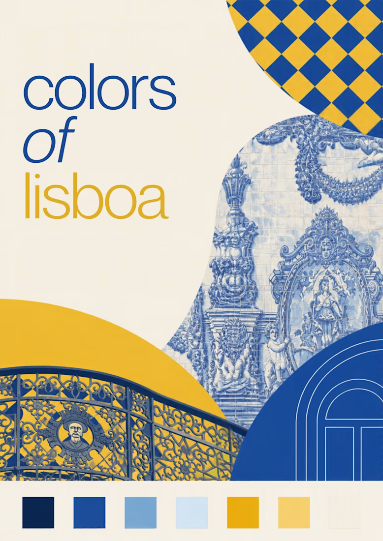
Turning the colors I notice around Lisbon into a series of posters, each inspired by a different photograph.
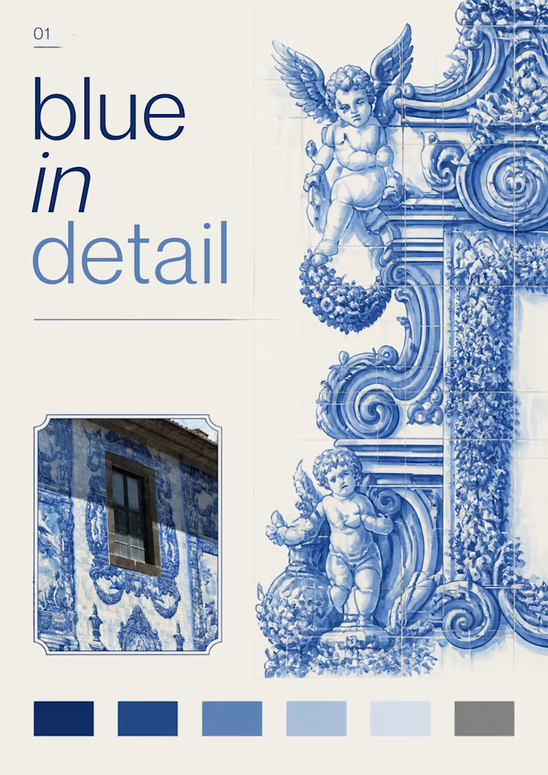
01 [Blue in Detail] started with the blue Portuguese tiles, exploring their intricate patterns, ceramic tones, and small details.
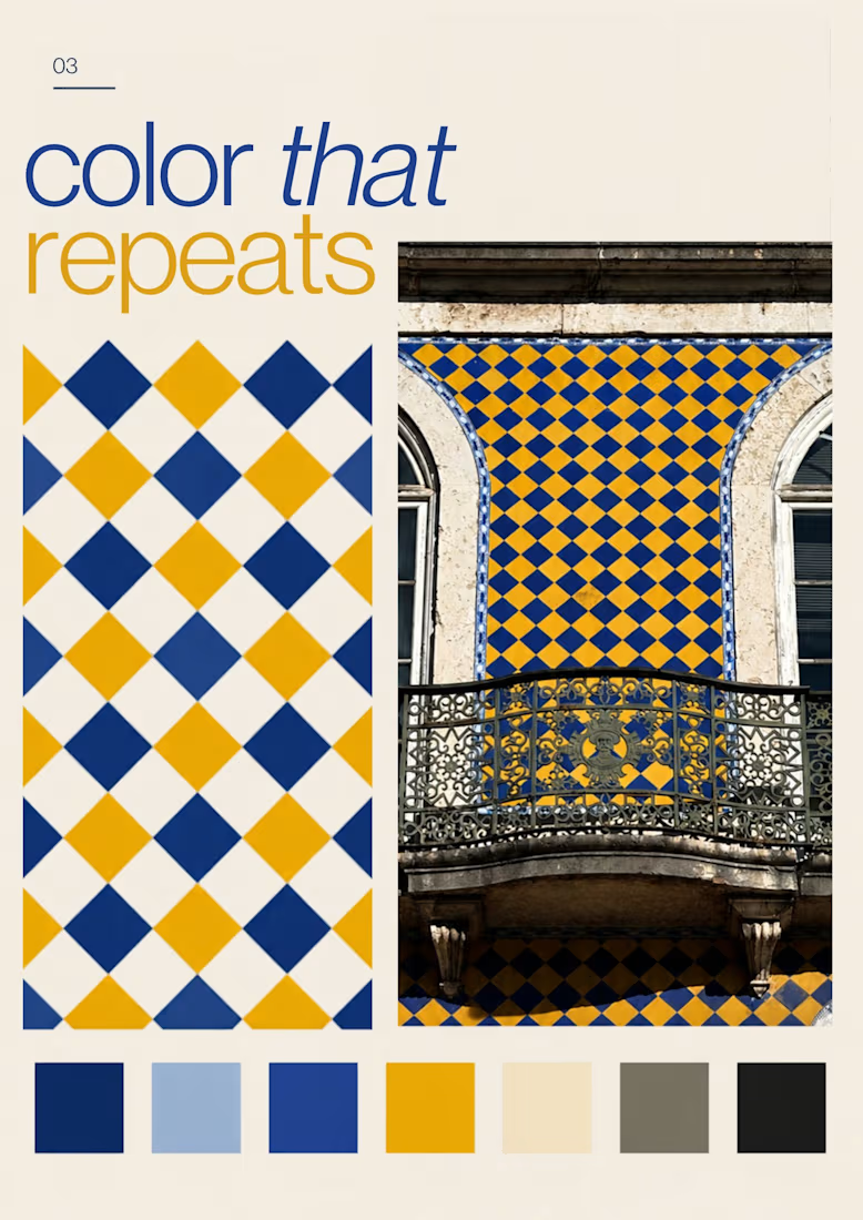
02 [Color on Repeat] explored the rhythm of blue and yellow tiles, using repetition as the starting point for the design.
I sampled colors from my photographs and used Canva Craft to explore layouts, typography, and graphic elements. Then I refined the designs by hand, adjusting the colors, spacing, and text.



Looks super polished! love it

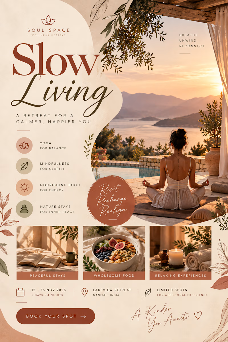
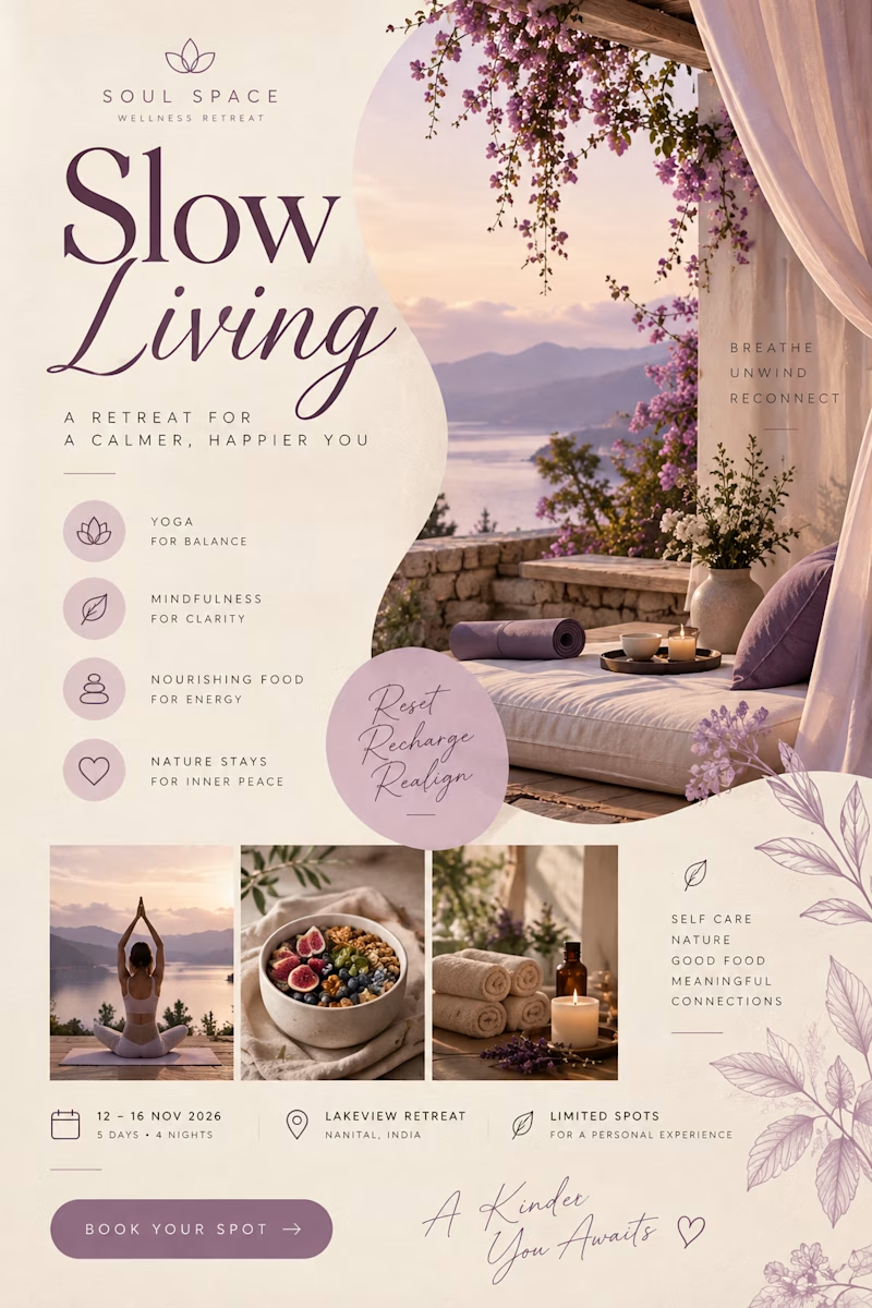
Created a collection of aesthetic promotional flyers for a wellness retreat brand, inspired by mindful living, relaxation, and nature.

2 voted
67%
1 voted
33%
3 votes
Closed