The network for creativity
Join 1.25M professional creatives like you
Connect with clients, get discovered, and run your business 100% commission-free
Creatives on Contra have earned over $150M and we are just getting started
Back to feedPost
𝗠𝗼𝘀𝘁 𝗲-𝗰𝗼𝗺𝗺𝗲𝗿𝗰𝗲 𝘄𝗲𝗯𝘀𝗶𝘁𝗲𝘀 𝗳𝗼𝗰𝘂𝘀 𝗼𝗻 𝗹𝗼𝗼𝗸𝗶𝗻𝗴 𝗯𝗲𝘁𝘁𝗲𝗿.
The best e-commerce websites perform better.
That's the difference.
𝗔 𝗯𝗲𝗮𝘂𝘁𝗶𝗳𝘂𝗹 𝘄𝗲𝗯𝘀𝗶𝘁𝗲 𝗺𝗶𝗴𝗵𝘁 𝗴𝗲𝘁 𝗮𝘁𝘁𝗲𝗻𝘁𝗶𝗼𝗻.
𝗔 𝗵𝗶𝗴𝗵-𝗰𝗼𝗻𝘃𝗲𝗿𝘁𝗶𝗻𝗴 𝘄𝗲𝗯𝘀𝗶𝘁𝗲 𝗴𝗲𝘁𝘀 𝗿𝗲𝘀𝘂𝗹𝘁𝘀.
Slow loading.
Weak product presentation.
Confusing navigation.
Poor mobile experience.
These problems quietly reduce sales every day.
A high-performing website should have:
Fast WordPress performance
Optimized Shopify experience
Clear product hierarchy
Smooth mobile interactions
Focused conversion flow
Everything feels faster.
Everything feels cleaner.
Everything feels easier to buy from.
Because when friction disappears...
Users trust faster.
Users browse longer.
Users convert more easily.
𝗕𝗲𝘁𝘁𝗲𝗿 𝗲𝘅𝗽𝗲𝗿𝗶𝗲𝗻𝗰𝗲 → 𝗯𝗲𝘁𝘁𝗲𝗿 𝗰𝗼𝗻𝘃𝗲𝗿𝘀𝗶𝗼𝗻𝘀 → 𝗯𝗲𝘁𝘁𝗲𝗿 𝗴𝗿𝗼𝘄𝘁𝗵.
The best websites don't just attract visitors.
They turn visitors into customers.
#𝗪𝗼𝗿𝗱𝗣𝗿𝗲𝘀𝘀 #𝗦𝗵𝗼𝗽𝗶𝗳𝘆 #𝗘𝗰𝗼𝗺𝗺𝗲𝗿𝗰𝗲 #𝗪𝗲𝗯𝗗𝗲𝘀𝗶𝗴𝗻 #𝗖𝗥𝗢 #𝗨𝗫𝗗𝗲𝘀𝗶𝗴𝗻 #𝗖𝗼𝗻𝘃𝗲𝗿𝘀𝗶𝗼𝗻𝗢𝗽𝘁𝗶𝗺𝗶𝘇𝗮𝘁𝗶𝗼𝗻 #𝗪𝗲𝗯𝘀𝗶𝘁𝗲𝗢𝗽𝘁𝗶𝗺𝗶𝘇𝗮𝘁𝗶𝗼𝗻 #𝗟𝗮𝗻𝗱𝗶𝗻𝗴𝗣𝗮𝗴𝗲𝗗𝗲𝘀𝗶𝗴𝗻 #𝗗𝗶𝗴𝗶𝘁𝗮𝗹𝗘𝘅𝗽𝗲𝗿𝗶𝗲𝗻𝗰𝗲
The network for creativity
Join 1.25M professional creatives like you
Connect with clients, get discovered, and run your business 100% commission-free
Creatives on Contra have earned over $150M and we are just getting started
Related posts
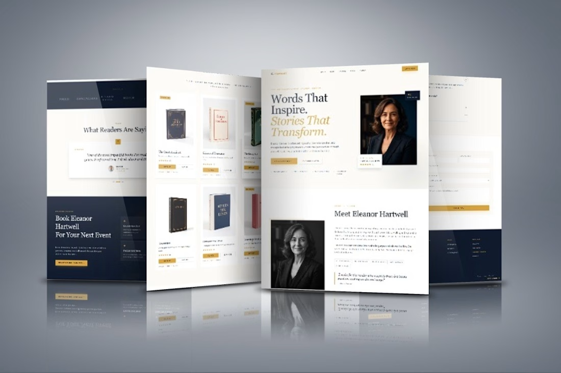
𝗛𝗶𝗿𝗶𝗻𝗴 𝗮 𝗪𝗼𝗿𝗱𝗣𝗿𝗲𝘀𝘀 𝗪𝗲𝗯𝘀𝗶𝘁𝗲 𝗗𝗲𝘀𝗶𝗴𝗻𝗲𝗿 𝗶𝗻 𝗡𝗶𝗴𝗲𝗿𝗶𝗮 𝘃𝘀. 𝗵𝗶𝗿𝗶𝗻𝗴 𝗹𝗼𝗰𝗮𝗹𝗹𝘆
If you run a service-based business, here's what really matters:
𝗖𝗼𝘀𝘁: You shouldn't have to overpay to get a professional, high-converting website.
𝗖𝗼𝗺𝗺𝘂𝗻𝗶𝗰𝗮𝘁𝗶𝗼𝗻: Clear updates, honest feedback, and someone who actually listens to your business goals.
𝗧𝘂𝗿𝗻𝗮𝗿𝗼𝘂𝗻𝗱: A structured process that keeps your project moving without sacrificing quality.
The truth?
Your next great website doesn't have to come from someone in your city.
It has to come from someone who understands how to turn visitors into inquiries and inquiries into paying clients.
Whether you're a coach, consultant, agency, law firm, healthcare provider, home service business, or any other service-based company, the right website can help you build trust before you ever have a conversation with a prospect.
Great websites aren't built because of geography.
They're built through strategy, communication, and a genuine understanding of your business.
𝗠𝗶𝗰𝗵𝗮𝗲𝗹 𝗔𝗱𝗲𝘁𝗮𝘆𝗼 · 𝗪𝗼𝗿𝗱𝗣𝗿𝗲𝘀𝘀 𝗪𝗲𝗯𝘀𝗶𝘁𝗲 𝗗𝗲𝘀𝗶𝗴𝗻𝗲𝗿 · Elementor Expert
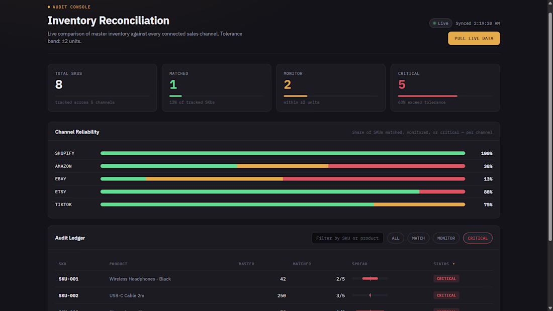
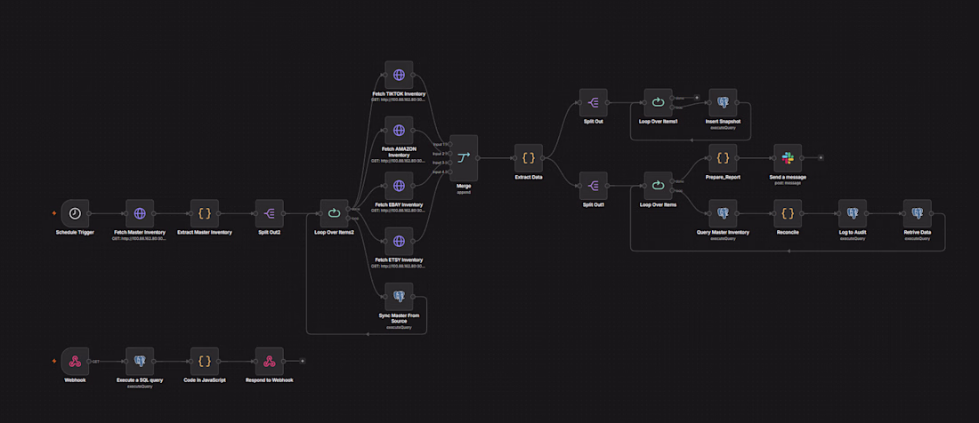
Just wrapped up the final version of my 𝐌𝐮𝐥𝐭𝐢-𝐂𝐡𝐚𝐧𝐧𝐞𝐥 𝐈𝐧𝐯𝐞𝐧𝐭𝐨𝐫𝐲 𝐑𝐞𝐜𝐨𝐧𝐜𝐢𝐥𝐢𝐚𝐭𝐢𝐨𝐧 𝐒𝐲𝐬𝐭𝐞𝐦.
The automation was done, but the dashboard didn't meet the standard I had in mind, so I redesigned it from scratch. The second iteration is much cleaner and focuses on what actually matters: visibility into inventory mismatches across sales channels.
𝐖𝐡𝐚𝐭 𝐢𝐭 𝐝𝐨𝐞𝐬:
Synchronizes inventory across multiple marketplaces
Compares channel inventory against the master inventory
Detects discrepancies automatically
Logs every reconciliation for auditing
Sends Slack alerts when mismatches are detected
Provides a centralized audit dashboard for monitoring
Built using n8n, PostgreSQL, and Docker on a self-hosted cloud VPS.
Sometimes the automation is the easy part. Building a dashboard people can understand at a glance takes even more iteration.
Nice concept
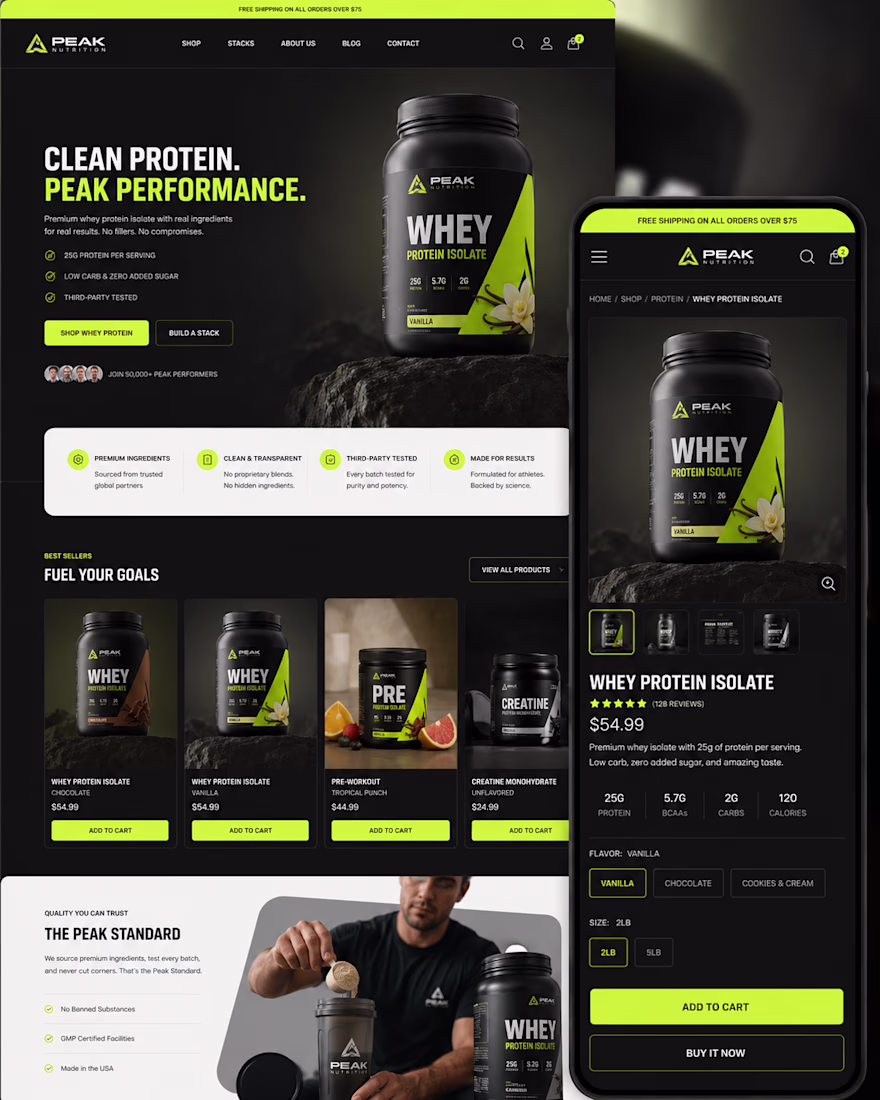
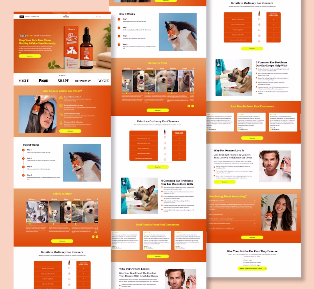
A homepage isn’t just the first page visitors see it’s the first opportunity to earn their trust.
I recently designed and developed this high-converting Shopify homepage in Replo for Kriath Pet Care, with a clear objective: transform first-time visitors into confident buyers.
Every section was carefully planned to guide users through the customer journey from capturing attention to educating, building trust, and driving action.
Here’s what I focused on:
✨ A bold hero section with a clear value proposition
📱 Fully responsive across desktop, tablet, and mobile
🎯 Benefit-driven storytelling that keeps visitors engaged
⭐ Social proof, customer testimonials, and before & after results
📊 Comparison tables that reduce buying hesitation
🐶 Educational sections that answer common customer questions
💚 Strong visual hierarchy for a seamless browsing experience
🛒 Strategic CTA placement to maximize conversions
⚡ Pixel-perfect development in Replo with Shopify integration
Every scroll has a purpose. Every section answers a question. Every CTA moves the customer one step closer to purchasing.
That’s what great eCommerce design is about not just creating beautiful pages, but creating experiences that convert.
Proud to bring this vision to life for Kriath Pet Care, and excited to keep helping brands build Shopify experiences that drive measurable results.
If you’re looking for a Replo developer to create high-converting homepages, landing pages, or product pages, let’s build something exceptional.
Trending
Claude
Claude has entered the design space. How are you using Claude Design?
Contra University
Learn from expert creatives how to earn more using next-gen AI tools.
fifaworldcup2026
The World Cup is here and the whole world's watching. How are you designing for the world stage?
creativeaiflow
Creative AI workflows are evolving. What tools do you use, and what are their strengths and weaknesses?
freelancerlife
Freelancer life is wins, pivots, and everything in between. What’s yours right now?