The network for creativity
Join 1.25M professional creatives like you
Connect with clients, get discovered, and run your business 100% commission-free
Creatives on Contra have earned over $150M and we are just getting started
Back to feedPost
Taste Test


A

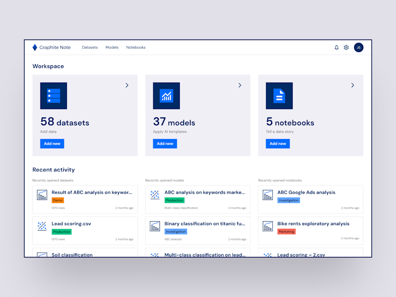
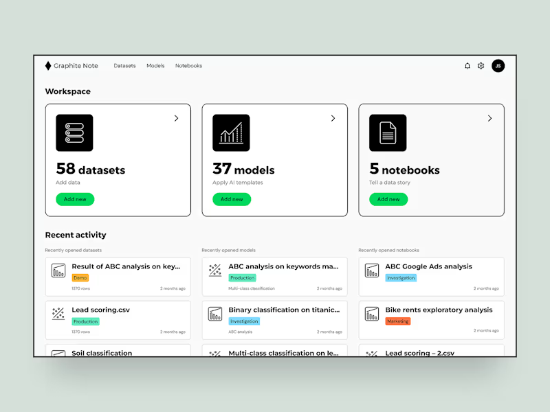
The compact card grid makes the hierarchy easy to scan, and showing both themes makes the comparison feel tangible. I’d lean A for the calmer analytics feel, though B has great contrast.


Option A

For a prediction app specifically I'd lean toward whichever version pushes the numbers forward and treats color as a status signal rather than decoration. What's driving the split in votes so far, is it a light vs dark preference or something about the data density?

Going with B. The muted green background reads more analytical and focused, which makes sense for a prediction tool. Option A feels like a generic SaaS dashboard.
The network for creativity
Join 1.25M professional creatives like you
Connect with clients, get discovered, and run your business 100% commission-free
Creatives on Contra have earned over $150M and we are just getting started





Related posts

Same prompt. Two builders.
One site made with Lovable, one with Google AI Studio. A Flemish still-life snack brand, gilt frames, GSAP scroll, the works.
Which one is better?
33 voted
67%

16 voted
33%

49 votes
Closed

Minimal vs Detailed - Which coin design feels more premium for a fintech brand?
9 voted
27%
24 voted
73%
33 votes
Closed

I like the premium gold version

Which one makes you want to stay A or B?


8 voted
24%
25 voted
76%
33 votes
Closed

I’d go with Immersive. It feels more engaging and premium, and the deeper color treatment makes the experience feel more like a real destination rather than just a booking page. 👌🔥