The network for creativity
Join 1.25M professional creatives like you
Connect with clients, get discovered, and run your business 100% commission-free
Creatives on Contra have earned over $150M and we are just getting started
Back to feedPost


The network for creativity
Join 1.25M professional creatives like you
Connect with clients, get discovered, and run your business 100% commission-free
Creatives on Contra have earned over $150M and we are just getting started

Challenges
View all


Related posts

Real Estate SaaS Dashboard
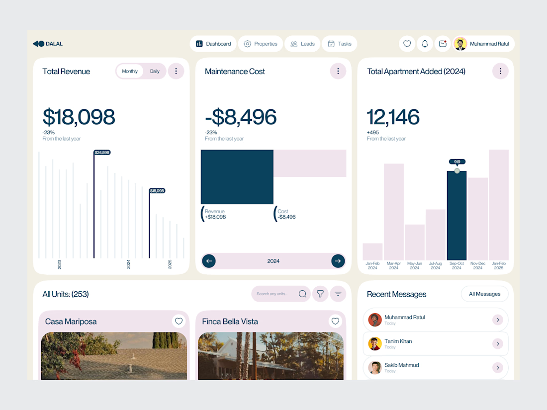
Real estate software often sits on top of a large amount of operational data.
Properties, leads, deals, revenue, tasks and performance all need to be visible without turning the product into an information wall.
For this dashboard concept, the design process started with hierarchy.
The most important metrics get immediate visibility. Supporting information is organized into focused sections, while actions remain close to the data they relate to.
The result is a SaaS interface designed around clarity, decision-making and everyday workflow.
Focus: Real Estate SaaS · PropTech UI/UX · Dashboard Design · Data Visualization · Property Management Software
The goal wasn't to make the product look complex.
It was to make a complex business easier to operate.
Designed by WaxyWeb.
Working on a SaaS or PropTech product?
hello.waxyweb@gmail.com
www.waxyweb.com


great one

Title: High-Converting Landing Page & UI Polish
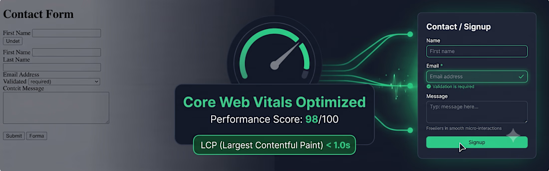
Explanation: Partnered with a design agency to overhaul a legacy client landing page. My focus was on converting a static HTML/CSS design into a modular Next.js structure with Tailwind CSS, prioritizing SEO and Core Web Vitals (achieving 90+ across all metrics on mobile). Integrated complex Framer Motion animations for smoother interaction, leading to a 25% increase in sign-up conversions. Proved that a pixel-perfect, fast UI drives real business results.



Designed a clean and modern AI-powered Project Management Dashboard for Oripio Ai.
This interface helps design teams organize UX/UI project kickoffs with clear status tracking (Not started, Started, In progress), project details, assigned members, budgets, and timelines — all in one simple and professional workspace.


the project cards look handy. nice job!