The network for creativity
Join 1.25M professional creatives like you
Connect with clients, get discovered, and run your business 100% commission-free
Creatives on Contra have earned over $150M and we are just getting started
Back to feedPost
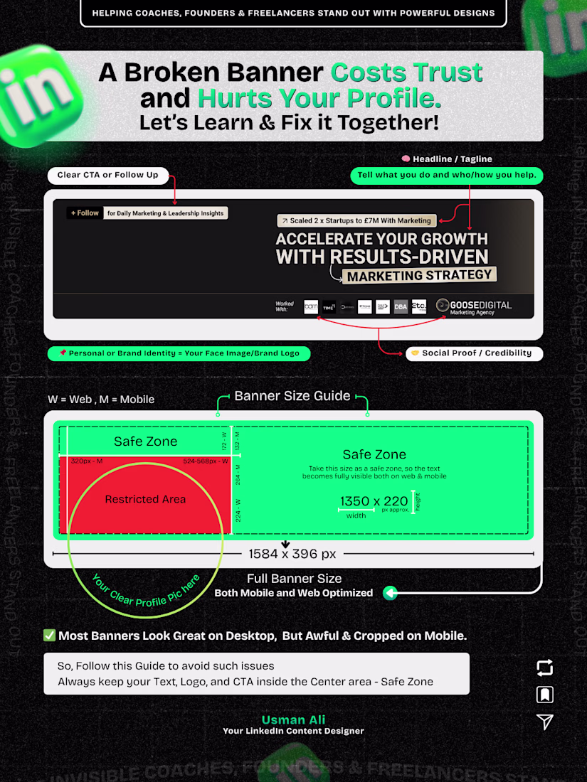
The 1 mistake I see most people design banners for desktop only. However 85% Users are on mobile app.
That is why, it should be mobile optimized.
2/ Too much text and colors.
3/ Unmatched font pairing.
4/ Broken layout.
5/ No clear CTA.
The network for creativity
Join 1.25M professional creatives like you
Connect with clients, get discovered, and run your business 100% commission-free
Creatives on Contra have earned over $150M and we are just getting started
Related posts
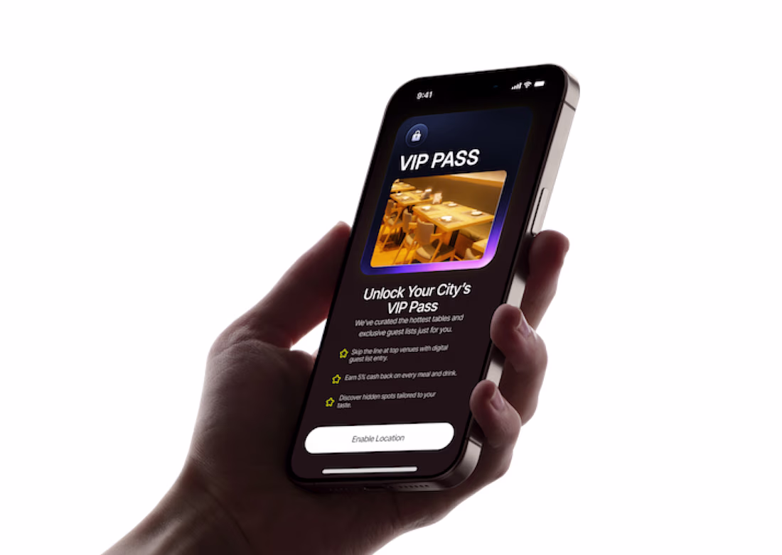
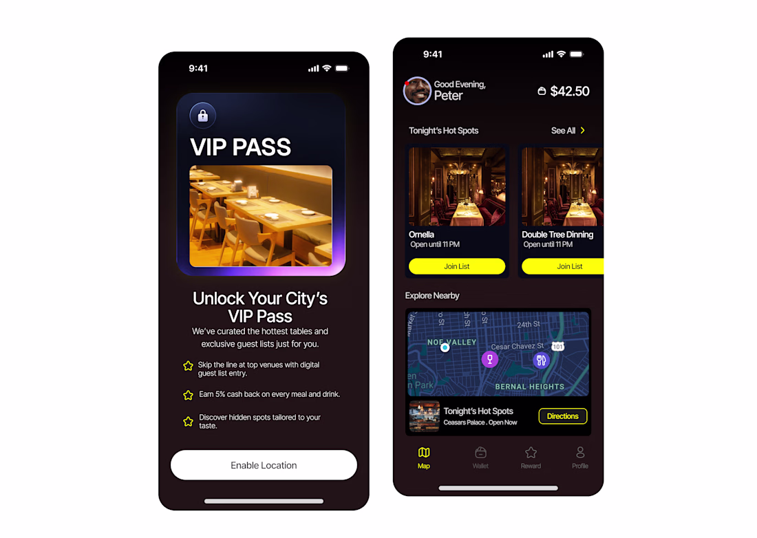
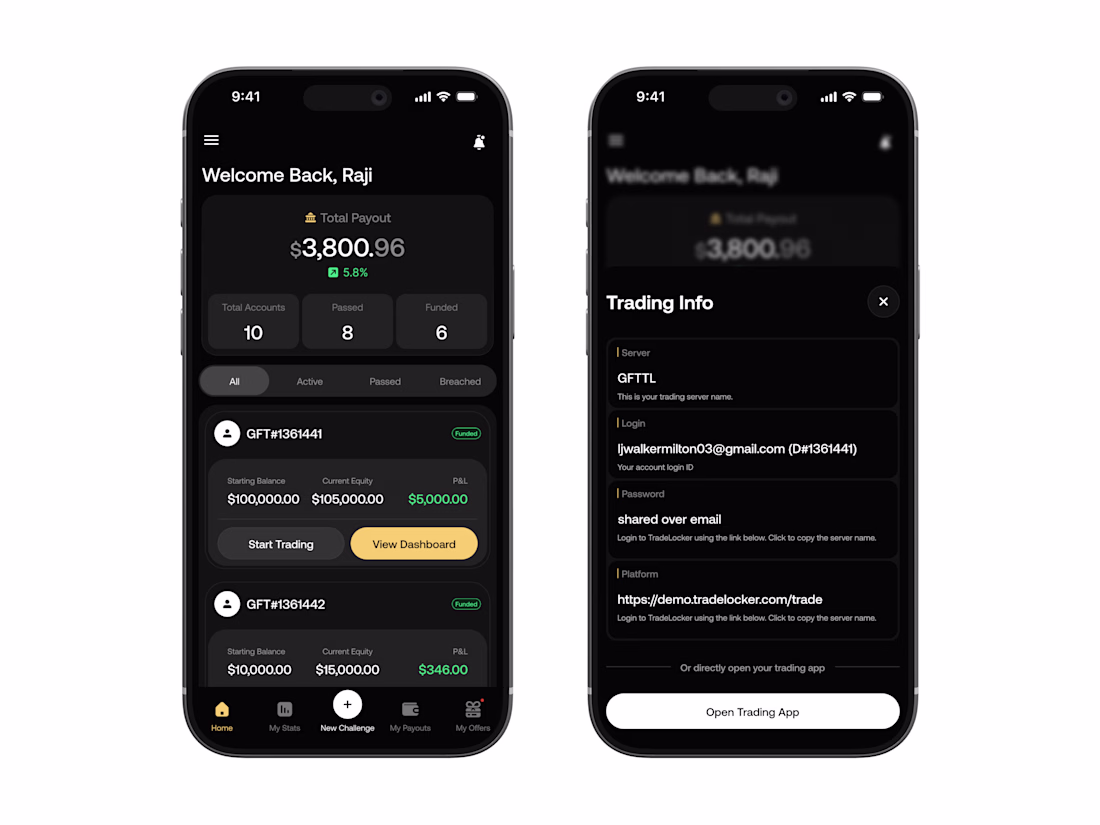
recent mobile screen designs.
It look clean and easy to use, great work!
Working on the UI/UX design flow for this screen.
If you were the player, which would you prefer?
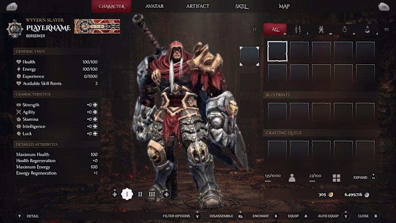
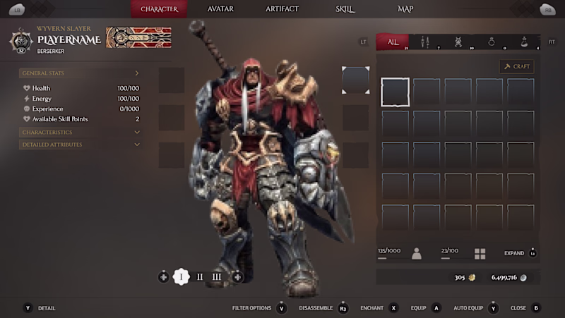
6 votes
Ends in 1d
Trending
Claude
Claude has entered the design space. How are you using Claude Design?
Contra University
Learn from expert creatives how to earn more using next-gen AI tools.
creativeaiflow
Creative AI workflows are evolving. What tools do you use, and what are their strengths and weaknesses?
portfolioreview
The best portfolios tell a story, not just show a grid. Share yours for feedback.
freelancerlife
Freelancer life is wins, pivots, and everything in between. What’s yours right now?